Responsive Devices Illustrations - Editable Keynote | ImagineLayout


Type: Keynote Charts template
Category: Illustrations
Sources Available: .key
Product ID: KC00739
Template incl.: 34 editable slides
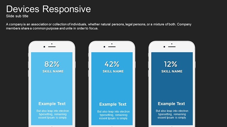
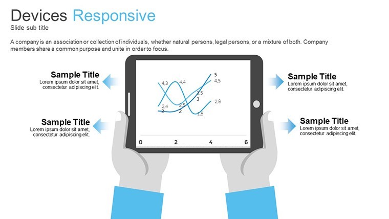
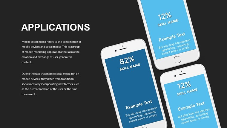
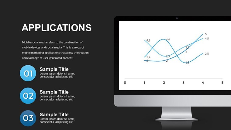
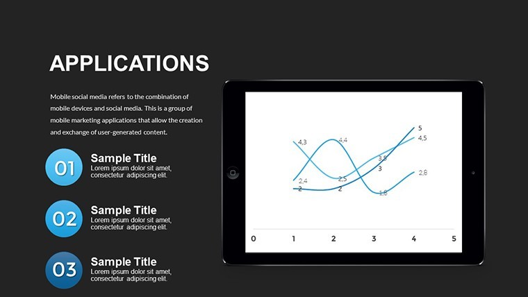
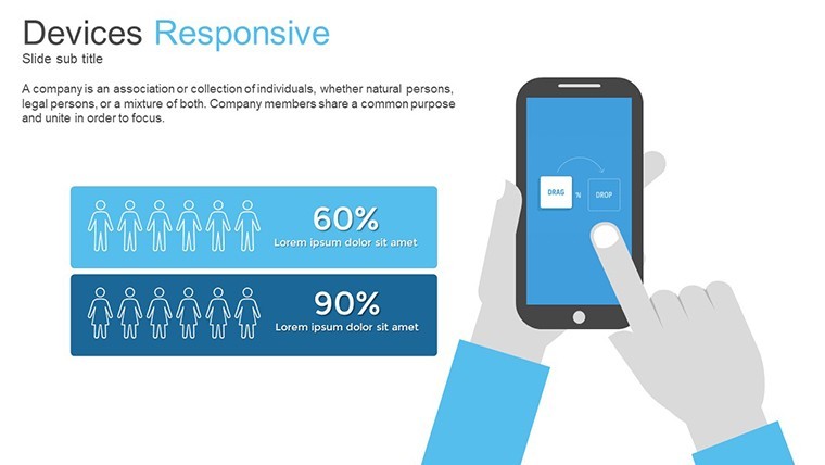
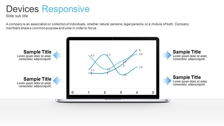
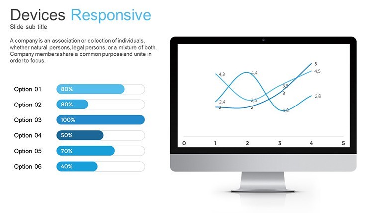
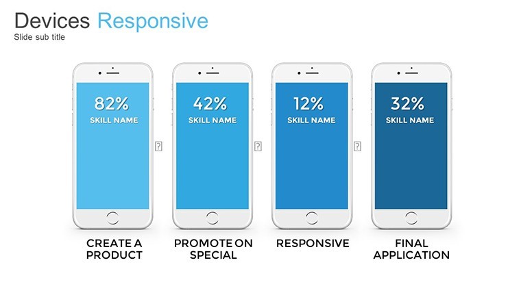
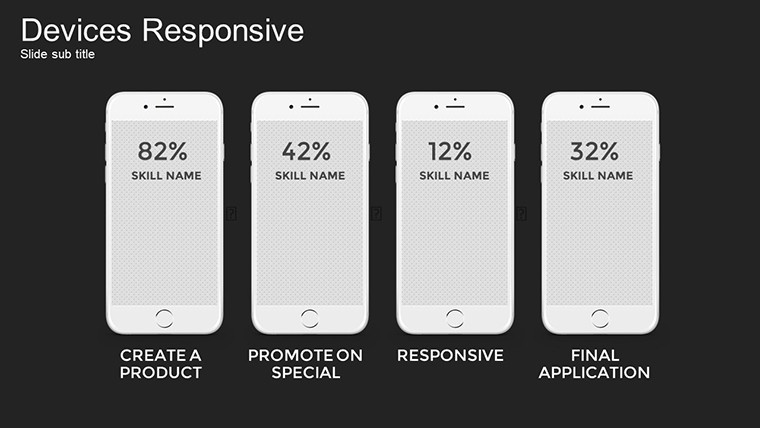
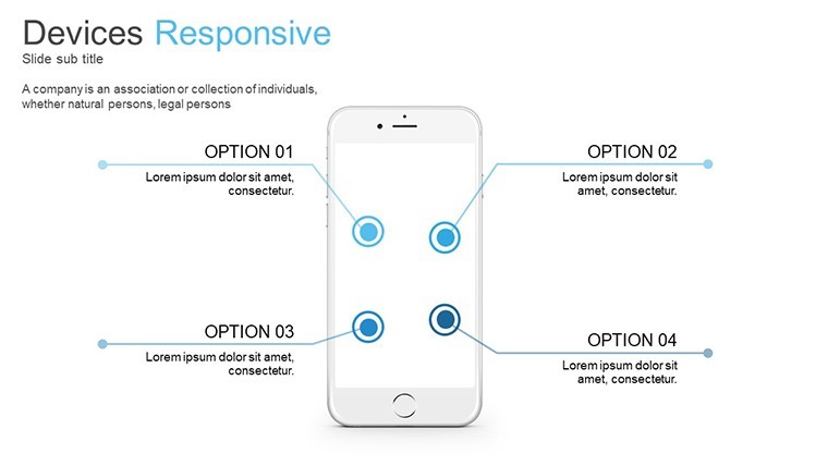
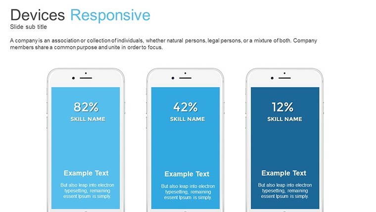
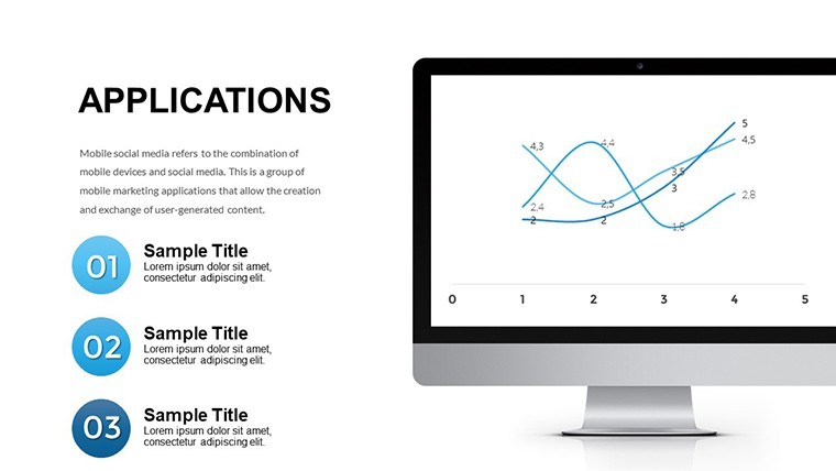
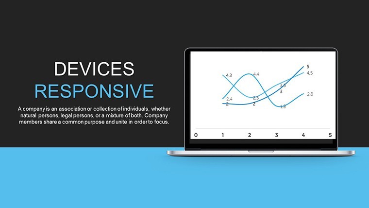
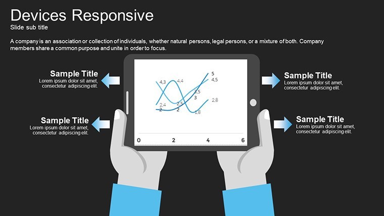
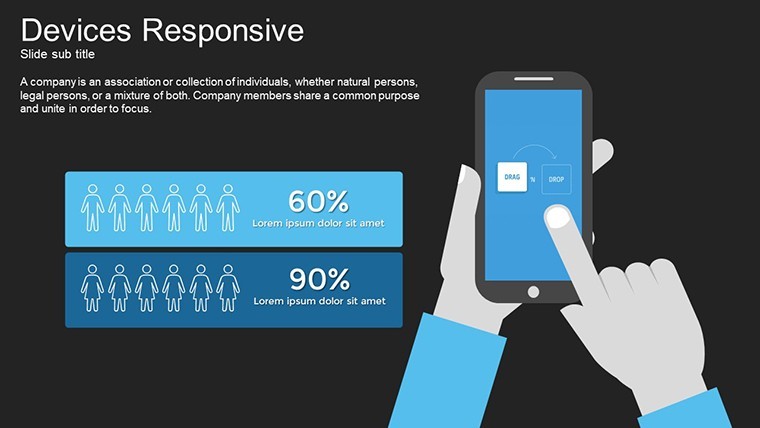
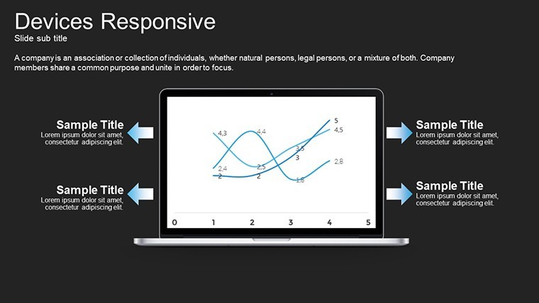
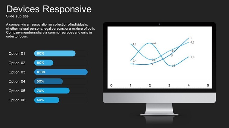
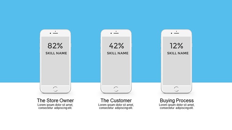
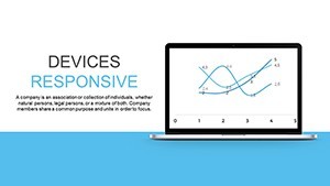
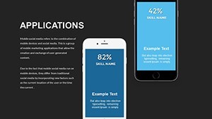
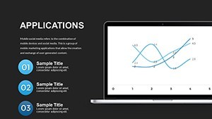
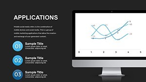
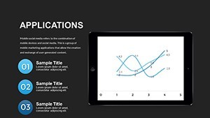
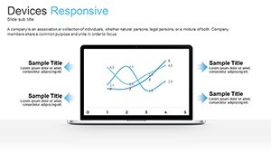
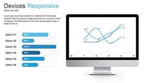
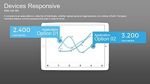
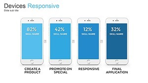
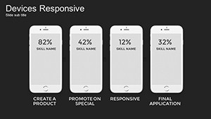
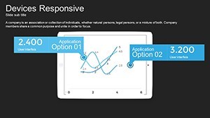
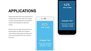
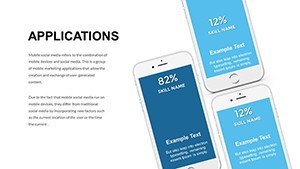
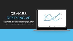
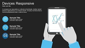
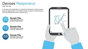
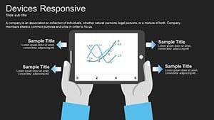
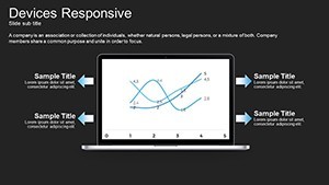
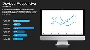
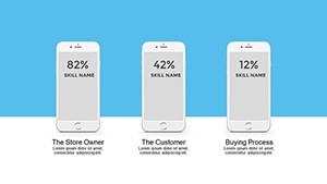
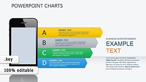
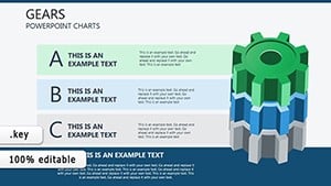
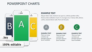
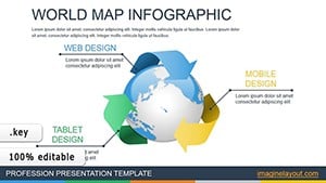
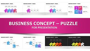
Responsive Devices Illustrations for Product Demos
No photo placeholders, no gradients - just 34 editable slides with responsive device illustrations in KEY format.
Ready to drop in.
The paid version delivers the complete 34-slide set while previews remain limited and the files follow standard KEY format compatible with current Keynote installations.
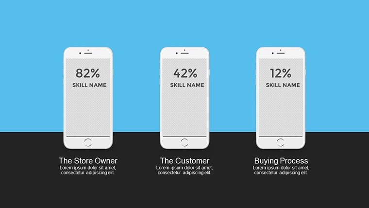
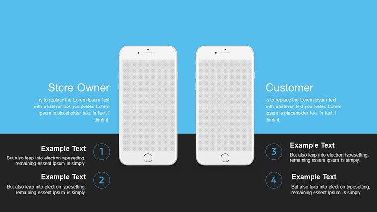
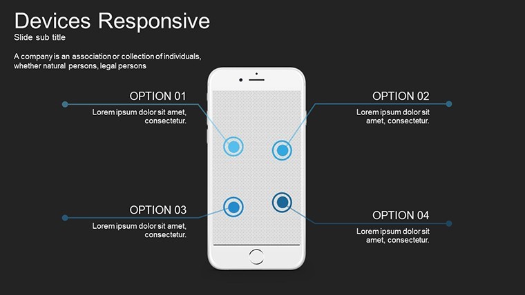
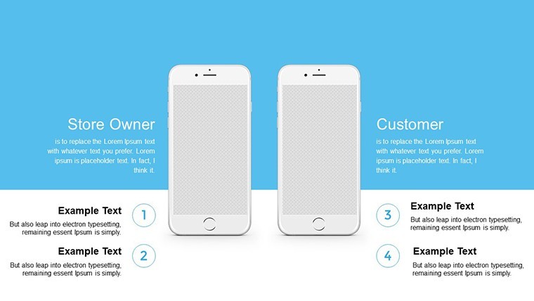
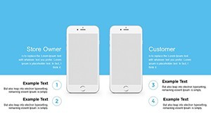
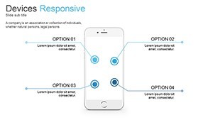
Product managers use these when they must demonstrate app interfaces on multiple screen sizes to clients without recreating mockups.
In most cases you only replace text and adjust colors.
These illustrations support comparison of user experience across devices so teams can decide which layout performs best before final development.
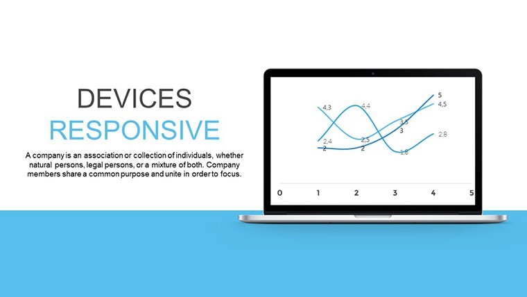
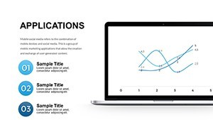
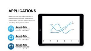
Not ideal for data-heavy dashboards that require numerical charts.
Use this instead of building diagrams manually in Keynote.
The predefined structure keeps everything aligned so you don`t end up adjusting spacing slide by slide and works across multiple reports.
See also Especially Mobile Devices Keynote Charts or Infographic Gadget Keynote Template for similar layouts.
Specifications
| Slides / diagrams | 34 editable illustrations focused on responsive devices |
|---|---|
| File format | KEY |
| Software version | Keynote 12+ |
| Color schemes | Editable via slide master (number not specified on page) |
| Editable elements | Text, device frames, colors and illustrations resize independently |
| Aspect ratio | 16:9 |
| Free vs Paid | Paid includes full 34 slides; free limited to preview |
| Masters / Backgrounds | Slide masters for instant color updates |
How do I change colors via slide master?
The slide master controls all colors across the deck. Open the master view in Keynote, select the background or text style you want to change, update the fill or font color, and close the master to apply it to all slides instantly. This works even if you duplicate slides later and typically takes under one minute.
Can I use the template for client work?
You can use the template for client projects under the standard license. Credit to ImagineLayout is not required but appreciated in the footer if space allows. One license covers one user or team for unlimited client work as long as the final presentation is not resold as a template.
What is the difference between the free and paid version?
The paid version unlocks the complete set of editable slides while the free download offers a limited preview with watermarks. You get all 34 slides only in the paid file with no restrictions on editing or commercial use. Switching between versions is not needed since the paid one includes everything.
What are the refund conditions?
Refunds are available within 14 days if the file does not open in your Keynote version or if it does not match the described slides. Contact support with your order ID to start the process. No refunds after the file has been downloaded and used in your presentation.
What Keynote version is required?
The templates work in Keynote 12 and newer on macOS Ventura or later. Older versions may show layout shifts on some slides but the core structure remains intact. Test in your current installation before final edits.
Everything is already structured.
Download and start editing immediately

