Economic Integration Keynote Charts - Editable | ImagineLayout


Effects of Economic Integration Keynote Charts
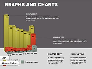
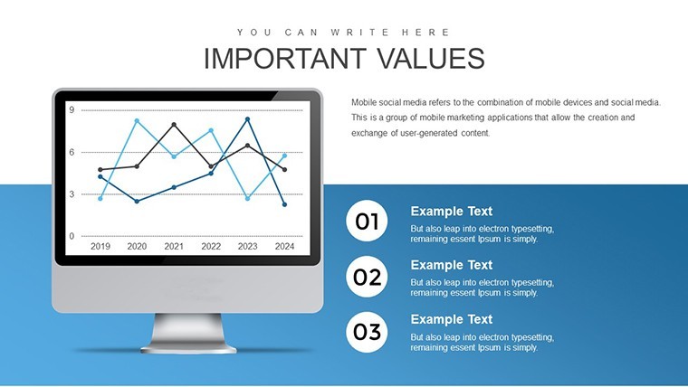
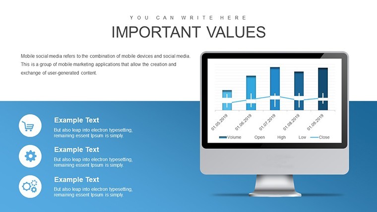
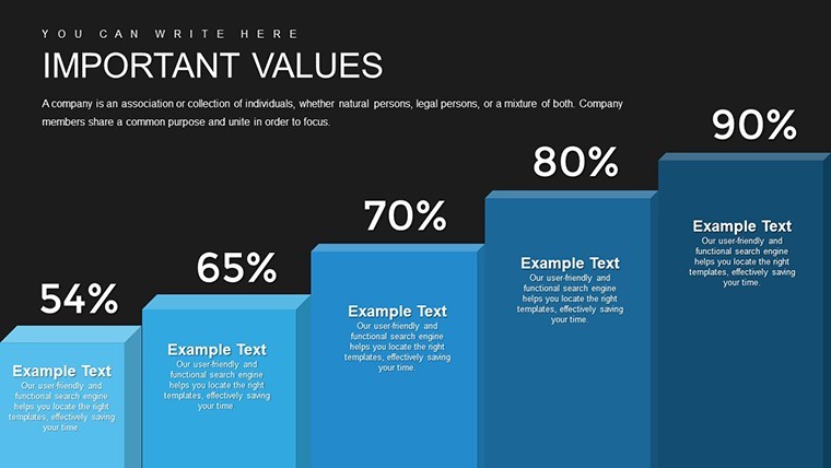
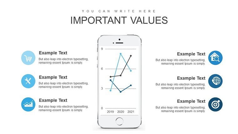
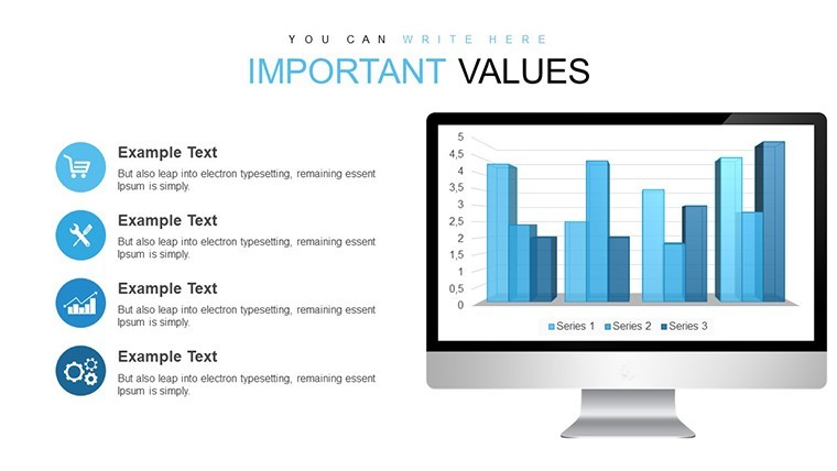
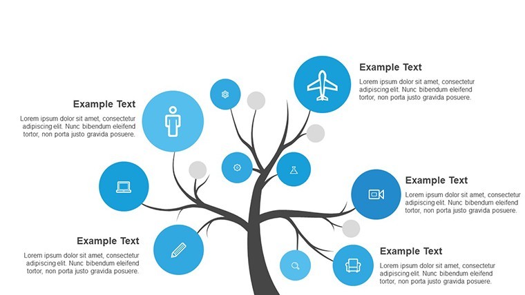
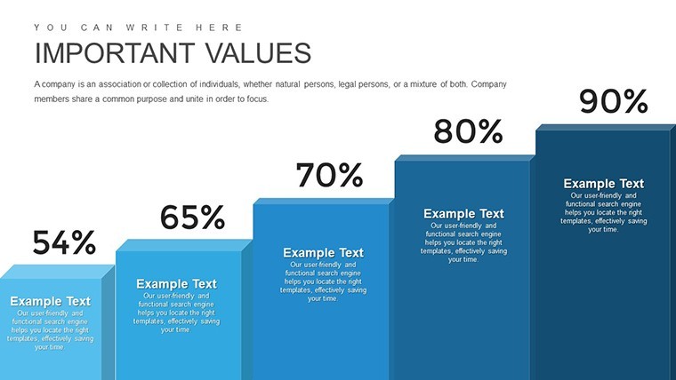
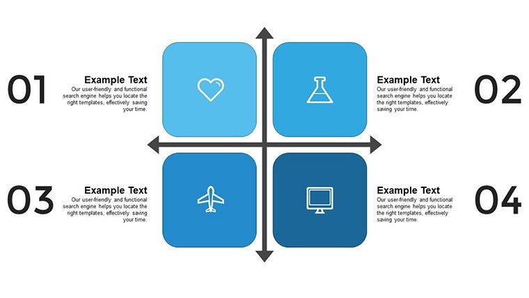
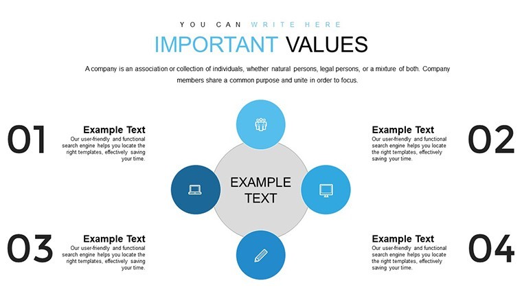
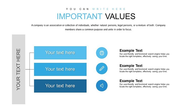
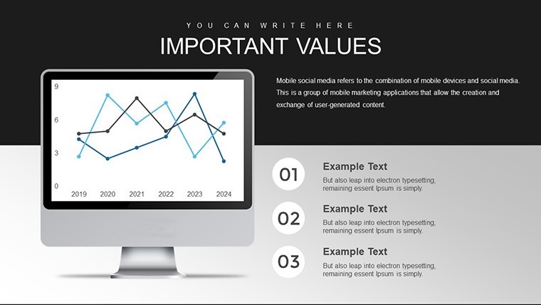
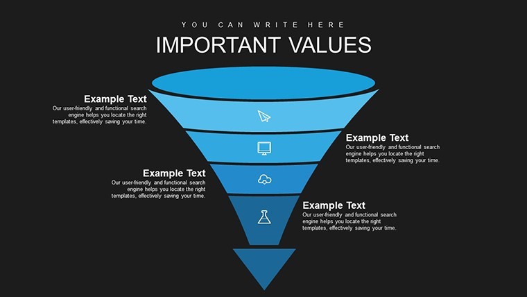
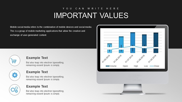
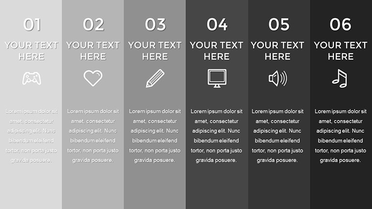
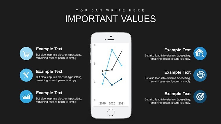
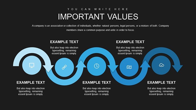
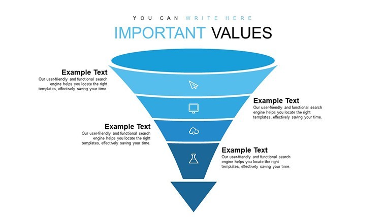
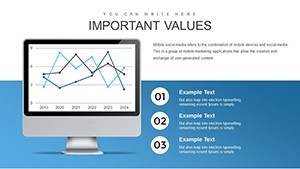
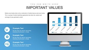
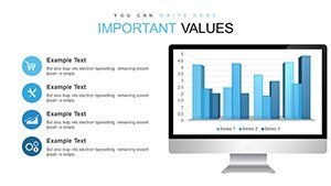
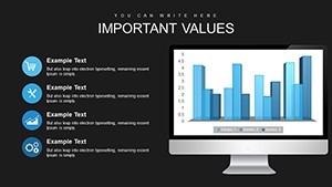
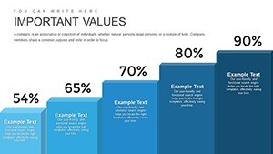
No generic placeholders - the 38 slides come packed with bar charts line graphs pie charts and scatterplots.
Ready to use.
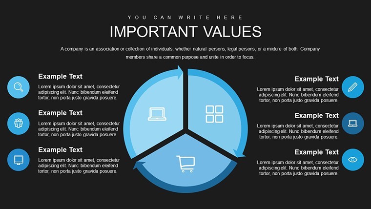
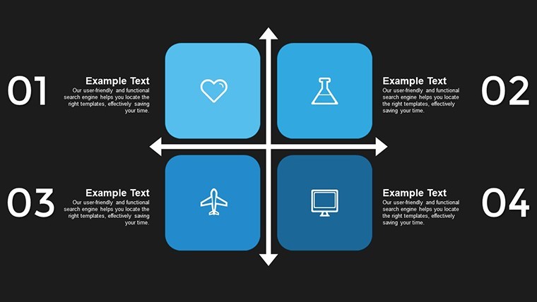
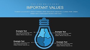
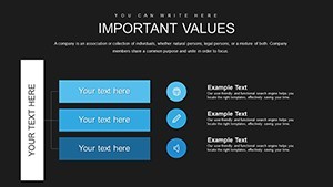
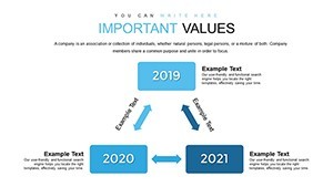
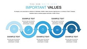
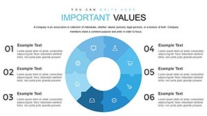
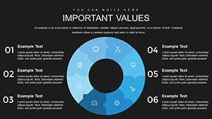
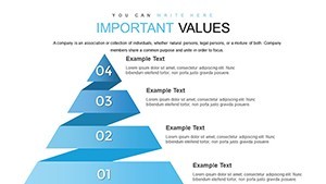
For economists or analysts presenting global impacts the 38 editable KEY slides organize complex economic data into clear visuals that fit one slide.
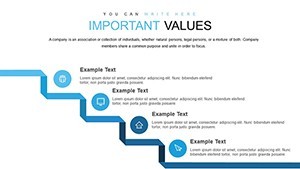
You replace numbers and the file works across strategy planning sessions.
The paid version includes all 38 editable slides with the listed chart types so you skip manual construction.
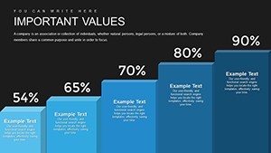
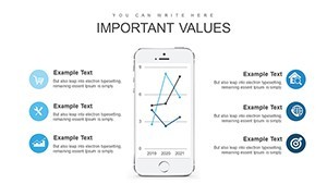
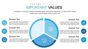
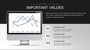
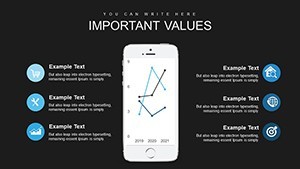
Color changes via slide master keep consistency while the scatterplots and line graphs support trend analysis that lets viewers decide on policy adjustments after reviewing the data relationships.
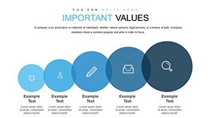
Finance teams rely on this template for board updates where the structure prevents overcrowded slides.
Not designed for team org charts or creative mood boards.
It works best when you have numerical economic data rather than qualitative stories.
See also Economic Analysis Keynote Charts and Important Indicators Keynote Charts Template.
| Feature | Details |
|---|---|
| Slides / diagrams | 38 bar line pie and scatterplot charts |
| File format | KEY |
| Software version | Keynote 6+ (exportable to PowerPoint) |
| Color schemes | Customizable via slide master |
| Editable elements | All bars lines pies scatterplots text and axes resize independently |
| Aspect ratio | 16:9 standard |
| Free vs Paid | Paid includes full 38 editable slides |
| Masters / Backgrounds | Slide master for global updates |
How do I change colors across all slides?
Open the slide master view in Keynote and modify the theme colors. Bar charts line graphs pie charts and scatterplots all update together. Consistency across the 38 slides is maintained instantly.
Can I use this template for client work?
The license allows client work in economic reports and presentations. Deliver the finished file but do not resell the template itself. One license covers one user.
What is the difference between free and paid?
The paid version supplies the complete 38 editable slides with bar line pie and scatterplot charts. No free version is specified on the page so the download is the full template.
What are the refund conditions?
Contact support within 14 days for Keynote compatibility issues. Full refunds apply only to files that fail to open correctly after verification.
Is it compatible with older Keynote versions?
The template works in Keynote 6 and later and exports to PowerPoint or PDF. It runs on macOS iPad and iPhone via the Keynote app with no extra setup.
Everything is already structured.
Download and start editing immediately