Integration Sites Keynote Charts - Editable KEY | ImagineLayout


Type: Keynote Charts template
Category: Analysis
Sources Available: .key
Product ID: KC00713
Template incl.: 30 editable slides
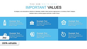
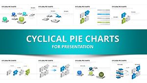
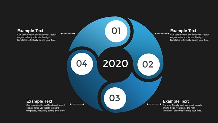
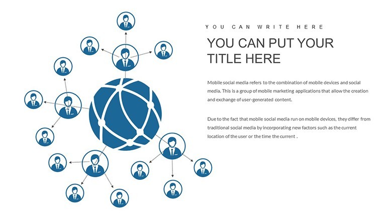
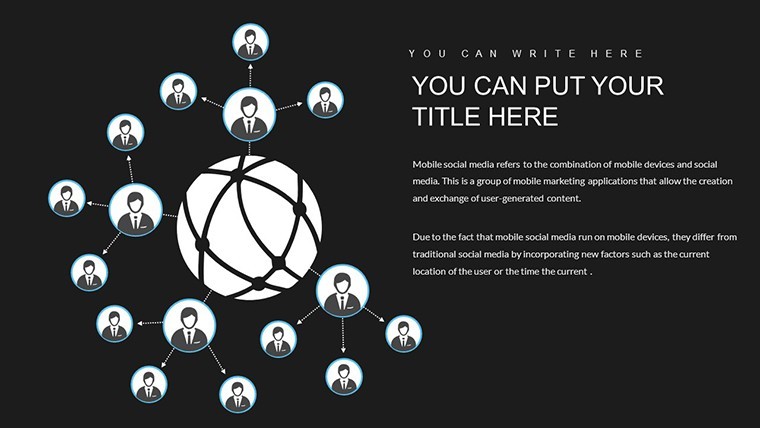
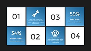
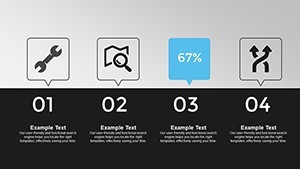
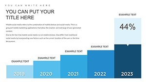
Integration Sites and Social Networks Keynote Charts
For teams mapping site and social network integrations the 30 editable slides in KEY format deliver immediate structure.
Compatible with current Keynote installations on any Apple device.
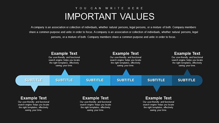
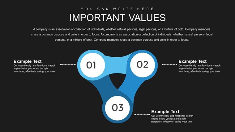
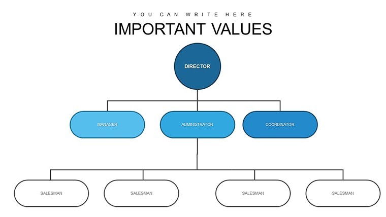
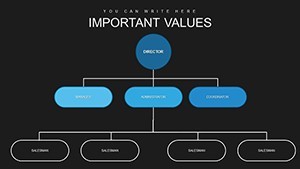
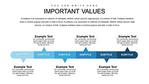
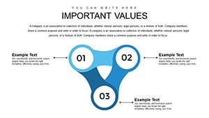
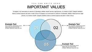
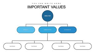
When you need to present integration flows to stakeholders the predefined charts replace manual connection lines and you simply enter your data.
Typically teams reuse the same structure for recurring updates.
The paid version includes the full 30 editable slides so no need to redraw network diagrams.
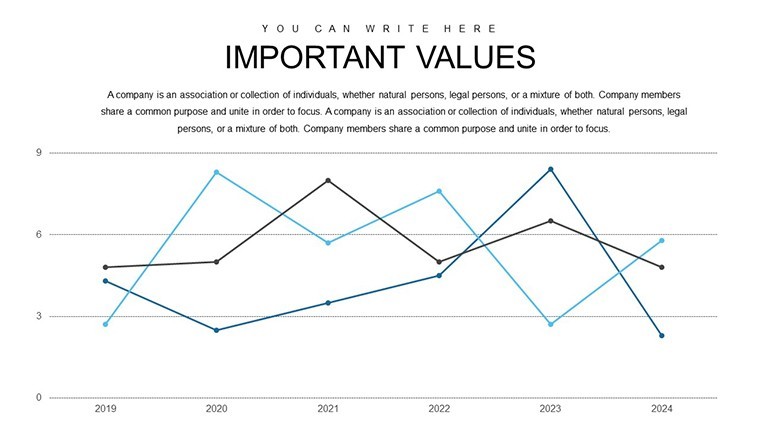
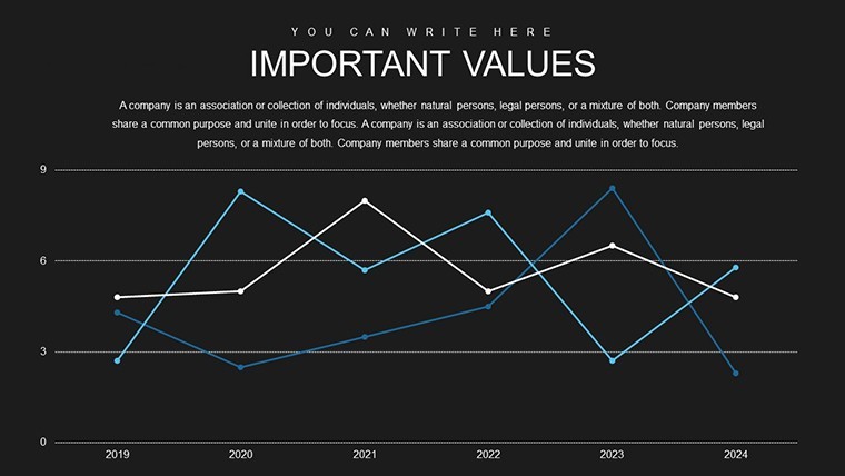
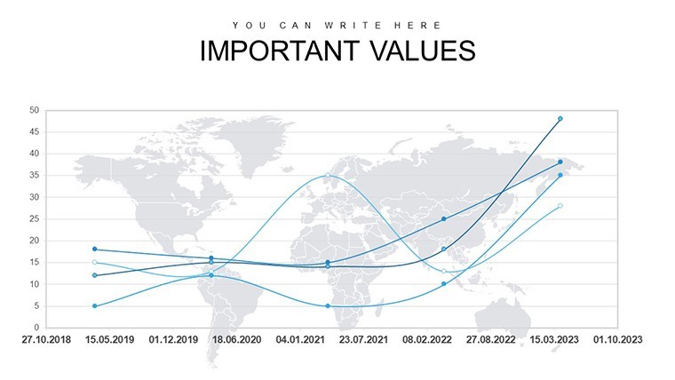
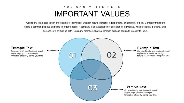
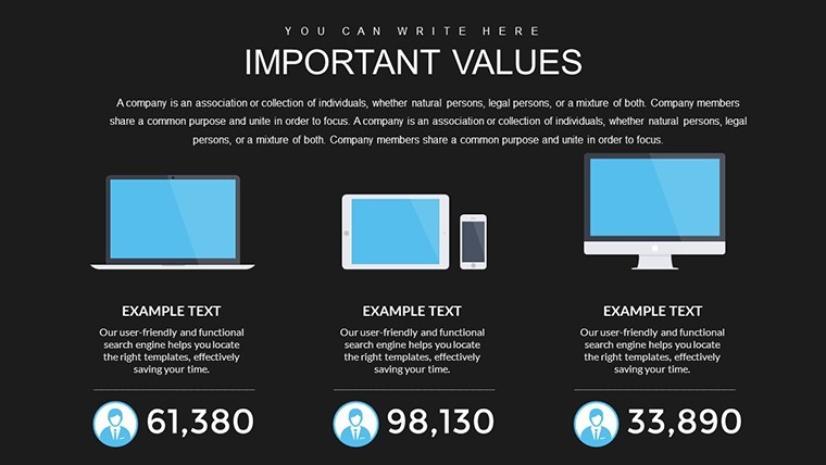
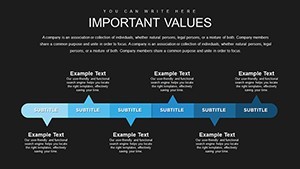
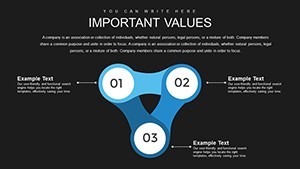
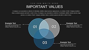
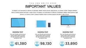
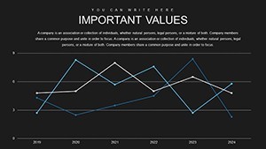
Color changes via slide master apply globally and the charts support relationship mapping analysis that helps viewers decide on platform priorities after viewing the layout.
Project managers use this file when explaining technical integrations without cluttered slides.
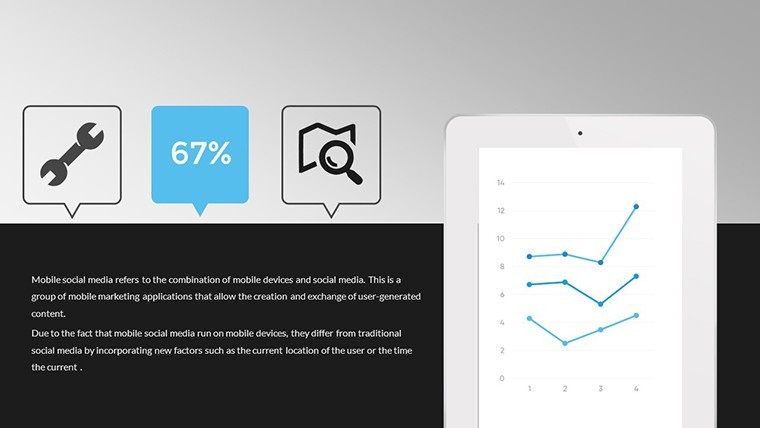
Not ideal for pure financial dashboards.
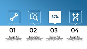
It works best when you show clear connections rather than dense numerical tables.
See also Analysis Keynote Charts and Business Graphics Keynote Template.
| Feature | Details |
|---|---|
| Slides / diagrams | 30 integration charts |
| File format | KEY |
| Software version | Keynote (all current versions) |
| Color schemes | Customizable via slide master |
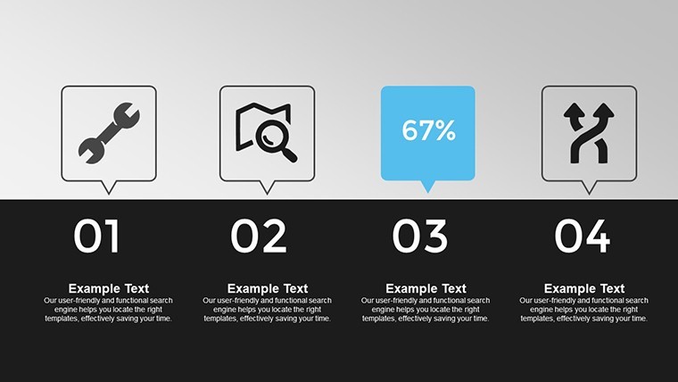
| Editable elements | All connection lines text and icons resize independently |
| Aspect ratio | 16:9 standard |
| Free vs Paid | Paid includes full 30 editable slides |
| Masters / Backgrounds | Slide master for global edits |
How do I change colors across all slides?
Open the slide master view in Keynote and update the theme colors. Every integration chart updates at once without individual edits. The change maintains visual consistency across the 30 slides.
Can I use this template for client work?
The license supports client work for any presentation or report. You can deliver the completed deck but must not redistribute the original KEY file. One license covers one user.
What is the difference between free and paid?
The paid version provides the complete 30 editable slides focused on integration sites and social networks. No free version is listed so the download is the full template.
What are the refund conditions?
Request a refund within 14 days for any file opening issue in Keynote. Technical compatibility problems qualify for full refund after the file is verified as non-functional.
Is it compatible with older Keynote versions?
The template launches in Keynote on macOS iPad and iPhone. It requires no coding and offers a quick learning curve for any version that supports standard KEY files.
You can duplicate slides and reuse the same structure.
Download and start editing immediately