Banking Keynote Charts Template - Editable | ImagineLayout


Banking Keynote Charts Template
40 editable slides come ready for banking financial reports.
No setup needed.
The paid version includes the full set of 40 editable slides in .key format compatible with current Keynote installations. Color changes via the slide master update the entire deck in seconds so you drop in your data and it works. In most cases you only replace text and adjust a few values instead of building charts manually.
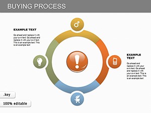
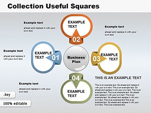
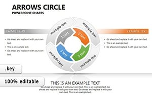
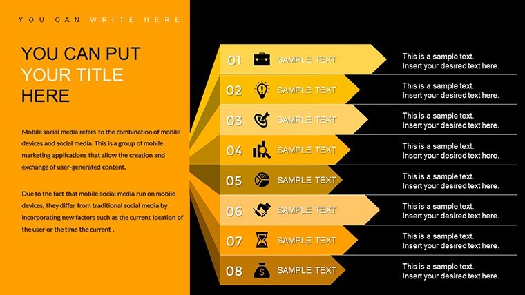
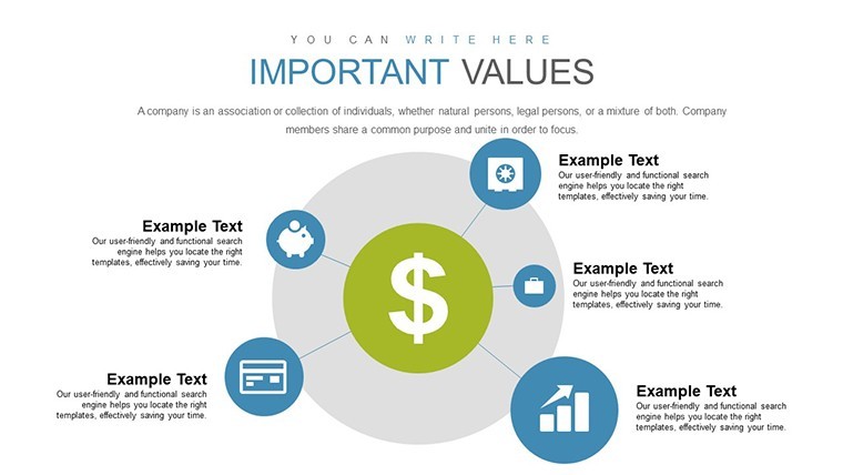
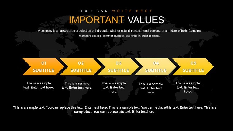
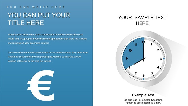
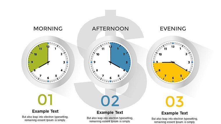
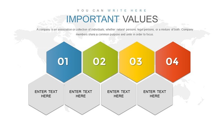
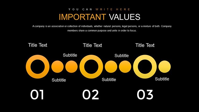
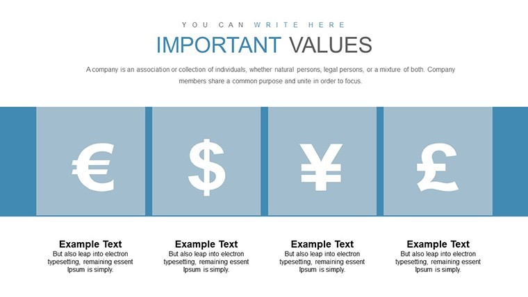
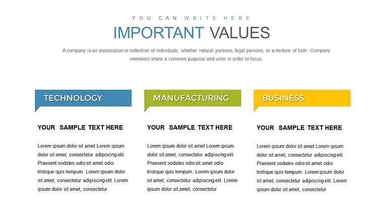
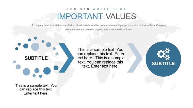
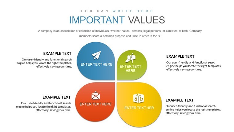
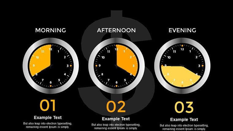
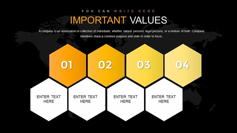
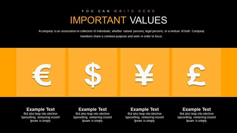
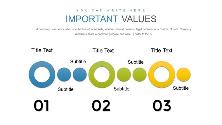
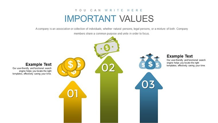
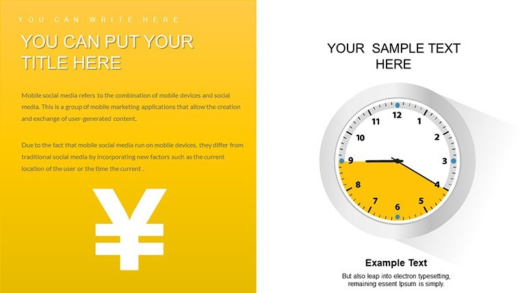
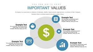
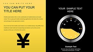
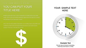
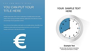
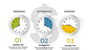
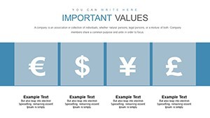
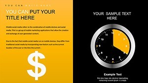
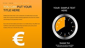
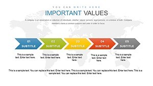
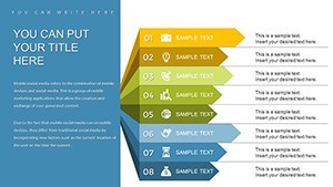
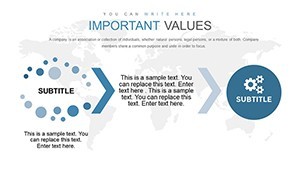
When you need to explain quarterly performance to the board the finance focused structures organize every metric on one slide. This keeps the layout readable and prevents overcrowded displays that confuse viewers. Use this instead of building diagrams manually in Keynote.
The charts support comparison analysis between different financial metrics. Decision makers can identify trends and prioritize budget allocation after a single glance. In practice this template suits banking analysts who prepare recurring client presentations.
It works best for structured data displays. The template is not ideal for data-heavy dashboards with dozens of metrics on every slide. It is not designed for highly creative storytelling slides with photos or free layouts.
You can reuse the same file across multiple reports without redrawing anything. The predefined structures save hours on every financial update cycle and keep everything aligned automatically.
| Feature | Details |
|---|---|
| Slides / diagrams | 40 editable finance charts |
| File format | .key |
| Software version | Keynote 12+ for macOS |
| Color schemes | Change via slide master for full deck consistency |
| Editable elements | Text data points and colors resize and recolor independently |
| Aspect ratio | 16:9 |
| Free vs Paid | Paid provides complete 40-slide file with no limitations |
| Masters / Backgrounds | Master slides for global color updates |
Everything is already structured for immediate use in financial storytelling.
Download and start editing immediately
How do I change colors via slide master?
In Keynote open the template and switch to slide master mode by choosing View > Edit Master Slides. Select the master slide and adjust the color scheme in the format panel. All 40 editable slides update automatically across the deck. This method ensures consistency without manual adjustments per slide and works in every future presentation you create from the file.
What Keynote version and macOS requirement applies?
The template is designed for Keynote 12 and newer versions on macOS Ventura or later. It works smoothly on Apple Silicon Macs as well. Older versions may require exporting to PDF for full compatibility in some cases but the core editable charts remain functional.
Does the license allow client work?
The license permits you to use the template for client work and deliver the final presentation. However you cannot resell or redistribute the original .key file itself. One purchase covers one user for commercial client projects with no additional fees.
What are the free vs paid differences?
The page does not list a free version. The paid option provides the complete template with all editable slides included. You get instant access to the full file upon purchase without watermarks or limitations.
What are the refund conditions?
Refunds are handled according to the marketplace policy if the template does not meet your expectations. Contact support within 30 days of purchase for assistance. Note that refunds are not available after the file has been downloaded and opened in Keynote.