Sales Analysis Keynote Charts - Fully Editable | ImagineLayout


Type: Keynote Charts template
Category: Analysis
Sources Available: .key
Product ID: KC00695
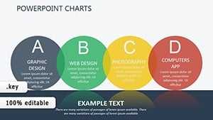
Template incl.: 48 editable slides
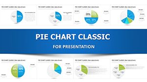
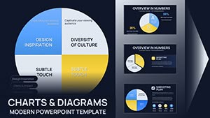
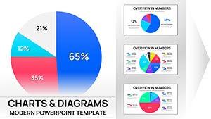
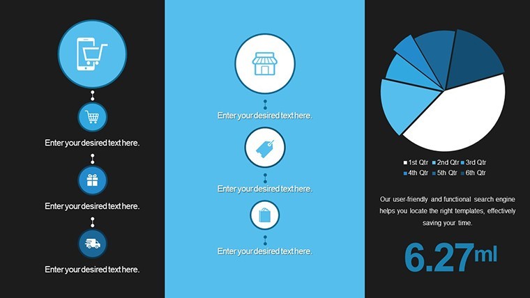
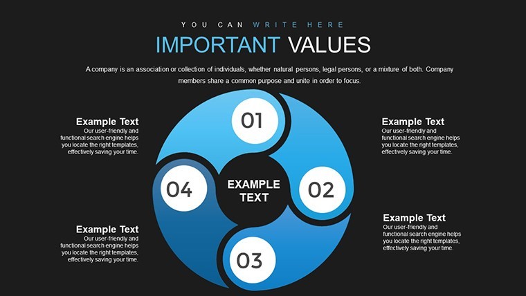
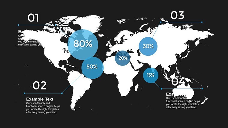
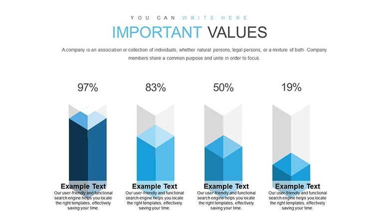
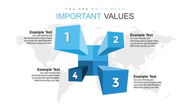
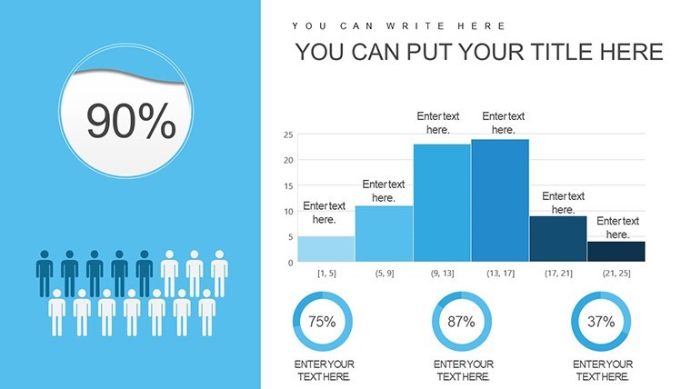
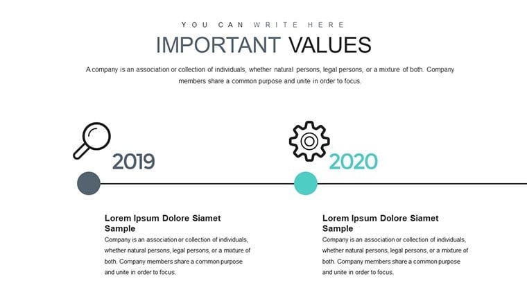
48 .key slides with pre-set color schemes for sales analysis charts.
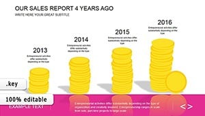
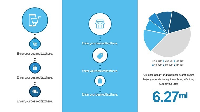
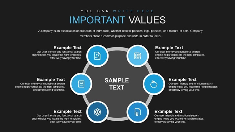
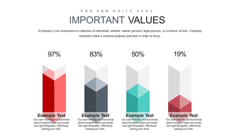
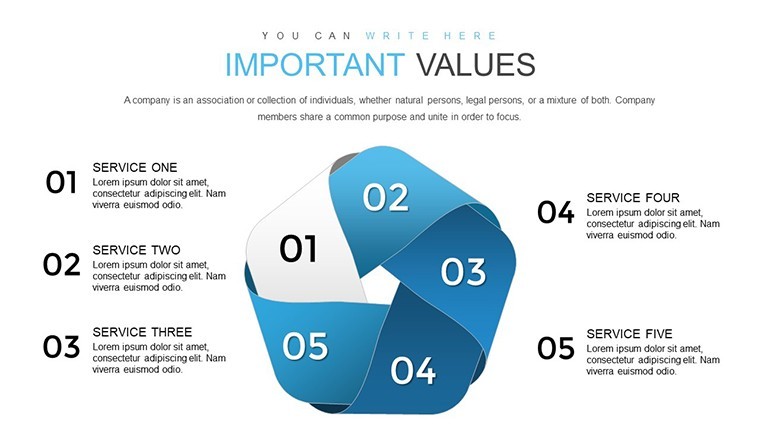
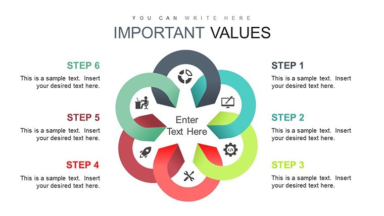
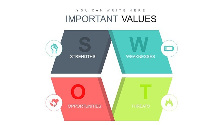
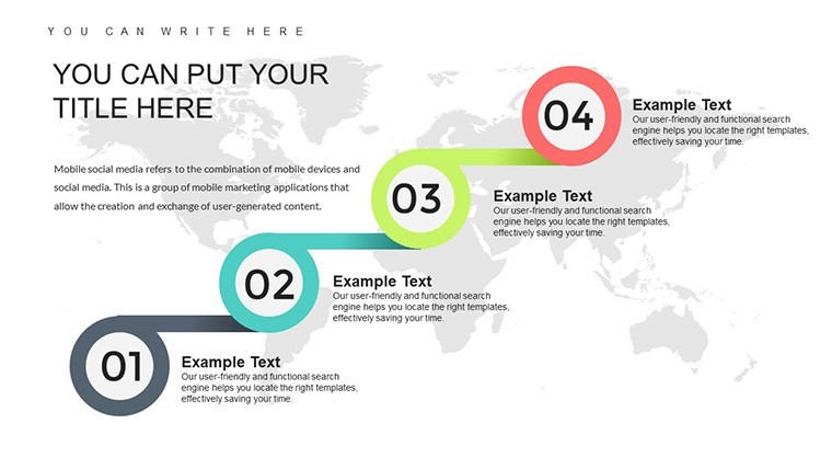
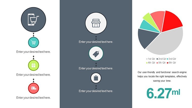
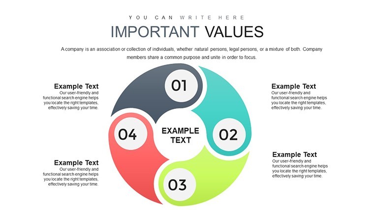
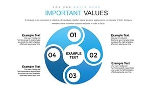
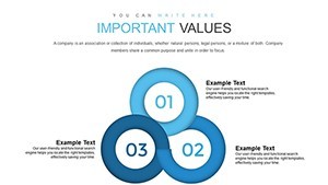
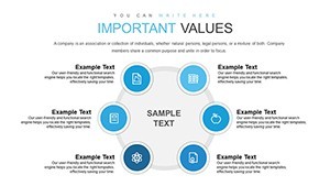
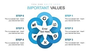
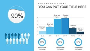
48 editable slides in .key format deliver bar line pie area scatter and radar charts ready for quarterly sales reviews. No setup needed.
The paid version unlocks the complete 48 editable slides packed with every chart type while previews show limited samples only. In most cases you drop in your numbers and adjust via the slide master in under two minutes. Typically teams reuse the same file across multiple client reports without rebuilding anything.
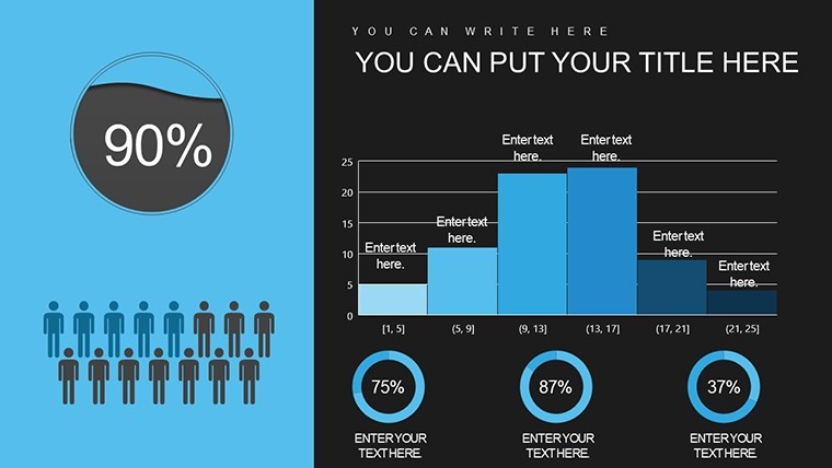
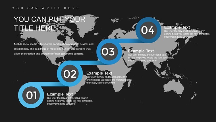
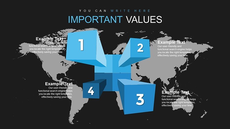
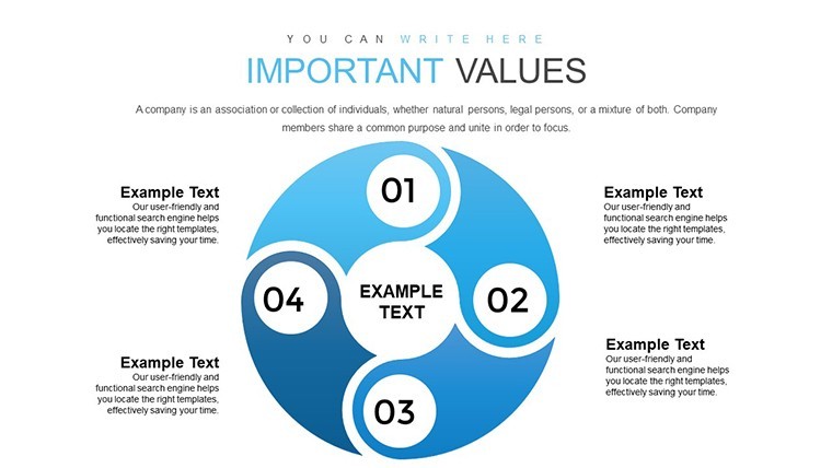
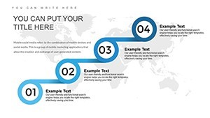
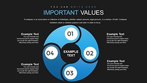
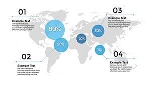
When you need to explain sales performance to stakeholders the clustered bar charts and trend lines handle comparisons out of the box instead of building diagrams manually in Keynote. The predefined structure keeps everything aligned on one slide so you avoid manual spacing tweaks slide by slide.
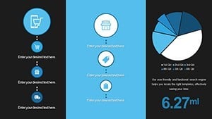
These charts support comparison trend and correlation analysis that lets you spot top products or regions quickly. After using the set you make clear decisions on resource allocation and forecasting. The vector graphics stay crisp at any zoom level.
This layout suits sales professionals analysts and managers who run regular metric presentations. It works best for structured numerical data not open creative storytelling slides. Not ideal when you have dozens of raw metrics that need heavy custom dashboards.
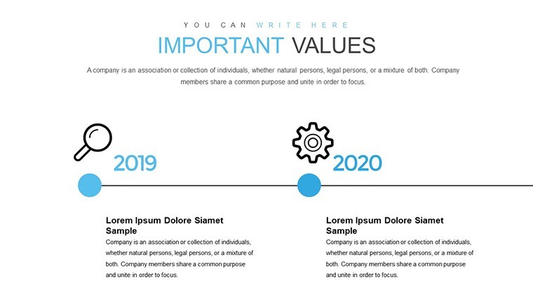
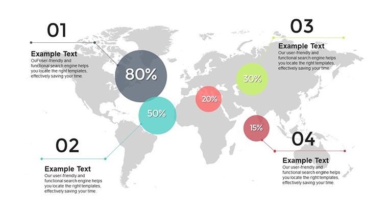
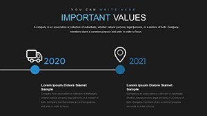
Use this when you need to show year-over-year growth or market share breakdowns without rearranging shapes manually. Similar to the Sales Report Keynote Charts or the Data Visualization Keynote Charts Template it saves hours on recurring internal reporting.
You open the file and start editing. Everything is already structured.
Download and start editing immediately
How do I change colors via slide master?
Open Keynote and go to View > Master Slides. Select the master that contains your chart then click any element like a bar or line to pick a new color from the palette. All slides update instantly with one change which is useful when you need to match brand colors across an entire deck.
Can I use this for client work?
Yes one license allows you to create presentations for multiple clients with the purchased template. You may deliver the final exported PDF or video to clients but you cannot resell or share the original .key file itself. This covers both internal and external commercial use.
What is the difference between free and paid versions?
The paid version provides the complete set of 48 editable slides with all charts and layouts fully unlocked. Any free preview if offered contains only sample slides or watermarked versions. The full paid file gives you every vector element and master ready for immediate customization.
What are the refund conditions?
Refunds are available within 14 days of purchase if the template does not meet your needs and you have not used it in any commercial project or exported final files. Contact support with your order details for a prompt full refund. No refunds after the file has been edited or integrated into presentations.
What Keynote version and macOS does this template require?
The files follow standard KEY formats and work with Keynote 6.0 and later on macOS. They also open on iPad and newer iOS versions. No Windows native support but you can run Keynote via virtualization if needed.