00% off everything!
SALE ENDS TODAY, Saturday November 0
Promo code "00LAYOUTS"
Time Left to Save
00:00:00

Dodecahedron Geometric Keynote Charts: Revolutionize Your Data Presentations

4
26 ratings
Dodecahedron Geometric Keynote Charts: Revolutionize Your Data Presentations - Slide #0
Dodecahedron Geometric Keynote Charts: Revolutionize Your Data Presentations - Slide #1
Dodecahedron Geometric Keynote Charts: Revolutionize Your Data Presentations - Slide #2
Dodecahedron Geometric Keynote Charts: Revolutionize Your Data Presentations - Slide #3
Dodecahedron Geometric Keynote Charts: Revolutionize Your Data Presentations - Slide #4
Dodecahedron Geometric Keynote Charts: Revolutionize Your Data Presentations - Slide #5
Dodecahedron Geometric Keynote Charts: Revolutionize Your Data Presentations - Slide #6
Dodecahedron Geometric Keynote Charts: Revolutionize Your Data Presentations - Slide #7
Dodecahedron Geometric Keynote Charts: Revolutionize Your Data Presentations - Slide #8
Dodecahedron Geometric Keynote Charts: Revolutionize Your Data Presentations - Slide #9
Dodecahedron Geometric Keynote Charts: Revolutionize Your Data Presentations - Slide #10
Dodecahedron Geometric Keynote Charts: Revolutionize Your Data Presentations - Slide #11
Dodecahedron Geometric Keynote Charts: Revolutionize Your Data Presentations - Slide #12
Dodecahedron Geometric Keynote Charts: Revolutionize Your Data Presentations - Slide #13
Dodecahedron Geometric Keynote Charts: Revolutionize Your Data Presentations - Slide #14
Dodecahedron Geometric Keynote Charts: Revolutionize Your Data Presentations - Slide #15
Dodecahedron Geometric Keynote Charts: Revolutionize Your Data Presentations - Slide #16
Dodecahedron Geometric Keynote Charts: Revolutionize Your Data Presentations - Slide #17
Dodecahedron Geometric Keynote Charts: Revolutionize Your Data Presentations - Slide #18
Dodecahedron Geometric Keynote Charts: Revolutionize Your Data Presentations - Slide #19
Dodecahedron Geometric Keynote Charts: Revolutionize Your Data Presentations - Slide #20
thumbnail slide #0
thumbnail slide #1
thumbnail slide #2
thumbnail slide #3
thumbnail slide #4
thumbnail slide #5
thumbnail slide #6
thumbnail slide #7
thumbnail slide #8
thumbnail slide #9
thumbnail slide #10
thumbnail slide #11
thumbnail slide #12
thumbnail slide #13
thumbnail slide #14
thumbnail slide #15
thumbnail slide #16
thumbnail slide #17
thumbnail slide #18
thumbnail slide #19
thumbnail slide #20

Type: Keynote Charts template

Category: 3D

Sources Available: .key

Product ID: KC00691

Template incl.: 21 editable slides
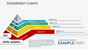
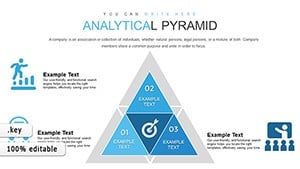
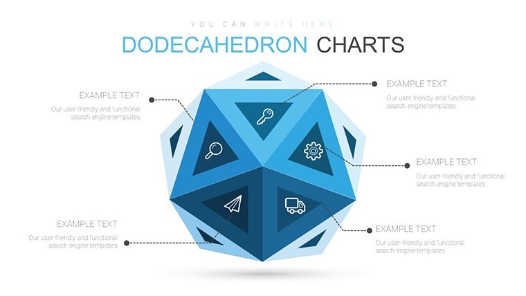
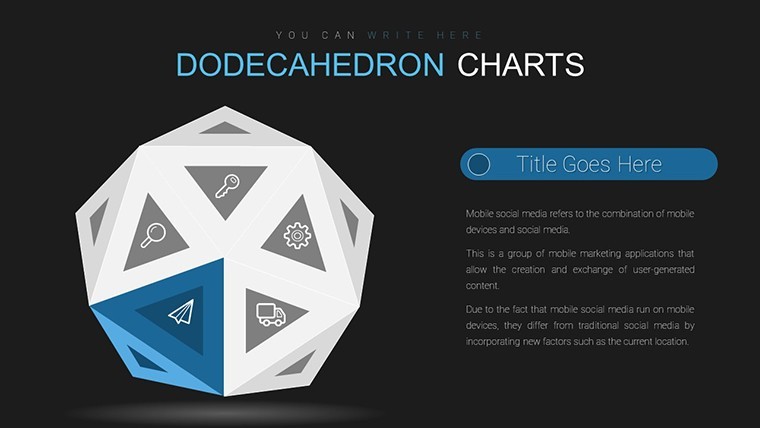
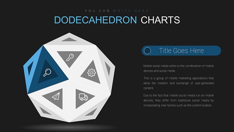
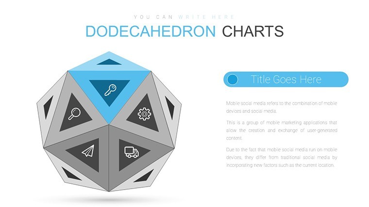
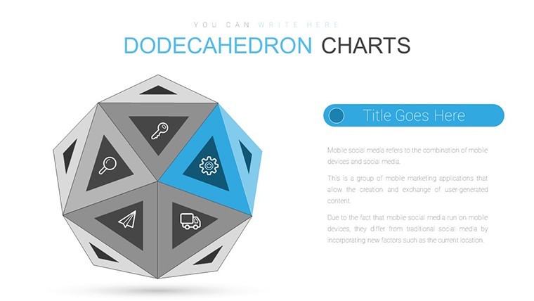
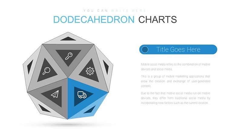
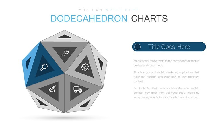
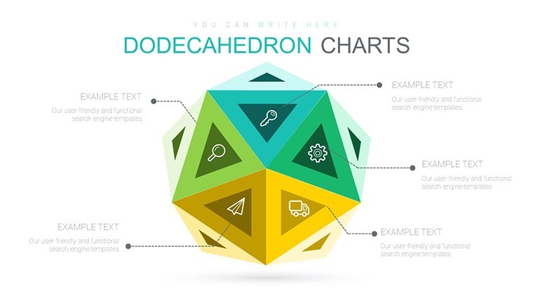
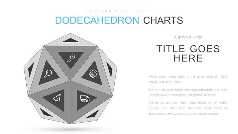
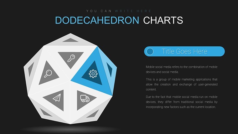
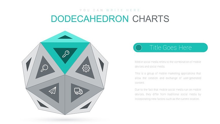
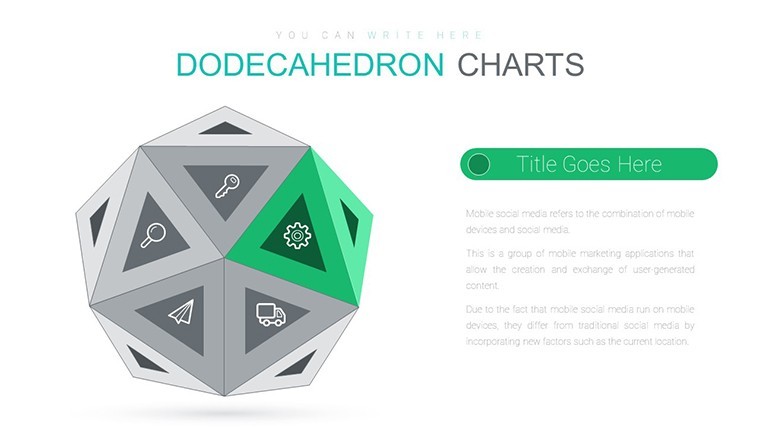
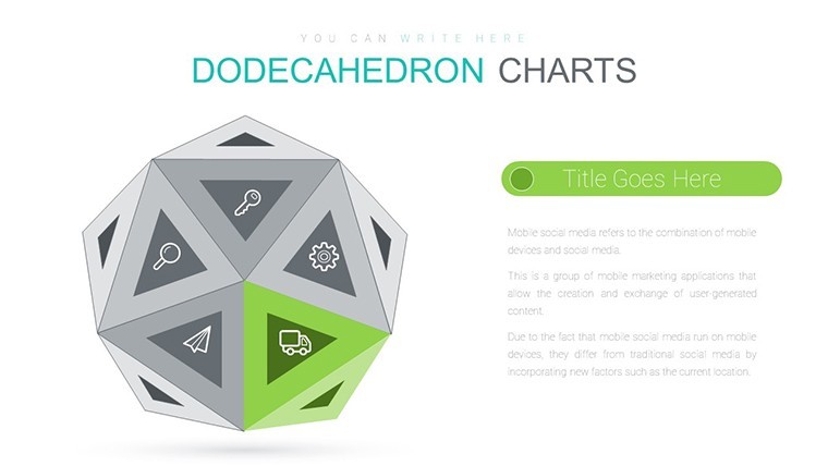
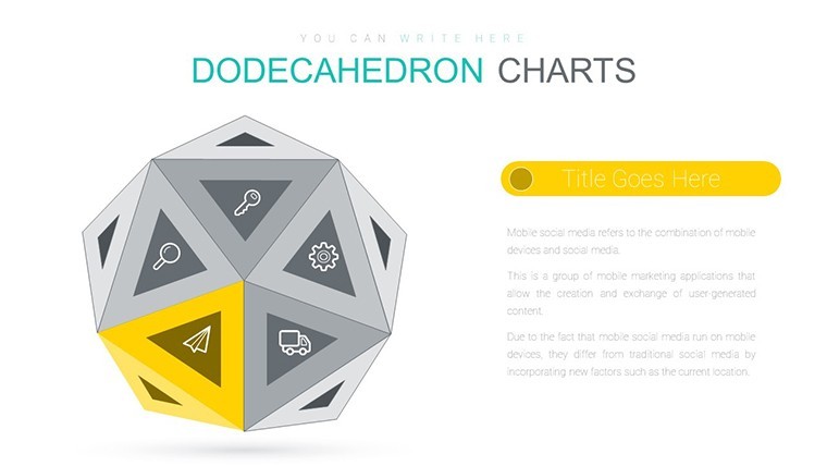
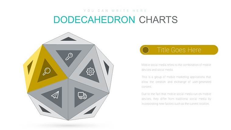
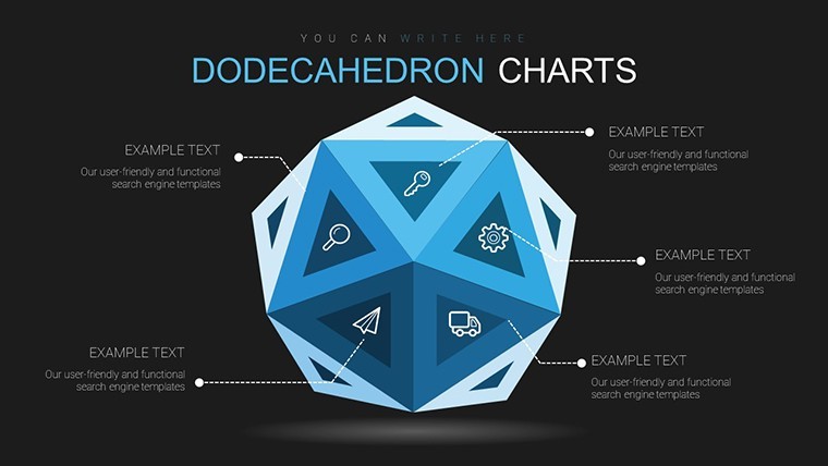
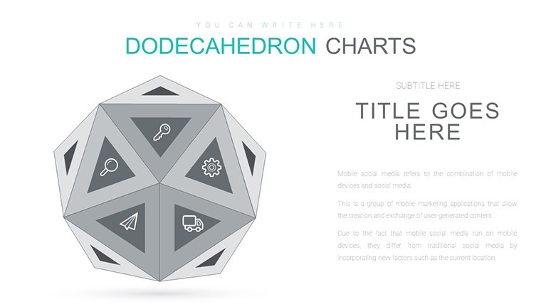
Purchase this template
$ 13.00

Imagine captivating your audience with data that leaps off the screen in three dimensions. The Dodecahedron Geometric Keynote Charts template brings this vision to life, using the intricate shape of a dodecahedron - a 12-faced polyhedron with pentagonal sides - to create immersive visualizations. With 21 editable slides, this template is perfect for data scientists, marketers, and educators who want to present complex information like sales figures, survey results, or financial metrics in a fresh, engaging format.

This isn't your standard flat chart; it's a 3D powerhouse that highlights relationships between data points through spatial representation. Compatible with Keynote 6.0 and beyond on Mac or Windows, it allows effortless customization of colors and data inputs. Whether you're in a boardroom dissecting quarterly earnings or at a conference sharing research findings, this template turns abstract numbers into tangible insights, making your presentations memorable and persuasive.

Picture the frustration of traditional 2D charts that fail to convey depth - overlapping lines and crowded labels. The dodecahedron design solves this by assigning data sets to each face, allowing viewers to rotate mentally (or via animations) for a holistic view. It's especially suited for multifaceted topics, like multi-variable analysis in market research or portfolio diversification in finance.

Core Features of the Dodecahedron Template

What elevates this template? Its blend of geometric precision and user-friendly design sets it apart in the realm of data visualization tools.

3D Polyhedron Structure for Multi-Faceted Data

The dodecahedron's 12 faces provide ample space for layered data. For example, assign sales by region to six faces, expenses to others, and profits to the rest, creating a cohesive 3D model. This structure excels in showing interconnections, unlike flat pie charts that isolate segments.

  • Face Customization: Input data per pentagon, with labels and values editable via simple clicks.
  • Rotation and Views: Use Keynote animations to spin the shape, revealing hidden insights dynamically.
  • Color Variety: Select from palettes to differentiate categories, enhancing readability and appeal.
  • Scalability: Adjust size and detail for everything from high-level overviews to granular breakdowns.

Drawing from Platonic solids in geometry, this template adds a layer of sophistication, impressing audiences with its intellectual flair.

Ease of Use and Integration

No need for advanced skills - start by selecting a color scheme, then populate with your data from spreadsheets. Export to various formats for sharing. In a real scenario, a tech startup used a similar 3D model to visualize user engagement metrics, resulting in clearer investor pitches and faster funding rounds.

Visual Engagement Boosters

The 3D aspect not only aids understanding but also keeps attention. Studies from visualization experts like Edward Tufte emphasize how spatial elements reduce cognitive load, making this template a smart choice for complex datasets.

Practical Use Cases Across Industries

Let's explore how this template applies in everyday professional contexts, turning data into actionable stories.

Sales and Market Analysis

For sales teams, map quarterly figures across faces: one for North America sales, another for Europe, with intersections showing global trends. Step-by-step: Import data, customize colors, animate rotations for emphasis. This method, akin to those in Harvard Business Review case studies, clarifies patterns that flat charts obscure.

  1. Compile data from tools like Google Analytics.
  2. Assign to dodecahedron faces.
  3. Tweak visuals for brand fit.
  4. Present with interactive elements.

Survey Results and Research Presentations

In academia or consulting, display poll responses multidimensionally - demographics on outer faces, opinions inside. This fosters deeper discussions, as seen in TED Talks where 3D visuals enhance audience retention.

Financial Reporting and Forecasting

Finance pros can visualize portfolios: Assets on faces, risks interconnected. Compared to basic Keynote spheres, the dodecahedron offers more facets for nuance, aligning with CFA standards for clear reporting.

Incorporate LSI terms like "interactive data models" naturally to enrich your slides.

Pro Tips from Data Visualization Experts

To maximize impact, follow these guidelines honed from years in the field:

  • Balance Complexity: Avoid overloading faces; aim for 2-3 data points each.
  • Animation Mastery: Use subtle spins to reveal info without dizziness.
  • Audience Testing: Preview with colleagues to ensure clarity.
  • Integration with Narratives: Pair with storytelling: "As we rotate, notice how Q2 surges connect to marketing efforts."

Add subtle humor: "Don't let your data stay flat - give it the dimension it deserves!"

Superiority Over Standard Tools

While free 3D add-ons exist, this $13 template provides polished, ready-to-use slides that save hours. Its geometric accuracy ensures professional results, outshining makeshift designs.

Elevate your next presentation - secure this dodecahedron template now and watch your data come alive.

Frequently Asked Questions

What makes the dodecahedron shape ideal for data?

Its 12 faces allow for multi-layered representations, showing relationships in 3D space effectively.

Can I customize colors and animations?

Yes, fully editable in Keynote, with easy adjustments to fit your theme.

Is it suitable for beginners?

Absolutely - intuitive interface with drag-and-drop data entry.

How does it compare to 2D charts?

It offers depth for complex data, improving comprehension over flat visuals.

Are exports high-quality?

Yes, support for PDF, images, maintaining 3D integrity.