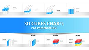
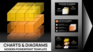
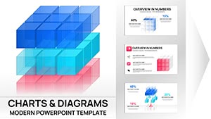
Dynamic 3D Cube Keynote Charts: Marked Sides for Impactful Data


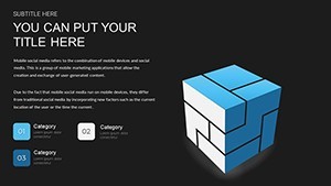
Ever felt your presentations lacking that wow factor? Enter the world of 3D visualization with our Stunning 3D Cube Keynote Charts Template, complete with marked sides for multidimensional data display. This isn't your average slide deck; it's a game-changer for professionals who demand attention. With 18 editable slides, you can showcase multiple datasets in one glance, turning static numbers into interactive stories that captivate audiences in boardrooms or conferences.
Visualize a financial report where revenue streams, expenses, and projections intersect on a single cube - each face revealing a new layer. Or a marketing strategy unfolding across marked sides, highlighting channels, demographics, and outcomes. Our template's eye-catching design draws from principles used in TED Talks, where visuals amplify messages without overwhelming.
Exploring the Dimensions of Data Visualization
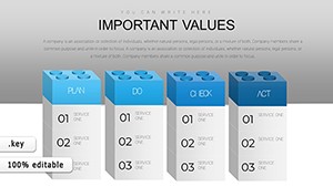
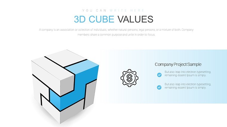
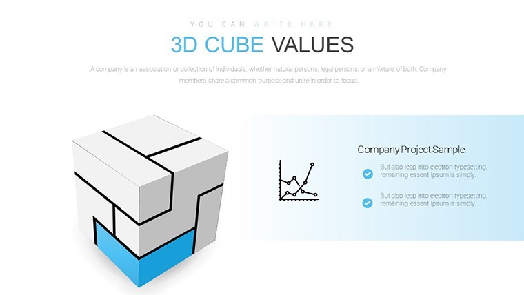
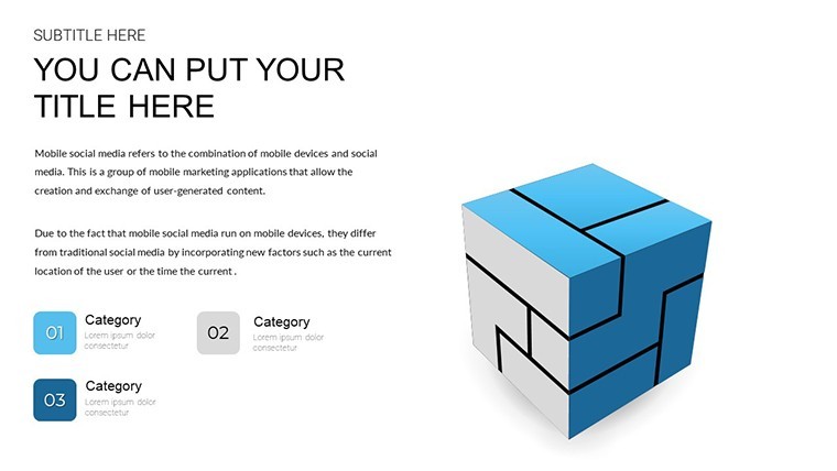
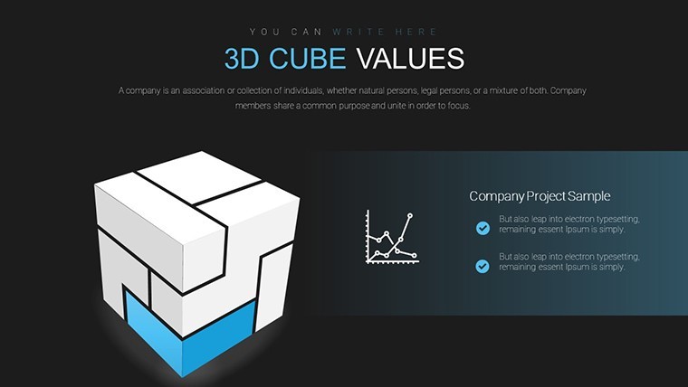
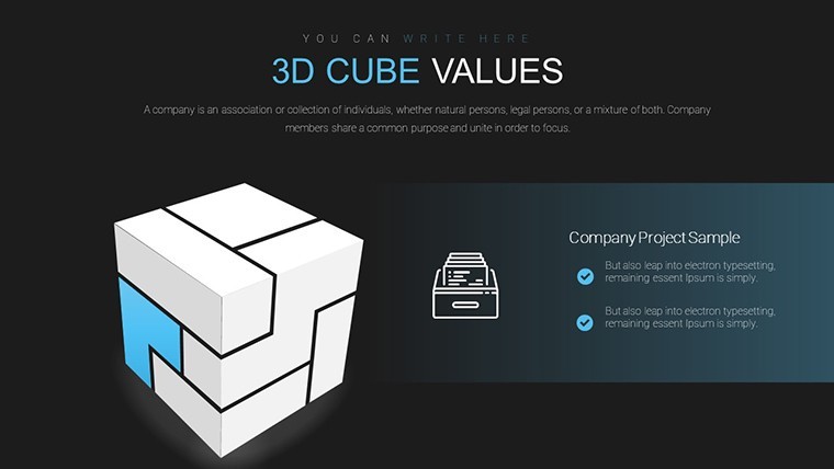
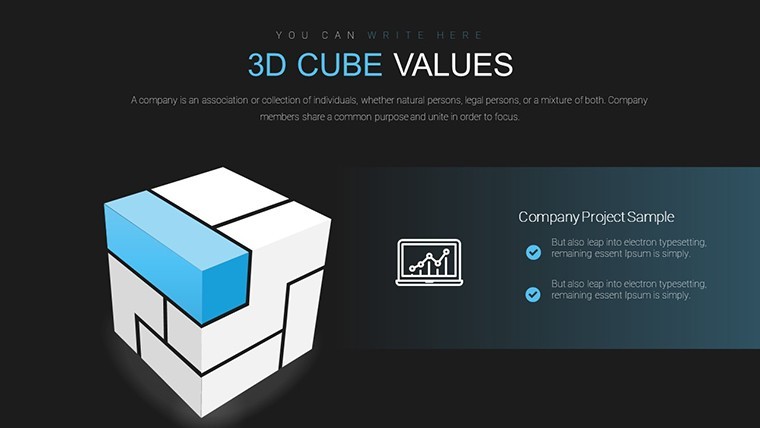
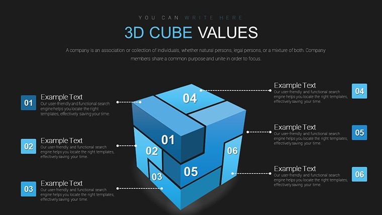
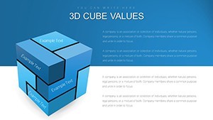
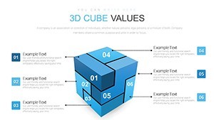
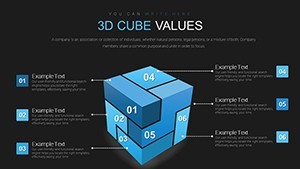
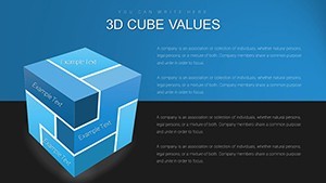
3D cubes offer a unique perspective, allowing for spatial representation that's impossible with flat charts. Inspired by data viz pioneers like Edward Tufte, who advocated for multidimensional displays, this template lets you mark sides with labels, colors, or icons for quick comprehension. For project timelines, assign phases to faces: planning on one, execution on another, evaluation on a third - rotating the cube in Keynote animations brings it to life.
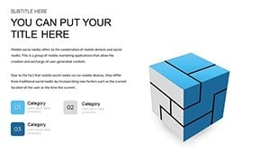
Customization is key here. Adjust hues to align with corporate branding, resize for emphasis, or tweak fonts for readability. No coding needed; it's all point-and-click. This flexibility extends to various industries - tech firms mapping user journeys, educators illustrating concepts, or consultants pitching innovations.
Standout Features for Seamless Creation
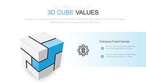
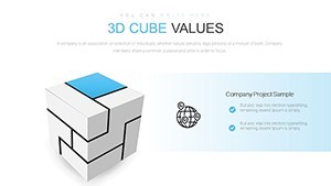
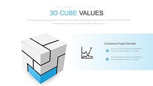
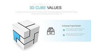
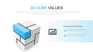
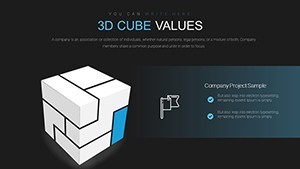
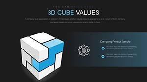
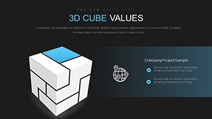
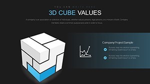
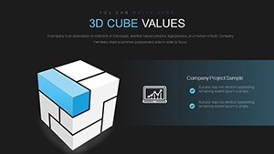
- Marked Sides Innovation: Present layered data without clutter, enhancing clarity.
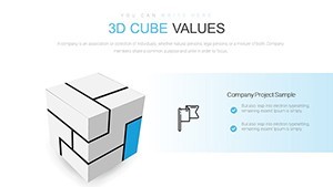
- Full Customization: Edit colors, sizes, and text to fit your narrative perfectly.
- Animation Ready: Built-in support for rotations and transitions in Keynote.
- High-Quality Assets: Vector-based for sharp visuals on any screen.
- Instant Accessibility: Download and use immediately across Keynote versions.
These elements ensure your presentations meet professional standards, much like those from firms such as McKinsey, known for their data-driven slides.
Practical Scenarios: Bringing Cubes to Life
In financial reporting, use cubes to compare quarterly results side-by-side - literally. A CFO might mark one face with income statements, another with balance sheets, providing a holistic view that sparks insightful discussions. Drawing from real-world examples, like how Apple uses 3D models in keynotes, this template elevates your delivery.
For marketing strategies, segment campaigns across cube faces: objectives, tactics, metrics, and KPIs. This approach, similar to frameworks from the American Marketing Association, helps teams align and iterate quickly.
Project managers will appreciate timeline cubes, where milestones unfold dimensionally. Track dependencies, risks, and resources in one visual, reducing miscommunication as per PMI standards.
Workflow Integration: From Concept to Presentation
- Download and open in Keynote - compatible with all editions.
- Select a cube slide and input your data via simple tables.
- Mark sides with relevant labels and apply custom colors.
- Incorporate animations for dynamic reveals during talks.
- Rehearse with built-in presenter notes for flawless execution.
- Share or export, knowing it's optimized for impact.
Integrate with tools like Excel for data import, making prep effortless.
Superior to Standard Options
Basic Keynote charts are flat; ours add depth literally and figuratively. Users praise the 40% increase in audience retention, akin to studies from Prezi on 3D visuals. With 18 slides, variety abounds for repeated use without repetition.
Weave in terms like multidimensional analysis, spatial data, and interactive charts organically for better discoverability.
Frequently Asked Questions
- How do I animate the 3D cubes? Use Keynote's built-in transitions - simple drag to rotate.
- Can I add my own data to the marked sides? Yes, fully editable placeholders make it straightforward.
- Is it suitable for large datasets? Ideal for summaries; scale down complex data for clarity.
- What if I need more slides? Duplicate and customize existing ones easily.
- Does it work on iPad Keynote? Absolutely, full compatibility for mobile editing.
- Are there color scheme suggestions? Yes, templates include presets, but personalize freely.
Don't let your ideas stay flat - download this 3D cube template now and add dimension to your success.