Preference Charts Keynote Template - Editable Keynote | ImagineLayout


Type: Keynote Charts template
Category: Analysis
Sources Available: .key
Product ID: KC00663
Template incl.: 28 editable slides
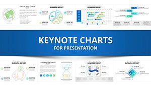
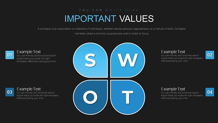
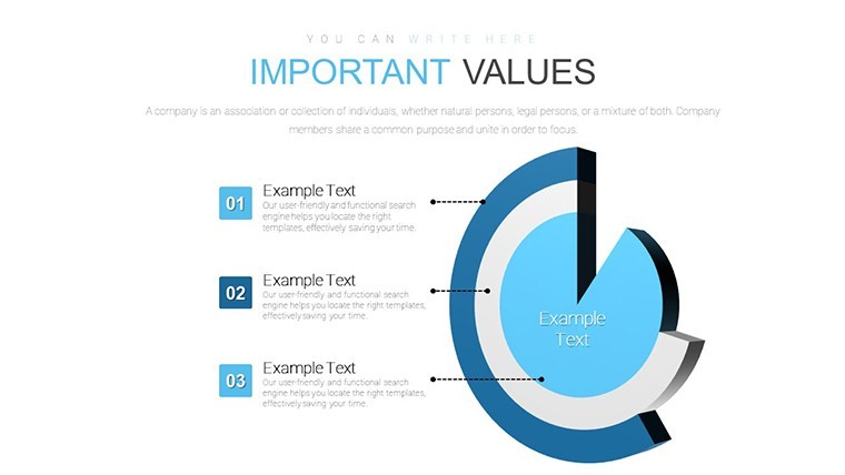
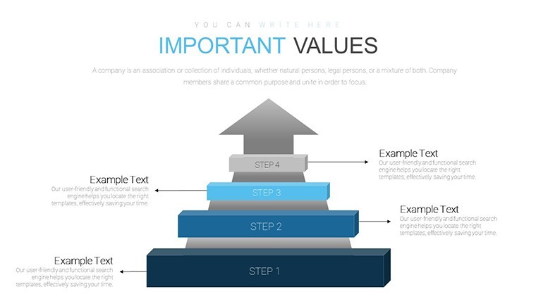
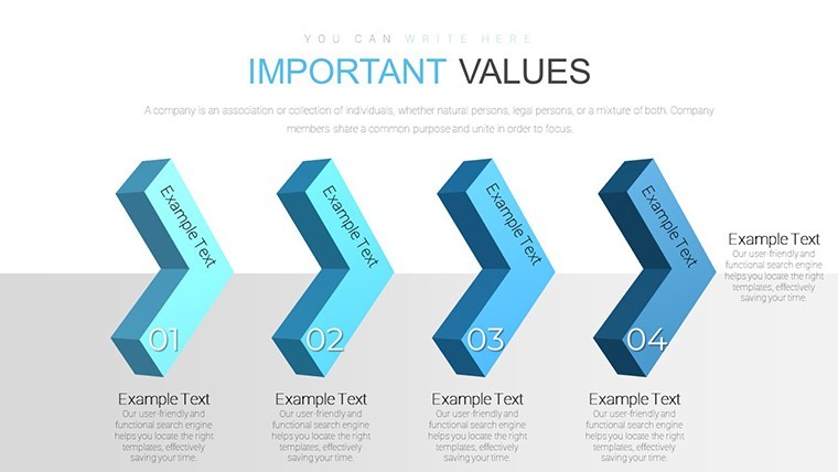
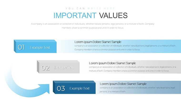
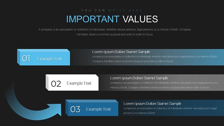
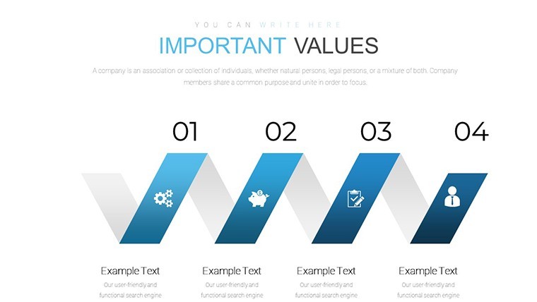
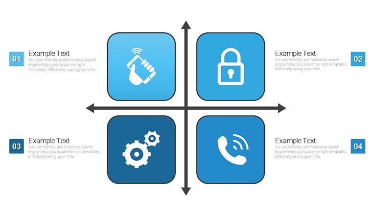
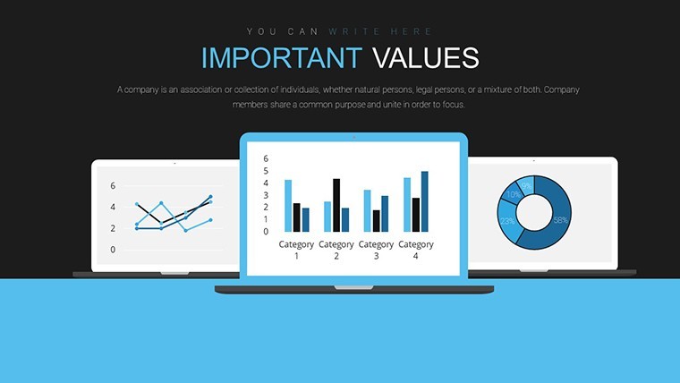
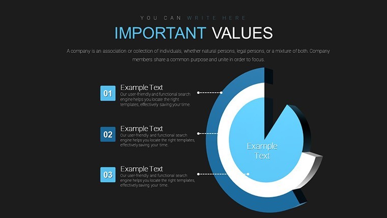
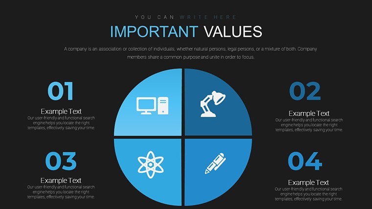
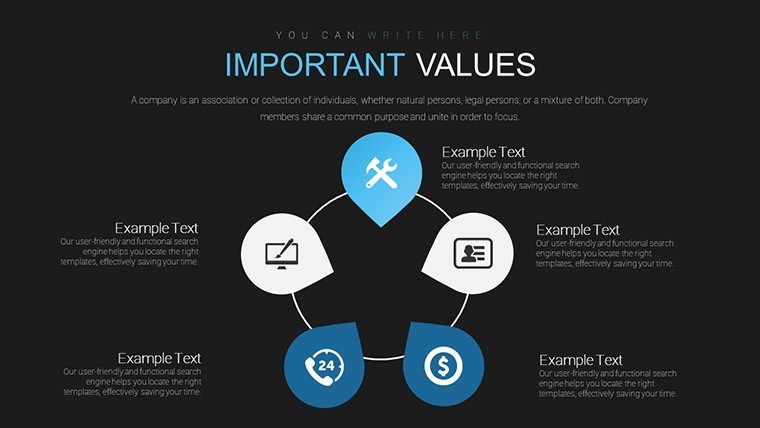
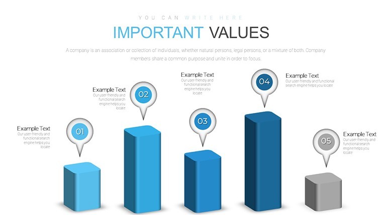
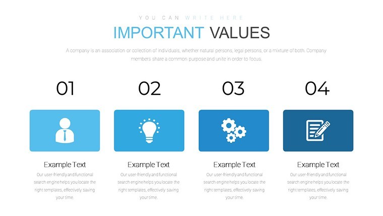
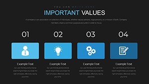
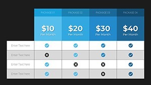
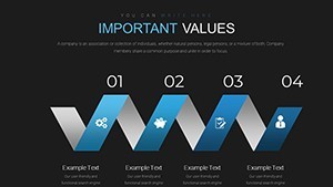
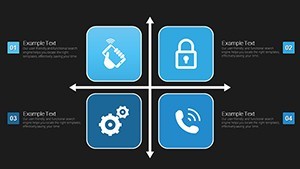
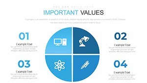
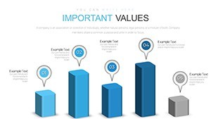
No generic charts here radar charts with circular line style plus bubble preference bars pie bar and line graphs deliver multi-attribute comparison in 28 editable slides.
Ready to edit.
The $18 paid version includes the complete collection of all 28 slides while files follow standard KEY formats compatible with current installations.
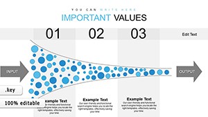
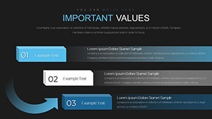
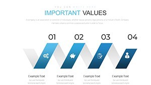
When you need to summarize survey results for marketing teams the preference bars handle instant ranking updates.
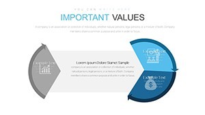
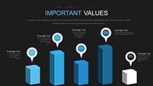
Radar structures support prioritization analysis that lets viewers decide top attributes at a glance.
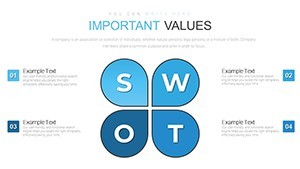
Market researchers typically use this set for customer preference mapping.
In most cases you only replace text and adjust colors.
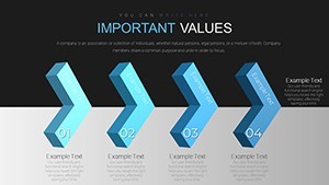
The circular line style keeps comparisons readable on one slide and prevents overcrowded layouts.
Use this instead of building diagrams manually in Keynote.
It works best for structured preference data not open narrative slides and is not ideal for highly creative concept illustrations.
You can duplicate slides and reuse the same structure for ongoing research reports.
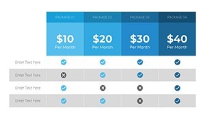
| Feature | Details |
|---|---|
| Slides / diagrams | 28 editable slides including radar bubble preference bars pie bar and line graphs |
| File format | KEY |
| Software version | Compatible with current Keynote installations on macOS |
| Color schemes | Customizable via slide master for segment-specific palette changes |
| Editable elements | Data points lines bars and labels resize and recolor independently |
| Aspect ratio | 16:9 widescreen |
| Free vs Paid | Paid version includes complete 28-slide collection of all diagram types |
| Masters / Backgrounds | Slide masters enable one-click color and layout updates |
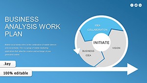
See also Business Analysis Work Plan Keynote Charts Template or Business Analysis Solution Keynote Charts.
Does this work with Keynote 2016/2019/365 on Mac?
The files follow standard KEY format and run on current Keynote versions including 2016 2019 and 365 releases on macOS.
Older versions may require minor layout tweaks but vector elements remain crisp.
Test on your setup before large edits.
How do I change colors across all slides?
Open the template in Keynote and switch to slide master view.
Select the master slide then update theme colors or individual fills for shapes and text.
Return to normal view and the changes apply instantly to every slide without manual fixes.
Can I use this template for client work?
Yes the license allows use in client presentations as long as you do not resell or redistribute the original template files.
Customize then deliver the final deck as part of your service.
Commercial projects are fully permitted under standard terms.
What is the difference between free and paid versions?
The paid version includes the complete 28-slide collection of all diagram types.
No free version is listed for this exact template.
Check the product page for any bundle options.
What are the refund conditions?
Refunds are processed within 7 days of purchase if the template does not meet your requirements.
Contact support with order details and reason for a smooth resolution.
Free templates have no refund since no payment is involved.
Works for structured analysis.
Download and start editing immediately