Circular Timeline Keynote Chart Template - 28 Fully Editable Slides | ImagineLayout


Present project timelines, sprint cycles, and sequential processes using 28 fully editable circular clock-style Keynote chart slides. Instant .KEY download. $20.
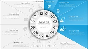
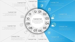
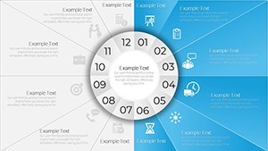
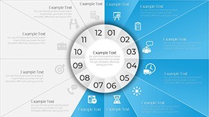
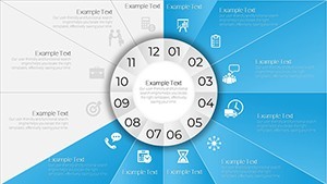
When a standard horizontal Gantt chart or linear timeline fails to capture the cyclical or clock-like nature of your data, this 28-slide circular timeline Keynote chart template - product ID KC00659 - delivers a genuinely different visual language. Built around large disk layouts divided into clock-face sectors, each slide transforms dates, phases, milestones, and recurring intervals into pie-and-cycle compositions that audiences can read at a glance. The file delivers in native .KEY format for $20, with instant download after purchase.
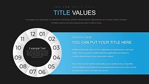
What's Included in This 28-Slide Circular Timeline Template
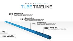
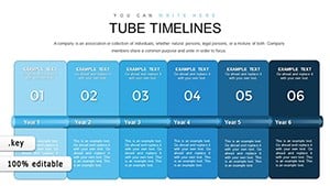
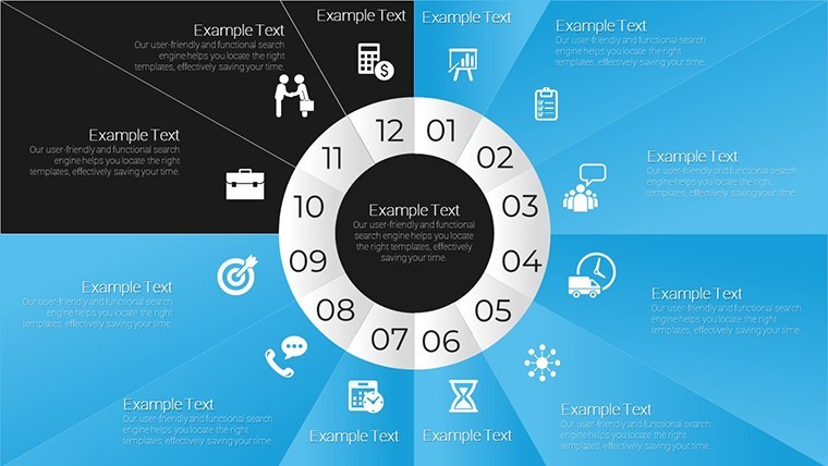
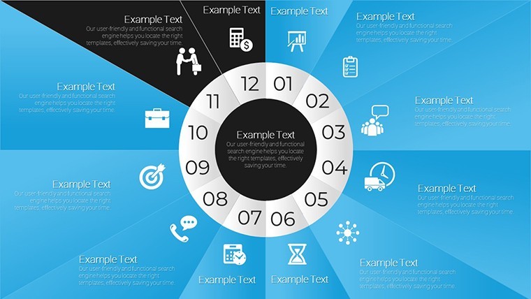
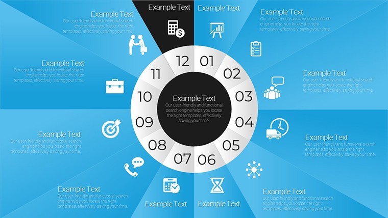
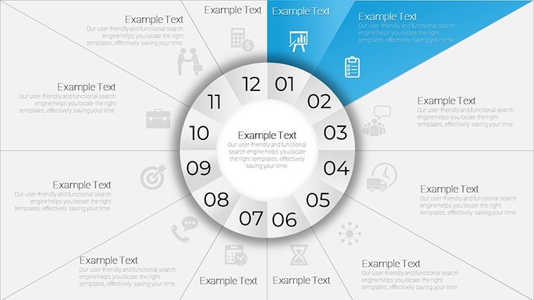
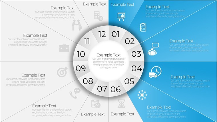
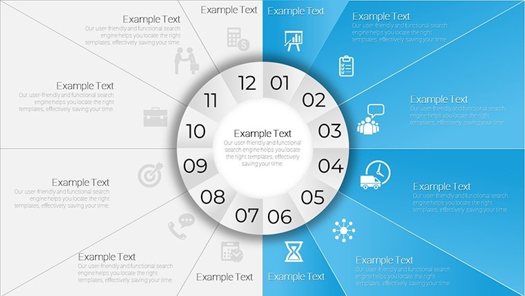
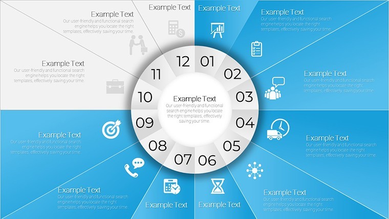
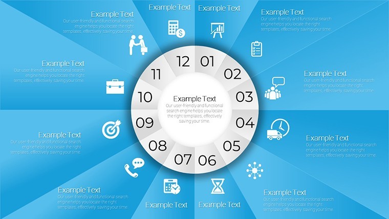
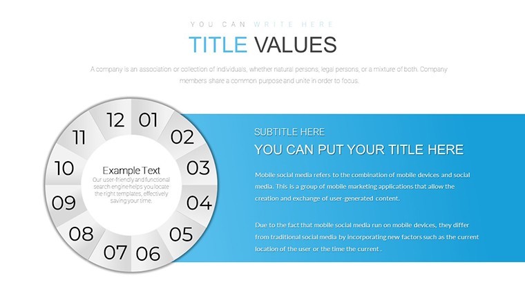
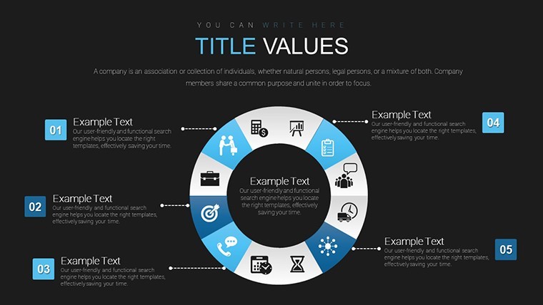
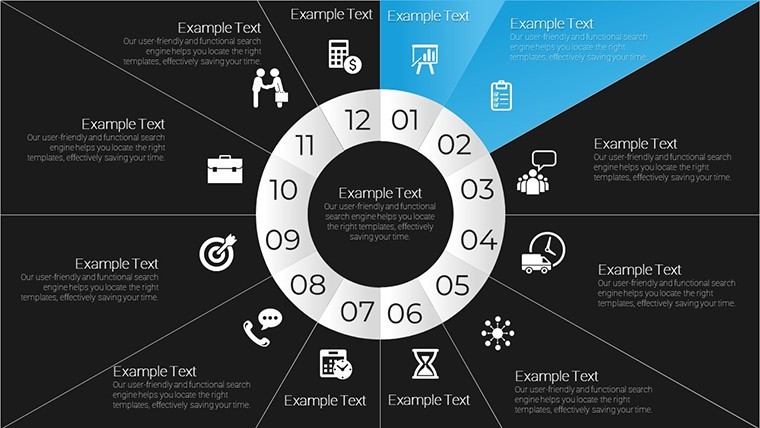
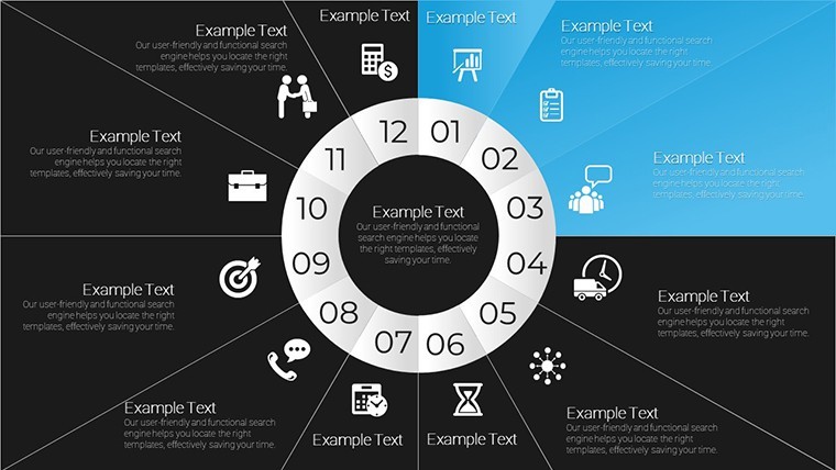
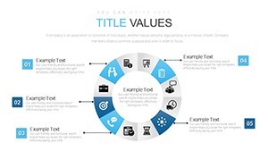
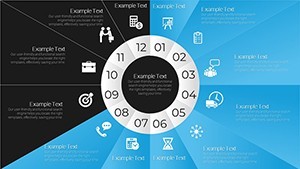
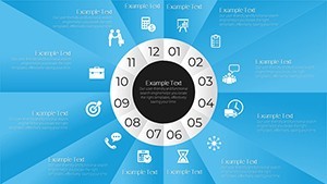
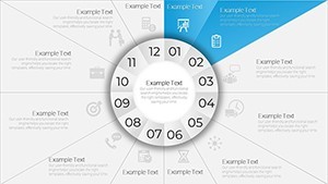
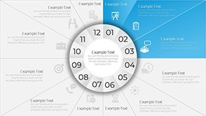
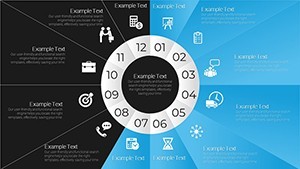
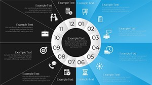
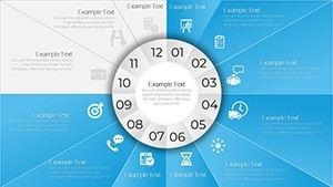
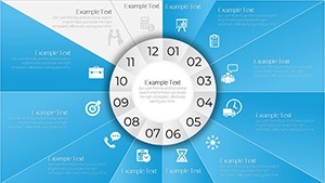
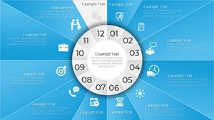
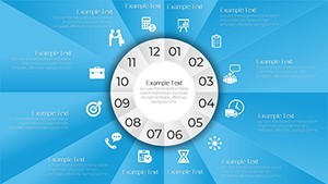
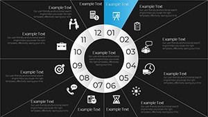
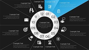
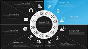
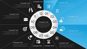
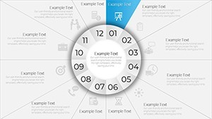
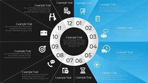
The template ships with 28 fully editable Keynote slides, all organized around the clock-face sector metaphor. Unlike linear timeline templates in the same category - such as the Pipe Timeline or Tube Timeline charts also available on ImagineLayout - this set is built specifically around circular, clock-like structures where each sector represents a time unit, phase, or proportion. Slides vary across single-ring layouts, multi-layered concentric circles (useful for nesting quarterly data inside an annual view), donut-style charts with hollow centers for label placement, and hybrid pie-cycle compositions that blend proportional and sequential readings simultaneously. Every slide includes editable text placeholders for dates, labels, and annotations; color-fill sectors that can be individually recolored; and icon placeholder zones for adding project-phase icons or category symbols. The template is tagged with keywords including timeline, timeline plan, donut, project, plan, results, and tenders, reflecting the breadth of real use cases this design supports.
Slide-by-Slide Layout Overview
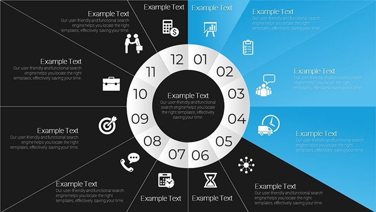
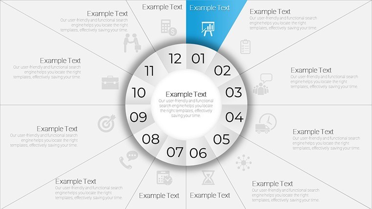
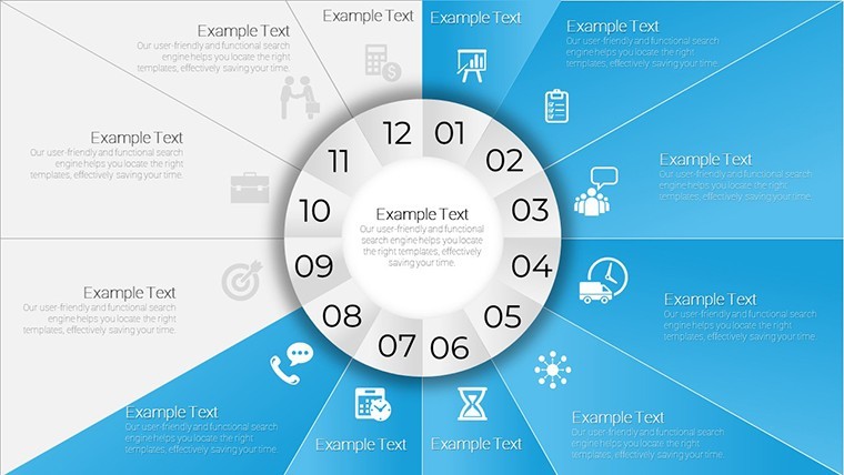
The opening slides present clean single-disk overviews - ideal as title or summary slides that orient an audience to a full project calendar before drilling down. Mid-deck slides introduce multi-layered concentric rings, where an outer ring might show 12 monthly divisions while an inner ring highlights four quarterly milestones with accent colors. Later slides in the set incorporate donut chart layouts with central text fields, allowing a key metric or headline figure to anchor the visual while surrounding sectors provide context. The final slides bring animated build options into play, where sectors can be set to rotate into position sequentially, simulating clock-hand progression and guiding audience attention through a narrative one phase at a time.
Key Features at a Glance
| Feature | Detail |
|---|---|
| Slide count | 28 editable slides |
| File format | .KEY (native Apple Keynote) |
| Chart types | Pie, cycle, donut, multi-ring concentric, hybrid sector |
| Editable elements | Sector color fills, text placeholders, icon layers, annotation fields |
| Animation support | Sequential sector reveals, rotation-style build animations |
| Categories | Cycle & Pie Keynote Charts |
| Price | $20 - instant download |
| Export options | PDF, PNG, JPEG via Keynote's native export |
Professional Use Cases: Who Uses This Template and How
The clock-face sector structure makes this template most valuable in scenarios where time is the primary organizing dimension and linear layouts feel reductive. Three practical professional scenarios illustrate where this template excels.
Agile Project Management - Sprint Cycle Visualization
A senior project manager at a mid-sized software development firm needed to present a 12-sprint release roadmap to a mixed audience of engineers and non-technical stakeholders. Using the multi-ring concentric slide from this set, she mapped the 12 sprints on the outer ring and four quarterly release gates on the inner ring, color-coding each sprint by status (completed in teal, in-progress in amber, upcoming in grey). The rotating sector animation on the final slide simulated clock-hand progression through the year, helping the executive team visualize delivery cadence without reading a Gantt chart. The presentation replaced a 22-row spreadsheet that had previously caused confusion in planning meetings.
Tender & Bid Submission - Project Phase Timeline
A bid manager at a civil engineering consultancy used the single-disk overview slide to present a six-phase tender delivery timeline to a municipal procurement panel. Each sector was labeled with a phase name and estimated duration, with icons placed in the sector centers to represent key deliverables (survey, design, review, submission, award, mobilization). Because the circular format reads as a complete, closed process rather than an open-ended linear bar, it communicated finality and structure - two qualities procurement panels value in competitive tenders.
Marketing Campaign Planning - Quarterly Cycle Mapping
A marketing director at a consumer goods company used the donut-style slides to map a 52-week promotional calendar, grouping weeks into seasonal campaign clusters. The central field of the donut displayed the annual revenue target, while surrounding sectors showed budget allocation per campaign phase as a proportion of the whole. This gave C-suite reviewers an instant read on how spend was distributed across the year without needing to reference a separate budget spreadsheet.
Ready to map your timeline in circular format? Download this 28-slide Keynote chart template now and open it directly in Apple Keynote to start editing sector colors, labels, and animation builds within minutes.
How to Customize This Circular Timeline Keynote Template
The workflow from download to presentation-ready is straightforward and does not require any third-party plugins or add-ons. Here is the standard customization path most buyers follow:
Step 1 - Download and open: After purchase, download the .KEY file and open it directly in Apple Keynote on macOS or iPadOS. All slides load with placeholder text and default sector colors intact.Step 2 - Replace sector labels: Click any text placeholder on a sector or annotation field and type your phase names, dates, or data labels. Font size and weight are pre-set but fully adjustable via the Format panel.Step 3 - Recolor sectors: Select any sector shape, open the Style panel, and replace the fill color with your brand palette or a status-based color scheme. Each sector is an independent shape layer, so they can be colored individually without affecting others.Step 4 - Add icons or images: Drag any icon from Keynote's built-in shape library, or import a custom SVG or PNG, into the icon placeholder zone within each sector.Step 5 - Adjust animation builds: Open the Animate panel on slides that feature rotation or sequential builds. Change the order, duration, or trigger of each sector's entrance to match your presentation pacing.Step 6 - Export: Use Keynote's File → Export to export as PDF for handouts, PNG for individual slides, or present directly from the .KEY file.
Building a comparable 28-slide circular timeline set from scratch in Keynote - drawing and aligning individual sector shapes, setting up text layers, and configuring animation sequences - would typically take a designer 6-10 hours. This template eliminates that setup entirely.
Why This Template vs. Other Timeline Charts on ImagineLayout
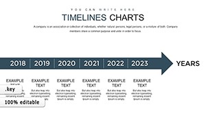
ImagineLayout carries several Keynote timeline chart templates, including the Pipe Timeline ($12), Tube Timeline ($15), Project Timeline ($28), and Company Timeline ($18). Each takes a different structural approach. The Pipe and Tube templates use horizontal linear structures that work well for left-to-right chronological storytelling. The Company Timeline is optimized for historical narrative arcs with milestone callouts along a single axis. This circular timeline template is fundamentally different: its clock-face sector architecture is purpose-built for cyclical, repeating, or proportional time data - sprint cycles, annual calendars, recurring campaign phases, tender process loops - where showing the return to start is as important as showing the progression. At $20 for 28 slides across pie, donut, cycle, and multi-ring formats, it is also the broadest single-purchase circular chart set in the Keynote Charts category on this site.
Use this template for your next project timeline, tender plan, or campaign calendar - add to cart and download the .KEY file instantly.
Frequently Asked Questions
What software do I need to open and edit this circular timeline Keynote template?
This template is delivered as a native .KEY file, which opens directly in Apple Keynote on macOS (any recent version) and iPadOS. You do not need any third-party plugins or add-ons. Keynote is a free application available from the Mac App Store and the iOS App Store. The .KEY format gives you full access to all editable layers, including individual sector shapes, text placeholders, icon zones, and animation sequences. If you need to share slides with Windows users who do not have Keynote, you can export to PowerPoint (.pptx) or PDF from within Keynote after editing.
Can I change the number of sectors on each clock-face slide to match my data?
Yes. Each sector on the circular diagrams is an independent shape layer in Keynote. You can duplicate, delete, or resize sectors to change the division count - for example, converting a 12-sector annual clock into a 6-sector semi-annual one, or splitting sectors further to represent weeks within a month. Text placeholders attached to each sector will need to be repositioned manually after resizing, but Keynote's alignment guides make precise placement straightforward. This level of structural editing is what distinguishes a native .KEY file from a locked or flattened template.
Are the animations pre-built, or do I need to set them up from scratch?
Selected slides in this 28-slide set include pre-configured animation builds - specifically the sector-reveal and rotation-style sequences that simulate clock-hand progression. These are accessible via Keynote's Animate panel on the right sidebar. You can use them as-is, adjust the duration and order of each sector's entrance, or remove animations entirely if you prefer a static presentation. Slides without pre-set animations are fully compatible with Keynote's own animation tools, so you can add your own build sequences to any slide in the deck.
Can I use this template for commercial client presentations and business proposals?
Yes. The standard license purchased through ImagineLayout covers use in commercial presentations, client proposals, business pitches, internal reports, and similar professional deliverables. You may use the template across multiple projects for your own organization or for client work. The license does not permit resale of the template files themselves or redistribution as a standalone design asset. If you need clarification on specific licensing scenarios, ImagineLayout's Terms of Use page provides full details, and the contact page is available for licensing questions.
What is the refund policy if the template does not meet my needs?
ImagineLayout has a refund policy available on its Refund Policy page. Because this is a digital download product, it is important to review the slide preview images carefully before purchasing to confirm the circular clock-face design style, the 28-slide count, and the .KEY file format all match your requirements. The product page shows all 28 slide thumbnails, which gives a complete picture of the layout variations included. If you have questions about specific slides or customization before buying, the contact page is the fastest route to a pre-purchase answer.
How does this circular timeline differ from a standard Keynote pie chart?
A standard Keynote pie chart is a single data visualization tied to a spreadsheet table - change the numbers and the chart updates automatically. The circular slides in this template are designed as presentation-layer diagrams: they use the same sector geometry as a pie chart but are structured for manual narrative content - phase names, dates, icons, annotations - rather than live data binding. This makes them ideal for timeline storytelling, process mapping, and sequential planning, where the message is qualitative or mixed (partly numeric, partly descriptive) rather than purely quantitative. The 28 slides also include multi-ring and donut variants that standard Keynote pie charts do not offer.