E-commerce Keynote Charts Template - Editable Keynote | ImagineLayout


Type: Keynote Charts template
Category: Tables, Illustrations
Sources Available: .key
Product ID: KC00644
Template incl.: 8 editable slides
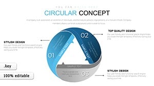
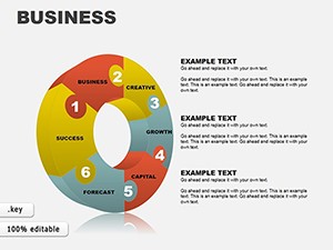
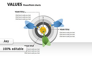
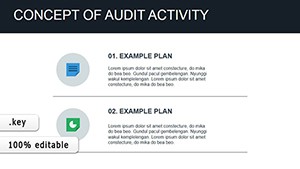
8 Keynote Chart Slides for E-commerce Data
The .key file delivers 8 editable slides built around e-commerce metrics - sales funnels, revenue trend lines, and customer behavior visuals - for analysts or marketers who present performance data to stakeholders on a recurring basis. Each layout is structured for a single chart type per slide, so the data stays readable without crowding. No need to rebuild these structures from scratch every quarter.
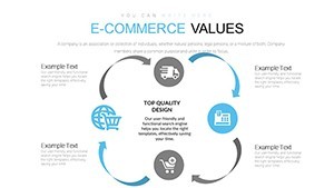
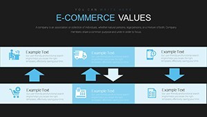
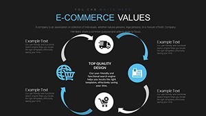
The slides use a flat, icon-light visual style with labelled chart areas and clear axis zones. The layout direction varies by slide: funnel structures run top-to-bottom, while trend and comparison charts are organized on a horizontal axis. Spacing is airy rather than compact, which keeps the content readable when projected. This Keynote chart template is categorized under Tables and Illustrations, meaning several slides combine structured data tables with supporting visual elements rather than pure chart graphics.
In practice, you open the file, replace the sample figures with your actual data, and adjust the color fills to match your brand. Color changes apply per element - there is no master palette control mentioned on the page, so in most cases you update fills individually per slide. That works fine for a set this size. The file format is .key only; no PPTX version is listed.
Use this when you need to present e-commerce KPIs - conversion rates, average order value, cart abandonment - to a client or internal team without designing chart frames manually. The predefined structure keeps each metric on its own slide, which prevents the overloaded layouts that happen when you try to fit multiple data points into a single custom-built chart. Not ideal for detailed dashboard-style reporting that needs multiple simultaneous chart types on one slide.
The deck suits marketing analysts, e-commerce managers, or agency account leads who present monthly or quarterly performance reviews. Typically, teams reuse the same slide structure across reporting cycles and only update the data. At $6.00, it replaces a significant amount of manual chart-building work in Keynote.
Everything is already structured. Download and start editing immediately
Specifications
| Feature | Details |
|---|---|
| Slides | 8 editable slides - funnel, trend line, and KPI chart layouts |
| File format | .key (Keynote) |
| Software version | Not specified on page; compatible with standard .key format |
| Color schemes | Not specified; colors editable per element via Format panel |
| Editable elements | Chart data areas, labels, text blocks, color fills |
| Aspect ratio | Not specified on page |
| Free vs Paid | Paid only - $6.00, no free version listed |
| Categories | Tables, Illustrations |
FAQ
How do I change colors across all slides?
Color adjustments are made per element via Keynote's Format panel. Select a shape or chart element, open the Format sidebar, and update the fill or stroke color. Because this file does not specify a master slide palette, you apply color changes directly to individual elements on each slide. For consistent branding, update one slide first as a reference, then duplicate the color values across the others using the eyedropper tool.
Can I use this template for client work?
The page does not specify license terms beyond standard use. For client-facing presentations, a single-seat purchase typically covers use in presentations you deliver. If you plan to resell or redistribute the template file itself, check ImagineLayout's Terms of Use at imaginelayout.com/terms/ before doing so. Using the slides as part of a client report or pitch deck is the standard intended use.
Is there a free version of this template?
No free version is listed for this product. The template is priced at $6.00 for the full 8-slide .key file. If you want to try a free Keynote chart file before purchasing, ImagineLayout offers other free templates in the Keynote Charts category that you can download and evaluate first.
What is the refund policy?
Refund conditions are governed by ImagineLayout's refund policy, available at imaginelayout.com/refund-policy/. Because digital files are delivered by download, refunds are typically limited. Review the policy page before purchase if this is a concern, and contact the support team via the contact page if you encounter a technical issue with the file after downloading.
Which Keynote version is required?
The page does not state a minimum Keynote version. The file uses the standard .key format, which opens in current Keynote installations on macOS and iOS. For best compatibility, use Keynote 12 or later. Older versions may open the file but could display minor formatting differences in chart elements or text spacing.