KPI Gauges Keynote Charts - Fully Editable | ImagineLayout


Type: Keynote Charts template
Category: Free Templates, Relationship, Illustrations
Sources Available: .kth
Product ID: KC00632
Template incl.: 16 editable slides
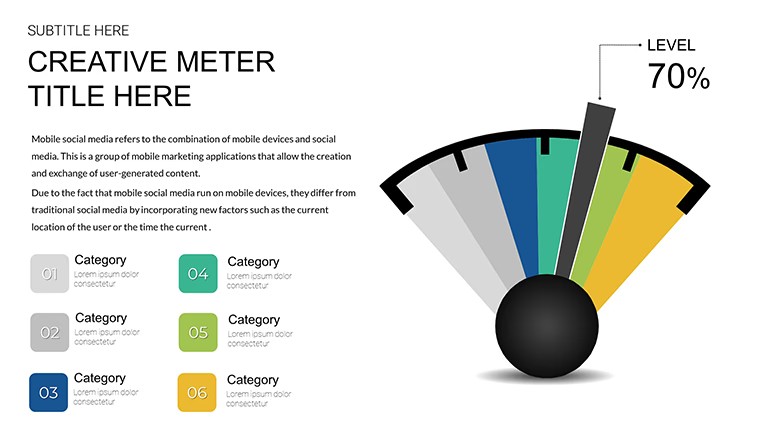
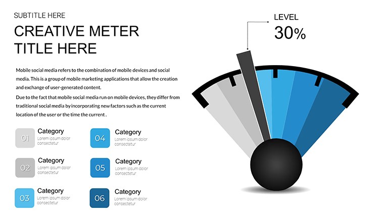
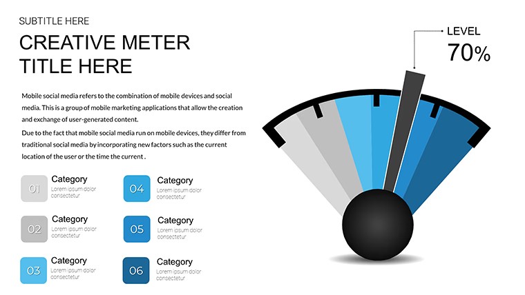
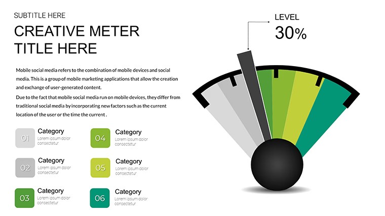
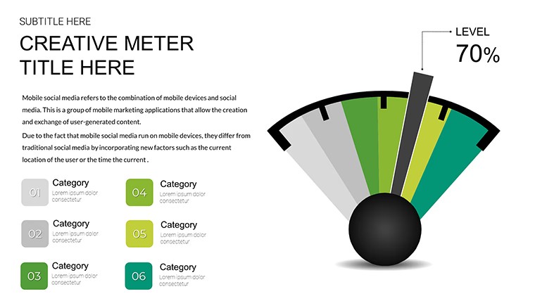
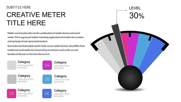
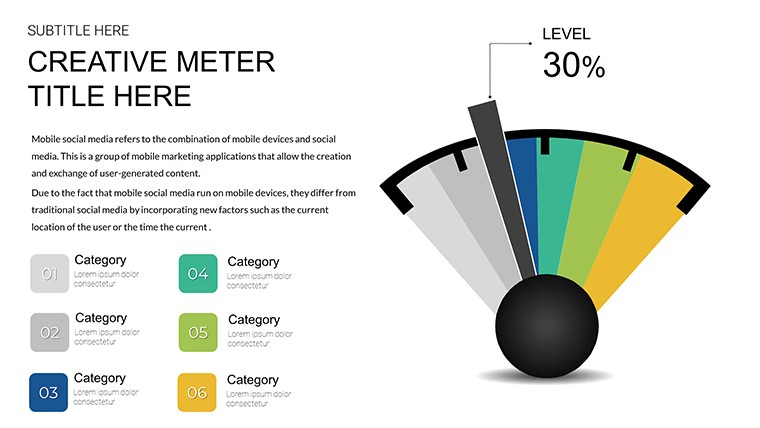
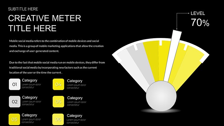
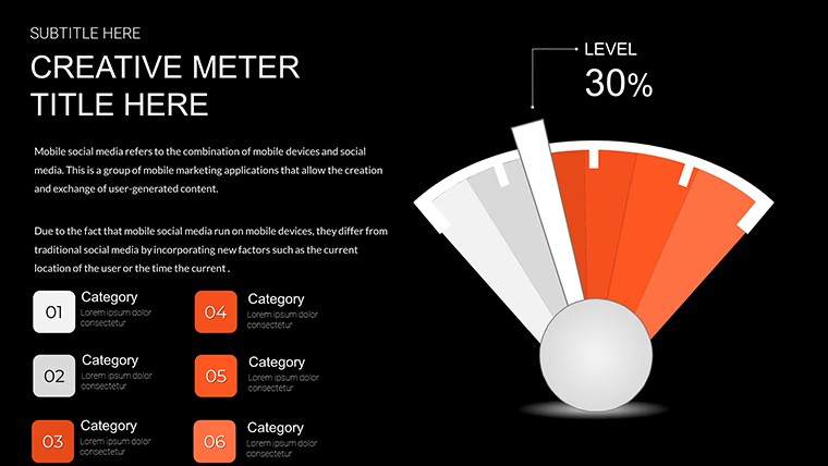
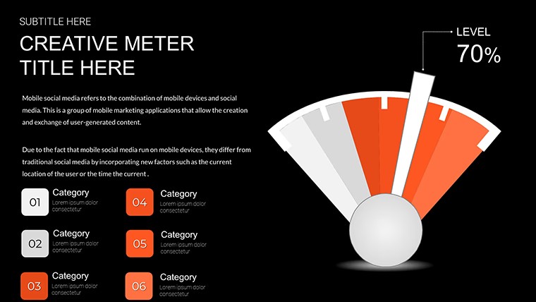
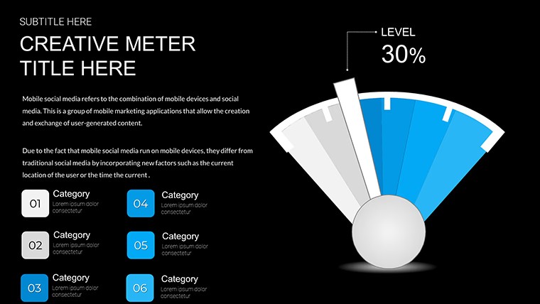
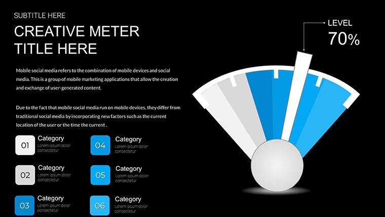
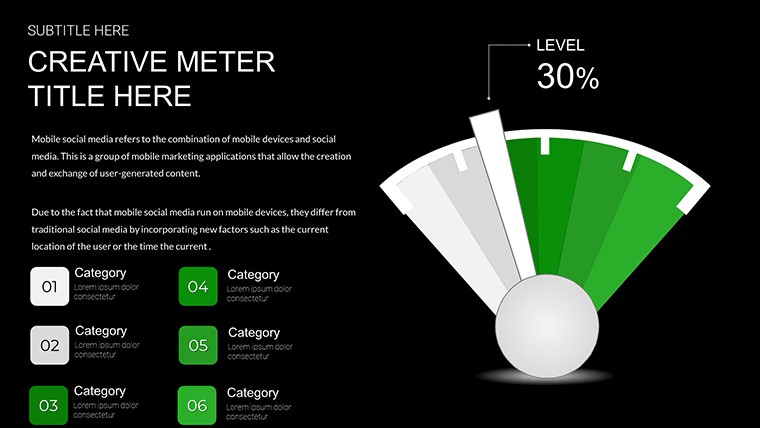
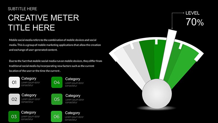
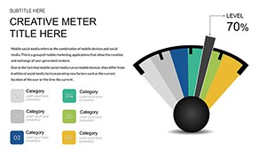
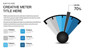
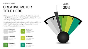
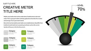
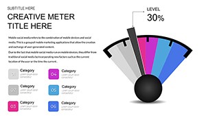
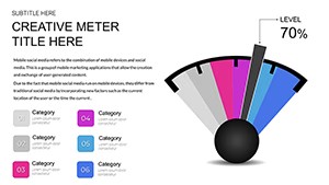
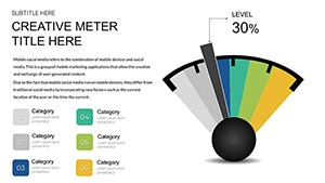
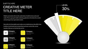
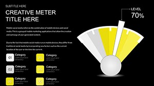
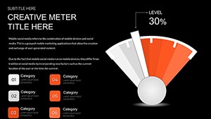
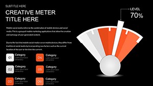
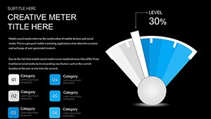
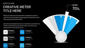
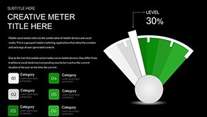
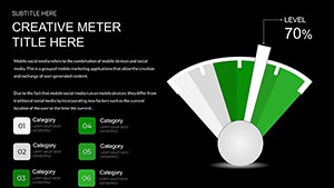
What's in the free pack? Sixteen speedometer gauges for KPI tracking with needles color zones and multi gauge dashboards turn raw metrics into instant visual reads.
No gradients needed, just clean gauges.
When you need to track sales velocity or team efficiency for executives the semi circle and full circle dials with green yellow red zones show thresholds without manual drawing.
You input values and the needle updates in real time in most cases.
This free Keynote chart template supports performance monitoring and prioritization so you flag risks or achievements then decide on corrective actions or resource shifts.
The free version includes 16 editable slides with .kth format compatible with current Keynote installations while the page does not list paid version details or exact color schemes but files follow standard KEY/KTH formats.
Color changes via slide master let you update the entire deck palette in one place.
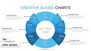
Use this when you need to show a multi step workflow without arranging shapes manually.
The predefined structure keeps everything aligned so you avoid adjusting spacing slide by slide.
Works best for structured KPI data and not ideal for creative storytelling slides or non quantitative narrative decks.
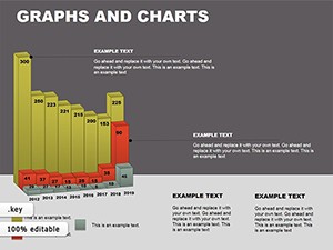
Typically teams reuse the same diagram across weekly reports instead of starting from scratch each time.
After viewing the gauges the viewer can immediately see if targets are met and make decisions on adjustments.
You open the file and start editing.
| Feature | Details |
|---|---|
| Slides / diagrams | 16 editable speedometer gauges single multi and progress tracker variants |
| File format | .kth |
| Software version | Keynote 12+ compatible with current installations |
| Color schemes | Multiple color variations switched via slide master |
| Editable elements | All needles dials zones text and icons resize and recolor independently |
| Aspect ratio | 16:9 widescreen |
| Free vs Paid | Free version delivers the full 16 slides |
| Masters / Backgrounds | Color variations and vector graphics included |
How do I change colors across all slides?
Open the file in Keynote then select any slide and go to the slide master view. Edit the color palette once and it applies to every chart and element automatically. This works in most cases even after you have already added your own data. You can also adjust individual charts independently if needed for specific emphasis.
Can I use this template for client work?
The single user license permits use in client projects as long as the template itself is not resold or distributed further. You deliver the final presentation file to your client with your content inserted. This covers internal and external presentations without additional fees in standard scenarios.
What is the difference between free and paid versions?
The free version delivers the complete 16 editable slides with gauges and animations. Paid upgrade details are not listed on the page but this is the full free pack available here.
What are the refund conditions?
Contact support within 30 days if the file does not meet your needs due to compatibility or functionality issues. Refunds are processed after verification that the template was not modified or used beyond initial testing. This policy applies to digital downloads with clear proof of purchase.
Does it work with PowerPoint 2016/2019/365/Mac?
This is a native Keynote .kth file so it opens directly only in Apple Keynote software. PowerPoint compatibility is not supported. The page confirms standard KEY/KTH format for current Keynote installations on Mac iPad or iPhone.
Browse more Free Keynote Charts
Market Segmentation Keynote Charts Template
Everything is already structured.
Download and start editing immediately