Bridge Value Keynote Charts - Instant Download | ImagineLayout


Type: Keynote Charts template
Category: Free Templates, Illustrations
Sources Available: .key
Product ID: KC00631
Template incl.: 14 editable slides
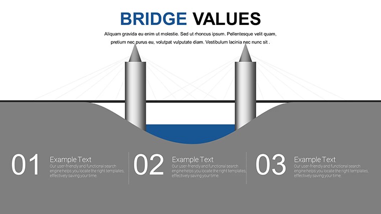
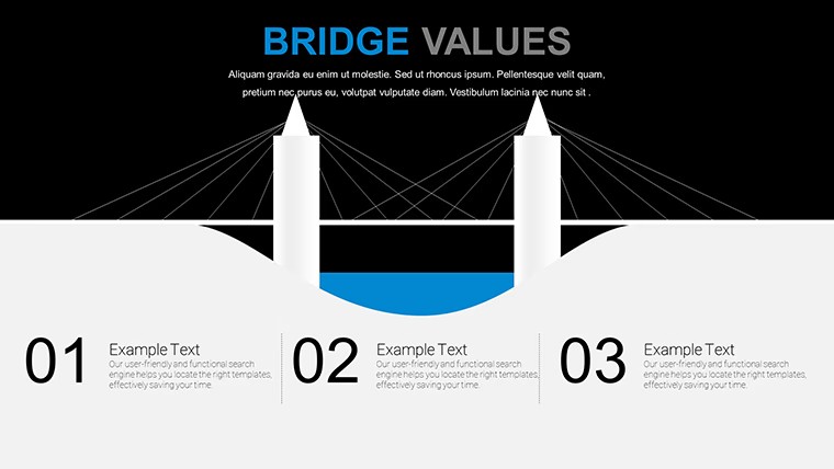
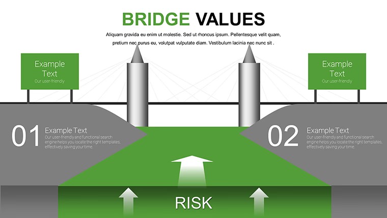
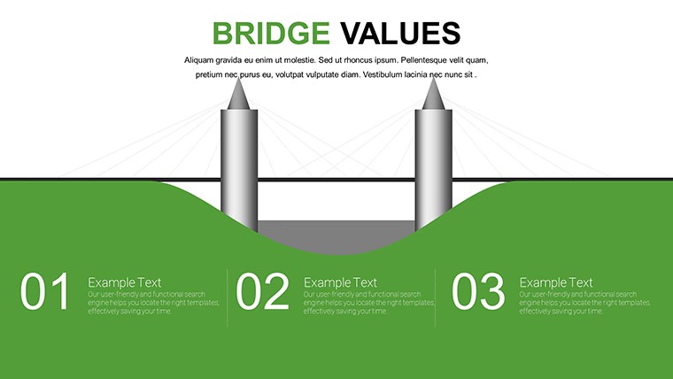
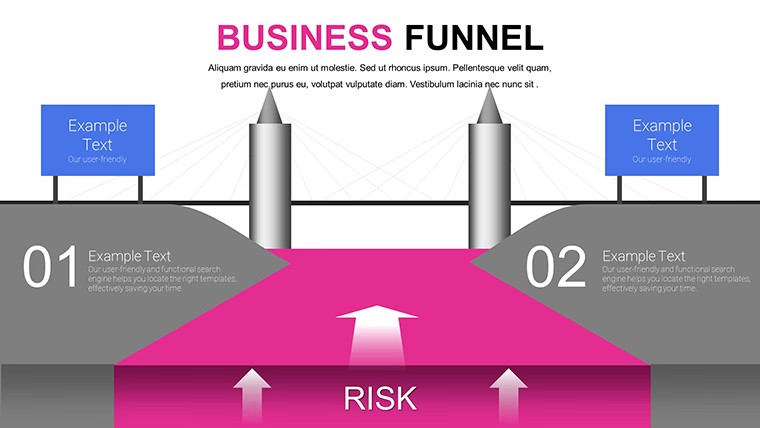
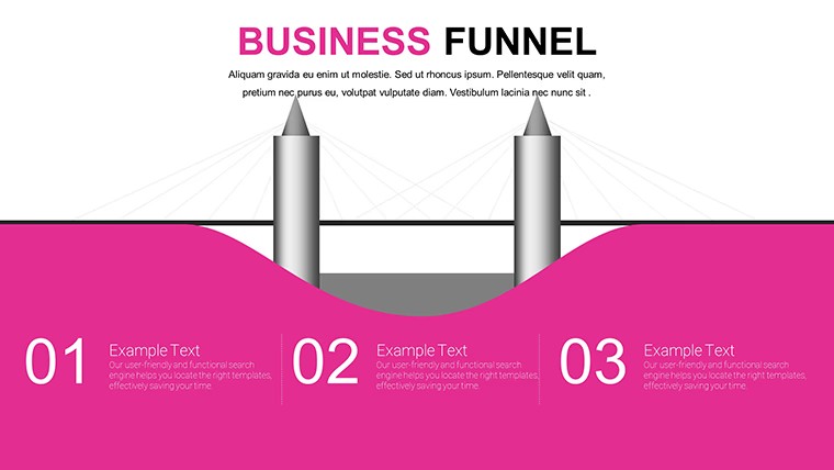
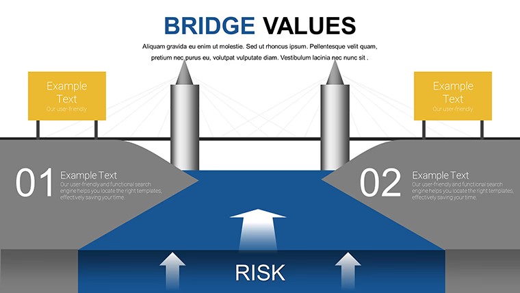
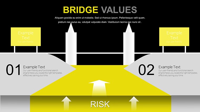
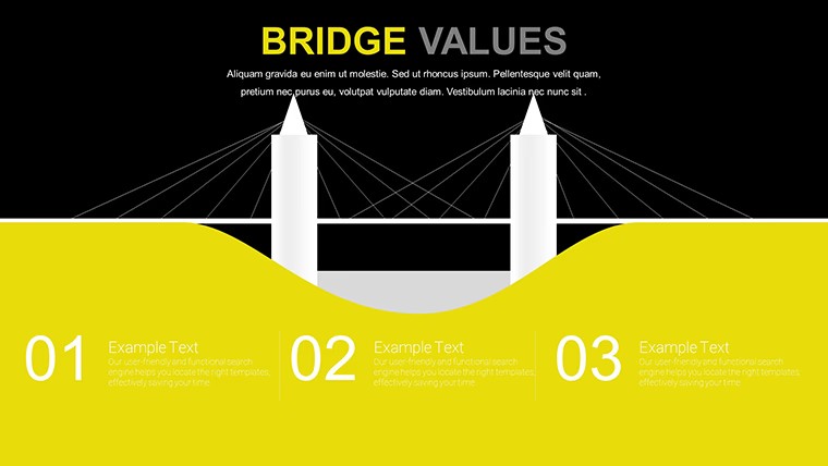
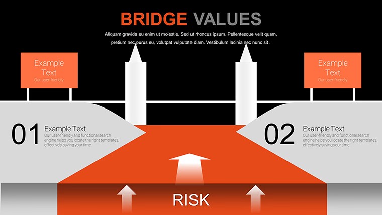
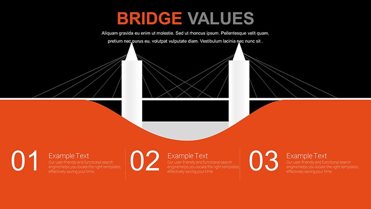
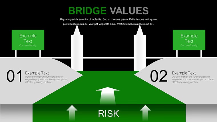
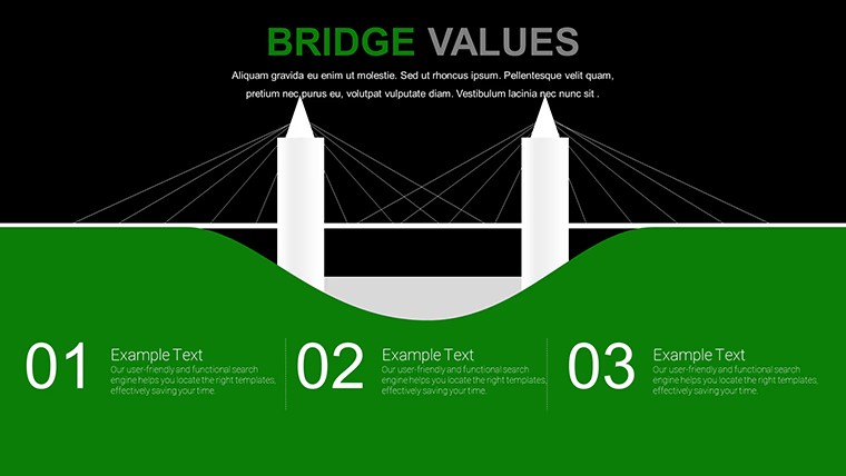
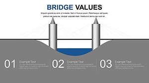
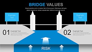
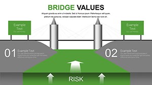
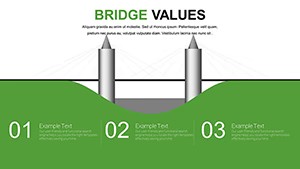
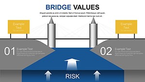
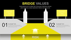
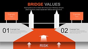
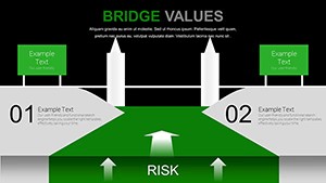
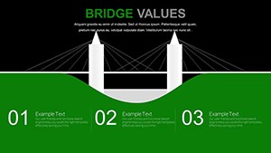
No complex data tables just horizontal bridge structures that show incremental changes at a glance for variance analysis in Keynote.
Ready in minutes.
When you need to explain revenue fluctuations or cost offsets to finance teams the horizontal linear bridge chart with flat icons and airy spacing handles the waterfall of positive and negative factors out of the box.
You replace numbers on the bars and the layout stays perfectly aligned in practice.
This free Keynote chart template supports variance analysis and relationship mapping so you highlight incremental impacts then decide on budget corrections or process improvements.
The free version includes 14 editable slides with .key format compatible with current Keynote installations while the page does not list paid version details or exact color schemes but files follow standard KEY formats.
Color changes via slide master let you update the entire deck palette in one place.
Use this instead of building diagrams manually in Keynote.
The predefined structure keeps everything aligned so you avoid adjusting spacing slide by slide.
Works best for structured incremental data and not ideal for non linear creative storytelling slides or data heavy dashboards.
Typically teams reuse the same diagram across weekly reports instead of starting from scratch each time.
After viewing the bridge the viewer can immediately see net change and make decisions on adjustments or approvals.
You open the file and start editing.
| Feature | Details |
|---|---|
| Slides / diagrams | 14 editable bridge charts horizontal linear and modular with flat filled outline icons |
| File format | .key |
| Software version | Keynote 12+ compatible with current installations |
| Color schemes | Multiple color variations switched via slide master |
| Editable elements | All bars icons text grid lines and placeholders resize and recolor independently |
| Aspect ratio | 16:9 widescreen |
| Free vs Paid | Free version delivers the full 14 slides |
| Masters / Backgrounds | Color variations grid assists and vector elements included |
How do I change colors across all slides?
Open the file in Keynote then select any slide and go to the slide master view. Edit the color palette once and it applies to every chart and element automatically. This works in most cases even after you have already added your own data. You can also adjust individual charts independently if needed for specific emphasis.
Can I use this template for client work?
The single user license permits use in client projects as long as the template itself is not resold or distributed further. You deliver the final presentation file to your client with your content inserted. This covers internal and external presentations without additional fees in standard scenarios.
What is the difference between free and paid versions?
The free version delivers the complete 14 editable slides with bridge layouts and icons. Paid upgrade details are not listed on the page but this is the full free pack available here.
What are the refund conditions?
Contact support within 30 days if the file does not meet your needs due to compatibility or functionality issues. Refunds are processed after verification that the template was not modified or used beyond initial testing. This policy applies to digital downloads with clear proof of purchase.
Does it work with PowerPoint 2016/2019/365/Mac?
This is a native Keynote .key file so it opens directly only in Apple Keynote software. PowerPoint compatibility is not supported. The page confirms standard KEY format for current Keynote installations on Mac iPad or iPhone.
Browse more Free Keynote Charts
Simple and Useful Tricks for Analysis Keynote Charts
Strategic Analysis Value Chain Keynote Charts
Everything is already structured.
Download and start editing immediately