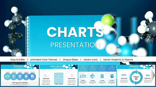
Chemical Test Keynote Charts - Instant Download | ImagineLayout


Type: Keynote Charts template
Category: Medicine - Pharma, Free Templates, Illustrations
Sources Available: .key
Product ID: KC00613
Template incl.: 18 editable slides
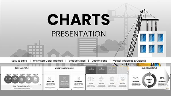
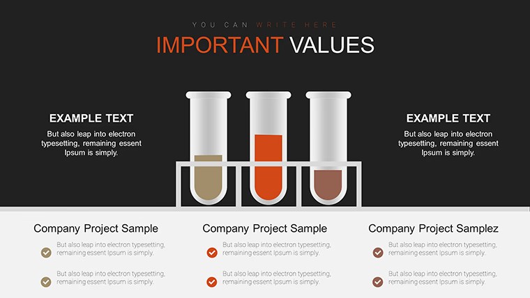
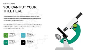
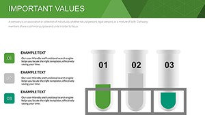
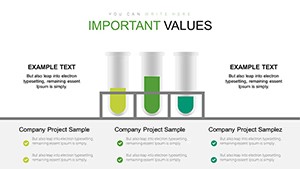
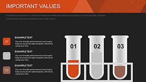
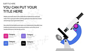
Free Chemical Test Keynote Charts Template
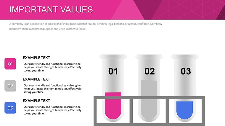
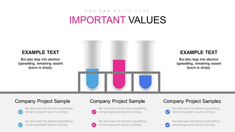
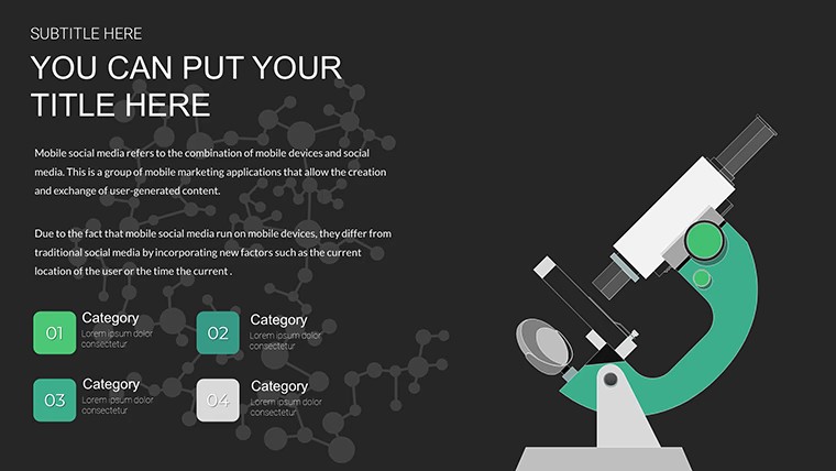
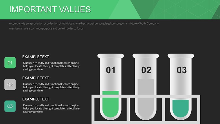
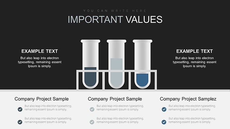
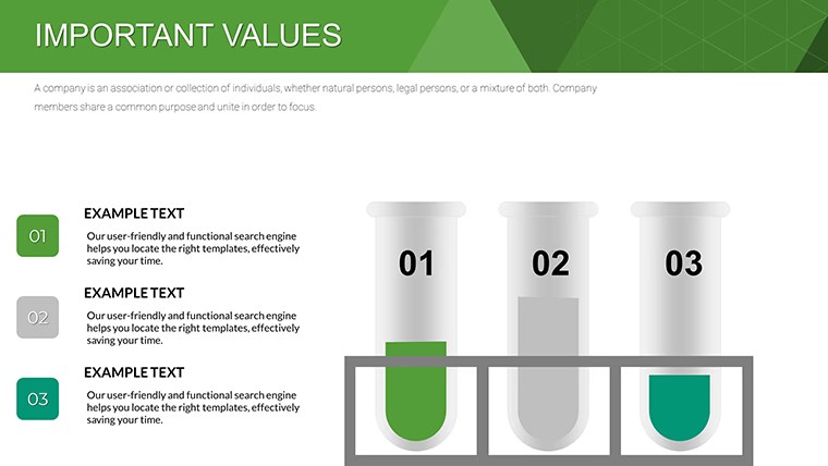
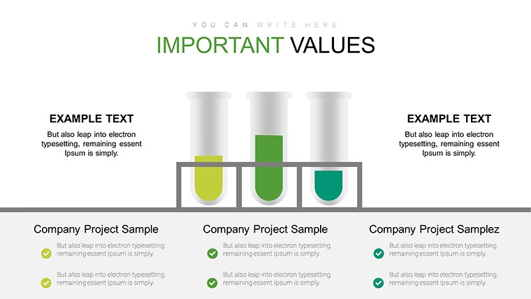
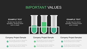
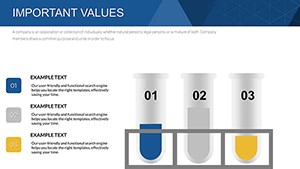
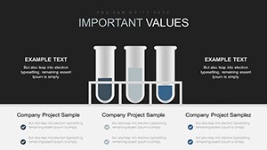
No generic charts here - 18 lab-themed graphs with pre-set schemes handle chemical data precisely.
Everything is already structured.
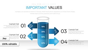
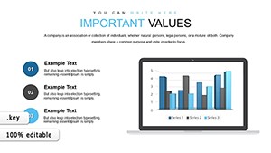
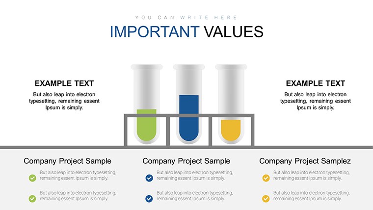
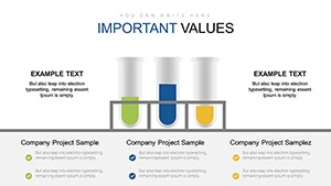
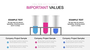
Vertical bars horizontal lines and circular pies sit inside airy layouts with lab color accents so trends and anomalies appear clearly without extra formatting.
Scientists insert reaction or test values into the predefined charts and the visuals stay balanced instead of rebuilding axes from scratch.
This free version supplies the full 18 editable slides with no paid difference listed.
You update colors through the slide master once and the entire set refreshes for consistent branding across multiple experiments.
The charts suit structured lab reporting yet they are not designed for narrative storytelling that needs illustrations or photos.
When you present experiment results to a research team the pre-built graphs replace manual plotting and keep every data point visible on one slide.
Typically you replace numbers and the layout remains intact for reuse in weekly progress updates.
Researchers and educators choose this Keynote charts template because the lab-themed visuals remove the time spent aligning standard chart tools.
It keeps structure readable on one slide so viewers focus on conclusions instead of deciphering crowded axes.
Not ideal for highly creative pitch decks that require custom iconography.
| Feature | Details |
|---|---|
| Slides / diagrams | 18 chemical test charts |
| File format | KEY |
| Software version | Keynote on Mac and iOS current installations |
| Color schemes | Lab pre-set schemes switch via slide master |
| Editable elements | Bars pies lines resize recolor independently |
| Aspect ratio | 16:9 standard |
| Free vs Paid | Fully free version with all 18 slides included |
| Masters / Backgrounds | Editable slide masters for quick palette switch |
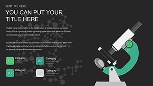
See also Biomedical Charts Keynote Template for Science and Lab Glassware Keynote Charts Template for Science.
How do I change colors across all slides?
Edit the slide master once and every diagram updates automatically. Select the chart element in master view to adjust fill or stroke. This applies the new scheme to the full deck in seconds.
Does the license allow client work?
The license permits use in client presentations as long as you do not resell or redistribute the original template files. One license covers one user for editing. Teams or agencies purchase additional copies for multiple editors.
What is the difference between free and paid versions?
This free version provides the complete set of 18 editable slides with no additional cost. No paid version appears on the page so the full content is available upfront. You download once and begin customizing immediately.
What are the refund conditions?
Digital downloads do not qualify for refunds once files are accessed due to instant availability. If the KEY file fails to open in your Keynote version contact support within 48 hours. Most cases receive a quick compatibility fix instead of refund.
Does the template support PDF or video export?
Export directly to PDF or video from Keynote with all charts preserved. Animations if present remain intact during export. Use standard Keynote export settings for best results.
Download and start editing immediately