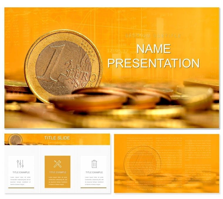
Envision distilling volatile markets into visuals that forecast fortunes, where lines trace triumphs and bars build bull cases. The Euro Bitcoin Gold Price Charts Keynote Template equips finance whizzes, analysts, and strategists to do just that. With 28 sophisticated diagrams, three master frameworks for trend overviews, and three neutral backgrounds, it decodes currency swings, crypto surges, and commodity climbs. Suited for investor updates, trading seminars, or portfolio reviews, it allows real-time data drops, animated forecasts, and scenario modeling - all powered by Keynote's precision.
It's the visual vault for economic narratives, blending Euro stability, Bitcoin volatility, and Gold's timeless appeal. Keynote 2016+ ready, the widescreen design fits trading floors or Zoom calls. Seven schemes - from metallic golds to digital blues - mirror asset vibes for thematic punch.
Charting Features: Precision in Every Plot
This isn't mere graphing; it's market mapping. Masters suit summaries, deep dives, and projections, with axes pre-scaled for financial feeds.
- 28 Advanced Diagrams: Candlestick arrays for Bitcoin ticks, line trends for Euro pairs, and bar stacks for Gold reserves.
- Background Basics: Grid lines or subtle waves for data dominance.
- Scheme Spectrum: Seven to denote bull/bear or risk/reward.
Revamp a volatility index: input API pulls, animate spikes to spotlight events, surpassing Keynote's stock tools in narrative depth.
From Data to Deck: Stepwise Setup
- Load the Ledger: Import .key, align master to asset focus.
- Plot Points: Feed series into traces, calibrate scales.
- Tint Trends: Apply scheme for instant asset coding.
- Forecast Forward: Output as interactive PDF for client drills.
Echoes Bloomberg terminal workflows, accelerating analysis to action.
Market Moves: Applications Across Finance
Hedge fund managers timeline Euro hedges against Gold safe-havens, embedding alerts for thresholds. Crypto traders chart Bitcoin halvings with cycle overlays, predicting peaks persuasively.
Educators model diversification pies, while execs radar global impacts from commodity fluxes.
Asset-Aligned Uses
For Traders: Multi-line forex vs. crypto comparisons.
For Advisors: Risk matrices blending all three assets.
For Academics: Historical trend timelines for lectures.
Like IMF reports visualized, it clarifies chaos.
Analyst Insights: Elevate Your Edges
Layer tooltips for hover details, or build sequences revealing correlations. Use ledger fonts for legibility, test on charts for accuracy. Vectors handle high-res zooms flawlessly.
Link to Excel for live refreshes, keeping decks as current as tickers. Yield: visuals that don't forecast - they foresee, guiding gains.
Plot your ascent? Acquire this Financial Charts Keynote Template for $22.
Frequently Asked Questions
Suitable for crypto and traditional assets?
Yes, diagrams adapt to Bitcoin volatility or Euro stability equally.
Data integration ease?
Seamless with CSV or direct pastes for quick updates.
Scheme variety?
Seven, each evoking asset characteristics.
Animation support?
Built for sequential reveals of trends.
File types?
.key and .kth for full flexibility.