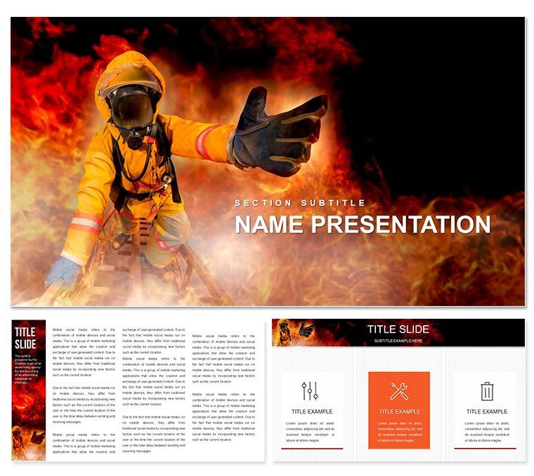
Picture this: You're leading a team through a high-stakes briefing on wildfire threats, where every slide needs to convey urgency without overwhelming your audience. That's where our Bushfire Risk Keynote Template steps in, transforming complex fire safety data into clear, visually striking narratives. Tailored for safety officers, environmental consultants, and enterprise leaders, this template equips you with 28 meticulously crafted diagrams, three versatile masters, and three dynamic backgrounds - all ready to adapt to your brand's voice. With seven color schemes ranging from earthy tones to alert reds, you can highlight risk zones, evacuation plans, or mitigation tactics in a way that resonates and motivates action.
Whether you're preparing for community workshops or corporate compliance reviews, these slides go beyond basic charts. Imagine layering in real-time data on fuel loads or wind patterns using the built-in editable vectors - effortlessly updating as conditions change. No more scrambling with generic tools; this Keynote template streamlines your workflow, letting you focus on the message that saves lives and properties. And at just $22, it's an investment in preparedness that pays dividends in clarity and confidence.
Core Features That Fuel Effective Presentations
At the heart of this template lies a suite of features designed to make your bushfire risk assessments not just informative, but unforgettable. Start with the three master slides, each optimized for different presentation flows: one for overview timelines, another for detailed risk matrices, and a third for action-oriented summaries. Pair them with backgrounds that evoke the natural landscape - subtle gradients of forest greens fading into warning oranges - to set an immersive tone from slide one.
The real power shines in the 28 diagrams, each one a standalone powerhouse. From radial maps plotting fire spread probabilities to layered infographics breaking down vegetation risks, every element is vector-based for infinite scalability. Switch between the seven color schemes with a single click: cool blues for prevention strategies, warm ambers for historical case reviews like the 2019-2020 Australian bushfires. These aren't static images; they're interactive canvases where you drag, drop, and tweak to fit your data story.
- Vector Precision: All icons and shapes resize without pixelation, perfect for zooming into hotspot analyses.
- Seamless Integration: Compatible with Keynote 2016 and later, pulling in live data from spreadsheets for dynamic updates.
- Accessibility Built-In: High-contrast options ensure readability for all viewers, aligning with safety communication best practices.
Unlocking the Diagrams: A Closer Look
Let's dive into a few standout slides to see how they bring bushfire risks to life. Slide 7's circular flowchart maps ignition sources - from lightning strikes to human error - allowing you to animate paths for dramatic effect. Or take Slide 14's comparative bar graphs: juxtapose pre- and post-mitigation scenarios side-by-side, using the amber scheme to underscore improvements. For educators, Slide 22's ecosystem impact timeline weaves in biodiversity stats, making abstract threats tangible.
Customization is intuitive: Select a diagram, swap colors via the scheme palette, and embed your logos without disrupting the flow. It's like having a design assistant who understands fire science, ensuring your visuals support rather than distract from critical insights.
Real-World Applications: From Field Reports to Boardrooms
In the world of emergency management, presentations aren't luxuries - they're lifelines. This template excels in scenarios where precision meets persuasion. For instance, a regional fire authority might use it to outline annual risk audits, leveraging the radial diagrams to visualize community vulnerability indices. The result? Stakeholders grasp priorities faster, leading to quicker resource allocation.
Consider an environmental NGO pitching conservation funding: Layer in satellite imagery overlays on Slide 19's map layouts, highlighting protected areas at risk. The template's flexibility shines here, as you resize elements to accommodate varying data densities. Or in corporate settings, HR teams adapt it for workplace safety drills, focusing on enterprise-specific hazards like industrial zones near bushland.
Step-by-Step: Building Your First Bushfire Deck
- Import and Orient: Open in Keynote, select a master slide, and import your risk assessment data via drag-and-drop.
- Visualize Threats: Populate diagrams with your metrics - e.g., assign fire intensity levels to the heatmap on Slide 10.
- Refine and Animate: Apply a color scheme, add subtle transitions to reveal layers, and test on a secondary display.
- Present with Purpose: Rehearse with the built-in presenter notes, pausing on key slides to drive home action items.
Users like regional planners have shared how this approach cuts prep time, letting them iterate based on feedback loops. It's not about flashy effects; it's about forging connections that spur preventive measures.
Why This Template Stands Out in Risk Communication
Compared to vanilla Keynote defaults, which often feel clinical and cluttered, this template infuses warmth and relevance. Where basic charts falter on context, our thematic icons - like flame motifs and shield symbols - reinforce the narrative without overwhelming. It's crafted with input from safety pros, ensuring layouts align with guidelines from bodies like the National Fire Protection Association.
Plus, the seven schemes cater to diverse needs: Monochrome for formal reports, vibrant for public awareness campaigns. Integrate it into your workflow alongside tools like GIS software for seamless data pulls, creating a hybrid of analytics and artistry.
Ready to safeguard your next presentation? Download the Bushfire Risk Keynote Template today for $22 and turn data into decisive action.
Frequently Asked Questions
What file formats are included?
The template comes in .key and .kth formats, fully compatible with Keynote on macOS.
Can I customize the color schemes?
Yes, each of the seven schemes is fully editable, allowing you to match your organization's branding.
Is this suitable for non-experts?
Absolutely - intuitive drag-and-drop editing makes it accessible for anyone familiar with Keynote basics.
How many backgrounds are there?
There are three backgrounds, each designed to complement the fire safety theme.
Does it support animations?
Keynote's native animation tools work seamlessly with all diagrams for engaging reveals.