Health - Wellness Brochures
Health brochures carry a different kind of weight than marketing materials. When a clinic administrator needs patient discharge instructions ready before Friday, or a wellness center is launching a six-week program and needs printed guides for 80 members, the layout has to do more than look presentable - it has to make the content scannable under pressure. This collection covers print-ready brochure layouts built specifically for health, wellness, medical, and fitness use cases, from tri-fold patient handouts to half-fold spa service guides.
The templates span a wide range of contexts: dental clinic overviews, cardiology patient education, massage and spa service menus, fitness program breakdowns, nutrition guides, and public health awareness materials. Each layout is structured with clear section hierarchy so readers can find what they need quickly - especially important when the audience is a patient or a first-time program member, not a professional reader.
Browse the collection and choose a layout that matches your communication goal and audience.
 (673)
(673) Heart Health Brochure - Instant Download | ImagineLayoutID: #BT01676$14.00
 (660)
(660) Heart Rhythms Brochure Template: Professional Designs for Cardiology EducationID: #BT01666$18.00
 (672)
(672) Healthy Sport Brochure - Fully Editable | ImagineLayoutID: #BT01662$14.00
 (330)
(330) Yoga Center Brochure TemplateID: #BT01546$14.00
 (1043)
Healthy Recipes Brochure TemplateID: #BT01527$15.00
(1043)
Healthy Recipes Brochure TemplateID: #BT01527$15.00 (969)
Lush Cosmetics Brochure Template: Infusing Wellness into Every FoldID: #BT01519$18.00
(969)
Lush Cosmetics Brochure Template: Infusing Wellness into Every FoldID: #BT01519$18.00 (1017)
Beauty Relaxation Techniques Brochure: Your Path to Serene GlowID: #BT01518$15.00
(1017)
Beauty Relaxation Techniques Brochure: Your Path to Serene GlowID: #BT01518$15.00 (1175)
Foot Treatment Brochure TemplateID: #BT01506$14.00
(1175)
Foot Treatment Brochure TemplateID: #BT01506$14.00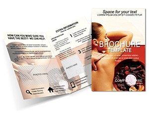 (1195)
Massage Spa Brochure TemplatesID: #BT01505$15.00
(1195)
Massage Spa Brochure TemplatesID: #BT01505$15.00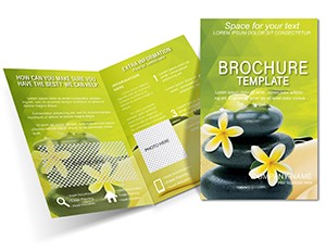 (1192)
Stone Massage Brochure Template: Classy Wellness PromotionID: #BT01420$15.00
(1192)
Stone Massage Brochure Template: Classy Wellness PromotionID: #BT01420$15.00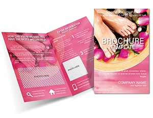 (217)
Feet Relaxation Brochure Template: Step into WellnessID: #BT01419$15.00
(217)
Feet Relaxation Brochure Template: Step into WellnessID: #BT01419$15.00 (1028)
Lose Weight Wellness Brochure TemplateID: #BT01390$18.00
(1028)
Lose Weight Wellness Brochure TemplateID: #BT01390$18.00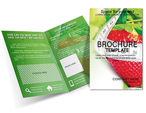 (457)
Strawberry Weight Loss Brochure Template: Fresh Designs for Fitness SuccessID: #BT01373$18.00
(457)
Strawberry Weight Loss Brochure Template: Fresh Designs for Fitness SuccessID: #BT01373$18.00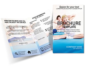 (418)
Yoga Brochure Template - Customizable Wellness DesignID: #BT01363$18.00
(418)
Yoga Brochure Template - Customizable Wellness DesignID: #BT01363$18.00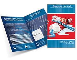 (44)
Tooth Care Brochure Design TemplateID: #BT01297$15.00
(44)
Tooth Care Brochure Design TemplateID: #BT01297$15.00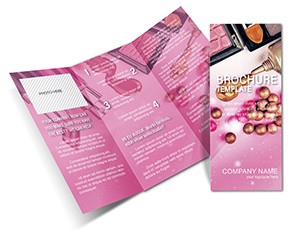 (1018)
Cosmetics and Perfumery Brochure TemplateID: #BT01296$18.00
(1018)
Cosmetics and Perfumery Brochure TemplateID: #BT01296$18.00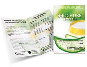 (733)
Aloe Vera Cream Brochure TemplateID: #BT01194$16.00
(733)
Aloe Vera Cream Brochure TemplateID: #BT01194$16.00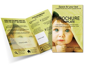 (946)
Adorable Baby Towel Half-Fold Brochure TemplateID: #BT01112$16.00
(946)
Adorable Baby Towel Half-Fold Brochure TemplateID: #BT01112$16.00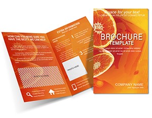 (955)
Fitness Orange Half-Fold Brochure Template: Energize Your Wellness OutreachID: #BT01041$14.00
(955)
Fitness Orange Half-Fold Brochure Template: Energize Your Wellness OutreachID: #BT01041$14.00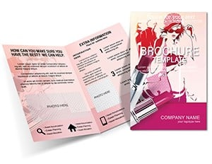 (1043)
Fashion and Lipstick Brochure Template: Glamour in Every FoldID: #BT01010$15.00
(1043)
Fashion and Lipstick Brochure Template: Glamour in Every FoldID: #BT01010$15.00 (305)
Dental Half-Fold Brochure - Print Ready | ImagineLayoutID: #BT00950$15.00
(305)
Dental Half-Fold Brochure - Print Ready | ImagineLayoutID: #BT00950$15.00 (1087)
Toothpaste Brochure Template: Your Guide to Brighter SmilesID: #BT00949$15.00
(1087)
Toothpaste Brochure Template: Your Guide to Brighter SmilesID: #BT00949$15.00 (109)
Happy Tooth Brochure Template: Smile-Worthy Marketing for Modern DentistryID: #BT00948$15.00
(109)
Happy Tooth Brochure Template: Smile-Worthy Marketing for Modern DentistryID: #BT00948$15.00 (163)
Dental Clinic Half-Fold Brochure - Print Ready | ImagineLayoutID: #BT00439$14.00
(163)
Dental Clinic Half-Fold Brochure - Print Ready | ImagineLayoutID: #BT00439$14.00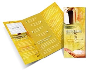 (1192)
Editable Beauty Spa Soap Brochure Design TemplateID: #BT00239$15.00
(1192)
Editable Beauty Spa Soap Brochure Design TemplateID: #BT00239$15.00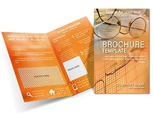 (1098)
Cardiogram Patient Brochure TemplateID: #BT00180$18.00
(1098)
Cardiogram Patient Brochure TemplateID: #BT00180$18.00
How brochure layout decisions affect whether patients actually read the content
Most people assume that if the information is correct, the document does its job. In practice, layout determines whether health content gets read at all. A nurse handing out post-procedure instructions has about 30 seconds of patient attention. If the key steps are buried in a paragraph of dense text, the patient leaves with the sheet, reads none of it, and calls the clinic the next day with questions the brochure already answered.
Structured brochure templates address that reality before a word of content is written. Panels are divided into scannable sections. Headings stand apart from body text. Lists replace paragraphs where sequence matters. That structure is not a design preference - it is how a document earns attention in a waiting room or a gym reception desk.
The templates in this collection are built with those constraints in mind. Whether the brochure is a tri-fold printed at a hospital print shop or a half-fold PDF sent to members before a yoga retreat, the visual hierarchy is already in place. Your job is to fill in the content, not design the information flow from scratch.
Four real-world scenarios where these templates solve the time problem
A clinic operations manager is preparing patient handouts for a new cardiology screening program launching in two weeks. She needs six different brochures covering different risk factors, each consistent in layout and tone. Starting from a blank Word document means six separate formatting decisions - column widths, heading sizes, spacing between sections. A consistent template set means she makes those decisions once and fills each version with the relevant content.
A fitness studio owner is expanding to a second location and wants printed materials ready for the opening week. The brochure needs to explain membership tiers, class schedules, and a 30-day trial offer - all on a half-fold layout that fits in a rack by the front desk. The template already accounts for how content flows across four panels, so he adjusts the text and brand colors without rebuilding the structure.
A public health coordinator at a regional hospital is preparing a campaign around preventive dental care for families in underserved communities. The brochure has to be readable at a sixth-grade level, visually approachable, and clear enough to act on without a follow-up appointment. A clean, low-decoration template with large section breaks and straightforward heading structure makes that possible without hiring a designer.
A cosmetics brand wellness coordinator is producing a leave-behind brochure for a spa partner event. The brochure needs to present a product line with brief descriptions and a QR code for online ordering. Here, the visual tone matters more than dense information - and a template designed for beauty and wellness content already balances imagery space with copy panels, so the layout does not need to be reinvented from a blank file.
Understanding the fold formats available in this collection
Not all brochures serve the same purpose, and the fold format is usually the first decision. The templates in this collection include both half-fold and tri-fold layouts, and choosing the right one depends on how much content you need to organize and where the brochure will live.
Half-fold brochures - where a single sheet is folded once to create four panels - work well for concise communications: a spa menu, a fitness class overview, or a simple patient welcome guide. They have enough space for a visual front panel, one or two content panels, and a back with contact information or a call to action.
Tri-fold brochures add two more panels and are better suited for content that benefits from logical progression: a step-by-step wellness program, a dental care guide covering prevention, treatment, and aftercare, or a public health campaign that needs to cover symptoms, risk factors, and where to seek help in a structured sequence.
If you are unsure which format fits your content volume, a useful test is to outline your headings first. If you have three to four distinct sections, a half-fold is likely sufficient. Five or more sections usually warrant a tri-fold to avoid crowding panels.
What makes dental and cardiology brochures a specific design challenge
Medical subspecialty brochures - dental care, heart health, and pharmacy-related materials - carry a layer of credibility responsibility that general wellness content does not. If a toothpaste brochure uses an awkward layout with inconsistent heading sizes, it looks informal. If a cardiology patient handout has crowded text and unclear section breaks, it looks unreliable.
Templates built for these categories tend to use more restrained color palettes - cooler tones, high contrast between headings and body text, and clear visual separation between sections. This is not arbitrary aesthetic preference; it reflects how institutional health documents establish trust with readers who may already be anxious about the subject matter.
The dental and cardiology templates in this collection follow that pattern. They provide space for anatomical or procedural imagery if needed, with copy panels that leave enough breathing room to keep the document legible and credible.
A practical editing sequence that saves rework later
Most template users make the same mistake: they adjust colors and fonts first, then try to fit their actual content into the design. This approach causes problems. The content rarely matches the template's default text volume, and resizing paragraphs after the design is locked creates misaligned panels and awkward white space.
A more reliable sequence is to write and place all content first - headings, body copy, bullet points, and any required contact details - at the template's default sizing. Once the content fits and the information flow reads correctly, then adjust colors, fonts, and any brand-specific elements. This order prevents the frustration of designing a layout that your content does not actually fit.
For print preparation: after your content is finalized, export to PDF and check that bleed margins are respected, fonts are embedded, and any images are at sufficient resolution for the intended print size. Most standard printing requires images at 300 DPI minimum. Low-resolution images that look acceptable on screen will appear pixelated on a printed brochure.
Technical note: print-ready export and font handling
When a brochure moves from screen to print shop, two issues cause the most problems: fonts that are not embedded and images that are low resolution. When you export your document to PDF, use the print-quality export setting rather than the standard or web setting. In Word, this option is found under File > Export > Create PDF/xPS, where you can enable high-quality output. In Adobe-compatible design tools, the export preset labeled "Press Quality" or "PDF/x-1a" embeds fonts and preserves color profiles correctly.
If your print shop requires a specific color mode - CMYK rather than RGB - check whether your editing software supports that conversion before export. Word's default color mode is RGB, which works for digital distribution but can shift slightly in printed output. For materials where color accuracy is important - branded wellness collateral, for example - it is worth confirming the mode with the printer before finalizing the file.
Why this collection is built differently from generic template marketplaces
A common frustration with general-purpose template marketplaces is that health and wellness brochure downloads are often repurposed from other categories - a business flyer reformatted with medical imagery, or a promotional layout reclassified as a patient handout. The structural logic does not match the use case.
The templates here are organized by actual communication purpose: patient education, fitness program promotion, spa and wellness services, dental care guidance, and public health campaigns. The layouts reflect those specific content needs - enough copy space for instructional content, section breaks appropriate for sequential information, and visual weight that prioritizes clarity over decoration.
Related categories for adjacent print and presentation needs
If your project involves print materials beyond the health and wellness category, the broader brochure template library covers industry categories including business, education, finance, and food and beverage - useful when a single organization needs materials across multiple departments. For healthcare organizations that also need slide presentations - for staff training, patient group sessions, or stakeholder reporting - the PowerPoint template collection includes layouts suited to clinical and corporate contexts. If your communication needs are primarily document-based rather than print-based, the Word template collection covers reports, policy documents, and structured written materials for the same professional contexts.
Browse the health and wellness brochure templates above to find a layout that fits your audience and content volume.
Frequently Asked Questions
Are these brochure templates ready for commercial printing?
Most templates in this collection are designed with print use in mind, including proportions suited to standard brochure paper sizes. Before sending to a commercial print shop, export your final document as a PDF using the highest quality setting available in your editing software - this ensures fonts are embedded and images are rendered at full resolution. Check that your print shop's required specifications match the file: common requirements include bleed margins (typically 3mm on each side), minimum image resolution of 300 DPI, and CMYK color mode for accurate color reproduction. Word-based templates export to RGB by default, so confirm with your printer whether a color mode conversion is needed before finalizing the file.
What software do I need to edit these brochure templates?
The editing software required depends on the file format of the specific template. Many templates in this collection are provided in Microsoft Word format (.docx), which means you can edit them in Word on Windows or Mac, or in Microsoft 365 online with most features intact. Some templates may be provided in other formats - always check the template's detail page before downloading to confirm compatibility with your available software. Word-based templates allow full editing of text, headings, colors, images, and layout elements without requiring design software. If you need to adjust column structures significantly, be aware that multi-column brochure layouts in Word can behave differently across versions, so review the layout in print preview before finalizing.
Can I use these templates for both printed handouts and digital distribution?
Yes, with one important consideration. Templates designed primarily for print use high-contrast layouts and clear typography that also translate well to PDF distribution - so a patient handout built from one of these templates will read clearly whether printed at a clinic or sent as an email attachment. If your primary channel is digital, you may find that some decorative elements or background colors render differently on screen versus in print. The safest approach is to test the PDF export on both a screen and a printer before distributing to larger audiences, especially for materials that will be used in both contexts simultaneously.
Can multiple people on my team edit the same brochure template?
Yes. Because most templates are provided as standard Word documents, they can be shared, stored on shared drives, and edited collaboratively using Word's built-in track changes and co-authoring features in Microsoft 365. For teams producing multiple brochures from the same template - for example, a clinic creating separate versions for different departments - it is worth saving one fully customized master version with your brand colors, logo placement, and preferred font already set. Team members then duplicate the master for each new brochure rather than reconfiguring brand elements each time. This approach also prevents accidental overwrites of the base template.
Are there licensing restrictions on using these brochures for patient-facing or commercial materials?
The license terms vary by template and are detailed on each individual template's product page. For most templates on ImagineLayout, the license covers both personal and commercial use, which means you can use the layout for clinic patient materials, branded wellness program guides, or fitness center promotional brochures without additional licensing fees. If you plan to distribute the material at large scale - for example, a public health campaign printing tens of thousands of copies - it is worth reviewing the specific license terms for the template you select to confirm there are no print-run restrictions.