Architecture - Estate Brochures
This collection delivers real estate brochure PowerPoint templates built for property marketing and architectural presentations. Each layout prioritizes image hierarchy, floor plan placement, and clear listing details - no decorative clutter. A real estate agent preparing a luxury listing brochure can drop images into a two-column spread and have consistent formatting across all pages in minutes, not hours. The column alignment here saves you the pain of manual margin adjustments.
When I opened a similar brochure set for a client launch, I checked spacing and image ratios first. These hold up. Choose a format, replace images, update specs, done. Browse the set and download the layout that fits your next board review.
 (286)
(286) Private Access Estate Brochure Template: Secure Your StoryID: #BT01574$14.00
 (1163)
 House Project Brochures templatesID: #BT01465$14.00
 (836)
Elegant Home Design Brochure TemplateID: #BT01464$18.00
(836)
Elegant Home Design Brochure TemplateID: #BT01464$18.00 (837)
Half Fold Real Estate Brochure Template - Fully Editable | Instant Download | ImagineLayoutID: #BT01254$14.00
(837)
Half Fold Real Estate Brochure Template - Fully Editable | Instant Download | ImagineLayoutID: #BT01254$14.00 (266)
Plumbing Repairs Brochure Template: Leak-Proof PresentationsID: #BT01197$15.00
(266)
Plumbing Repairs Brochure Template: Leak-Proof PresentationsID: #BT01197$15.00 (911)
Rental House Half-Fold Brochure TemplateID: #BT01142$18.00
(911)
Rental House Half-Fold Brochure TemplateID: #BT01142$18.00 (268)
Plumbing Tools Brochure Template: Pipe Up Your Professional PitchID: #BT01130$18.00
(268)
Plumbing Tools Brochure Template: Pipe Up Your Professional PitchID: #BT01130$18.00 (417)
Eco-Friendly Brochure Template for RenewablesID: #BT01113$14.00
(417)
Eco-Friendly Brochure Template for RenewablesID: #BT01113$14.00 (521)
Modern Design Apartment Brochure TemplateID: #BT01087$18.00
(521)
Modern Design Apartment Brochure TemplateID: #BT01087$18.00 (311)
Technology Construction Buildings Brochure Template - Modern ArchitectureID: #BT01068$18.00
(311)
Technology Construction Buildings Brochure Template - Modern ArchitectureID: #BT01068$18.00 (761)
(761) Premium Architecture Tri-Fold Brochure - Fully Editable | ImagineLayoutID: #BT01050$14.00
 (382)
Modern Construction Brochure Template - Blueprint for GrowthID: #BT01036$14.00
(382)
Modern Construction Brochure Template - Blueprint for GrowthID: #BT01036$14.00 (531)
Real Estate Housing Half-Fold Brochure TemplateID: #BT01025$18.00
(531)
Real Estate Housing Half-Fold Brochure TemplateID: #BT01025$18.00 (323)
Repairing Windows Brochure Design Template: Professional Marketing for Home Repair ExpertsID: #BT01018$16.00
(323)
Repairing Windows Brochure Design Template: Professional Marketing for Home Repair ExpertsID: #BT01018$16.00 (1101)
Homestead Tri-Fold Brochure - Instant Download | ImagineLayoutID: #BT00972$10.00
(1101)
Homestead Tri-Fold Brochure - Instant Download | ImagineLayoutID: #BT00972$10.00 (907)
(907) Architecture House Plans Brochure Template: Guide Clients to Dream HomesID: #BT00869$14.00
 (637)
Professional City Brochure - Fully Editable | ImagineLayoutID: #BT00709$10.00
(637)
Professional City Brochure - Fully Editable | ImagineLayoutID: #BT00709$10.00 (1074)
Repair Construction Tri-Fold Brochure Template: Professional Designs for Building and ReconstructionID: #BT00645$15.00
(1074)
Repair Construction Tri-Fold Brochure Template: Professional Designs for Building and ReconstructionID: #BT00645$15.00 (758)
Statue of Liberty Brochure - Print Ready | ImagineLayoutID: #BT00641$12.00
(758)
Statue of Liberty Brochure - Print Ready | ImagineLayoutID: #BT00641$12.00 (117)
Architecture Real Estate Property Brochure Template: Seal Deals with StyleID: #BT00551$19.00
(117)
Architecture Real Estate Property Brochure Template: Seal Deals with StyleID: #BT00551$19.00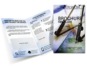 (1141)
Drawing Instruments Brochure Template: Half-Fold Precision DesignID: #BT00313$15.00
(1141)
Drawing Instruments Brochure Template: Half-Fold Precision DesignID: #BT00313$15.00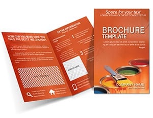 (143)
Paint Colors Half-Fold Brochure - Print Ready | ImagineLayoutID: #BT00178$12.00
(143)
Paint Colors Half-Fold Brochure - Print Ready | ImagineLayoutID: #BT00178$12.00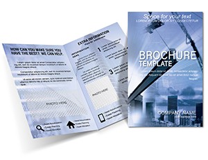 (795)
Construction of Buildings Brochure Template: Build Your Brand StrongerID: #BT00022$18.00
(795)
Construction of Buildings Brochure Template: Build Your Brand StrongerID: #BT00022$18.00
What a real estate brochure layout does that a presentation cannot
A brochure sits between a slide deck and a printed report. It tells a multi-page story without the compression of a presentation. When you open a real estate brochure template, you get spreads designed for sequential reading - not live delivery. The reader turns pages at their own pace, absorbs floor plans, property photos, and financial highlights side by side. That structure matters when a buyer compares multiple units or an investor reviews a development proposal. A PowerPoint deck pushes toward quick decisions; a brochure invites careful review. Choose this format when the reader needs time to evaluate details, not when you need to drive a single call to action in ten minutes.
Real-world scenarios from actual projects
Luxury listing agent, weekly open house preparation. The agent has high-resolution property photos but struggles to place them without breaking text flow. Opening a pre-built brochure template with two-column spreads solved the layout instantly. The image ratio held, captions aligned, and the agent completed the brochure in under an hour instead of three.
Architecture studio partner, pitch for a mixed-use development. The team needed to show concept sketches, floor plans, and financial summaries in one document. A slide deck felt too fragmented; a report felt too heavy. The brochure format forced clarity - image, detail, highlight, repeat. The client read it over the weekend and came back with specific questions, not generic feedback.
Real estate developer, investor packet for multiple units. Instead of emailing separate PDFs for each property, the developer compiled everything into a single structured brochure. Investors flipped through variations cleanly, compared unit sizes and amenities, and made faster decisions. The difference was having a consistent image hierarchy across every page - something that falls apart easily when built manually.
Property manager, quarterly portfolio update for stakeholders. The manager needed to summarize lease expirations, maintenance projects, and financial performance. A brochure allowed them to use tables for lease data and side-by-side images for before-after renovations. When I opened this collection for a similar client review, the thing that stood out was how stable the image boxes stayed after swapping content. No re-cropping, no realignment panic.
In-house marketing lead at a construction firm, project launch booklet. The firm had a new residential project and needed a leave-behind for potential buyers. The brochure template handled floor plans in one panel and finish selections in another. The lead edited the file Friday afternoon and had print proofs ready Monday morning. That speed comes from pre-set margins and typography - not from design heroics.
What breaks when you build a property brochure from scratch
Start with a blank document and you immediately face a cascade of small decisions. Column width, image placement, text wrapping, caption alignment, spacing between spreads. Each decision interacts with the next. Change one photo and the entire page layout can shift. I have watched teams spend three hours fixing margins that drifted because someone dragged an image a few pixels too far. These real estate brochure templates remove that repetition. The Slide Master holds the structure. Image frames are anchored, captions are linked to photo positions, and columns keep their width when you replace content. You focus on which property details to highlight, not on resetting indents for the fourth time.
When to choose this brochure collection over other formats
If you need a single-page summary or a purely internal document, Word templates give you faster editing with less visual complexity. If you are building a live pitch with sequential talking points, PowerPoint templates make more sense because they are designed for screen delivery. Brochures work for the middle ground: more visual than a Word doc, more detailed than a slide deck. Not every project needs one. But when a client or investor needs to study information - not just react to it - nothing replaces a well-structured brochure.
For marketing-heavy materials with heavy branding emphasis, compare brochure templates in other industries as well. The layout logic transfers, but industry-specific image ratios and content hierarchy vary.
Editing pain points specific to real estate brochures
Image ratio is critical. Swap a landscape photo for a portrait shot without adjusting the frame, and the layout breaks immediately. The image stretches or leaves awkward white space. Crop before inserting. Saves time later.
Text blocks are pre-sized for readability. Do not stretch them too much. It looks off. Small thing, but noticeable when a client compares two property descriptions side by side.
Bleed and margins matter for print. Most templates are set for standard brochure sizes, but always check printer settings before final export. Nothing ruins a print run like cut-off headers.
Technical observations from work inside PowerPoint and Keynote
Brochure templates in PowerPoint rely heavily on grouped shapes for layouts. When you ungroup to adjust a specific element, connector lines between text boxes and image frames can detach. Always duplicate the slide before significant ungrouping. In Keynote, transparency on overlapping photo frames can cause PDF export issues - flatten images before saving as PDF for print. For PowerPoint, embedded fonts sometimes fail when sending to commercial printers. Convert text to outlines or embed fonts explicitly in the export settings.
Why this collection stands apart
These layouts keep a rhythm that works both in print and on screen. Many marketplace templates pile on decorative elements that look good in previews but break under real content. This collection focuses on structural stability: column alignment, image hierarchy, and balanced white space. The tradeoff is limited heavy customization - you cannot rebuild the entire layout without effort. That tradeoff is intentional. You get a brochure that works out of the box, not a design experiment.
Navigate related formats
If you are working across multiple asset types, combine these brochures with postcard templates for direct mail follow-ups or with business card templates for consistent property branding. For purely internal documentation, explore Word templates to avoid over-visualizing information that only your team needs to read.
What file formats are included in this brochure collection?
These real estate brochure templates are delivered in editable PowerPoint (PPTX) format. From there, you can export to PDF for print or digital distribution. The templates also open in Keynote with minor formatting adjustments, but I recommend using PowerPoint for full layout stability, especially if your print shop requests native files. For commercial printing, always export as high-resolution PDF/X-1a to preserve bleed settings and color profiles. Quick and reliable is the goal - and that starts with choosing the right format for your printer.
Can I edit images and text easily without breaking the layout?
Yes, everything is editable. The images are placeholders, and the text blocks are standard. However, keep image proportions in mind. From experience, cropping your photos to match the original aspect ratio before inserting them saves a lot of fixes later. If you just drag a new image into the frame without adjusting its dimensions, you risk distorting the shot or leaving empty space. The layout holds up well under normal edits, but it is not magic - respect the frame sizes, and the design stays intact.
Are these brochures suitable for commercial print?
Usually yes, but it depends a bit on your printer settings. Most of these templates are set up for standard brochure sizes (like letter or A4) and include margins that respect typical bleed requirements. That said, always check the bleed and margin settings before final export. I have seen many print jobs ruined because someone assumed the template was ready and skipped the pre-flight check. Do a quick export test, compare it to your printer's specs, and adjust if needed. Nothing unusual here, but that one extra check saves a lot of reprints.
Can I significantly change the layout structure of these templates?
So basically, yes, but it takes effort. These are structured layouts, not freeform canvases. You can adjust sections, swap columns, and move elements, but major structural changes - like turning a three-panel spread into a single-page flyer - mean rebuilding parts of the design. The templates are opinionated about information hierarchy. For most users, small edits are enough: replace images, update text, tweak colors. If you need complete layout freedom, you are better off starting from a blank file, but then you lose all the pre-set spacing and alignment. Choose your tradeoff.
How do I keep text from overflowing when I add more content?
Text overflow happens when you ignore the pre-set character limits of the text frames. The template designers set those limits to maintain readability and visual balance. If your content is longer, do not just enlarge the font or stretch the box - that will throw off the whole page rhythm. Instead, edit the text to be more concise, or add a second page using the same master layout. From experience, trying to cram extra sentences into a fixed box is the number one reason a clean brochure starts to look messy. Respect the layout or accept that you will be reformatting for the next hour.
What is the licensing model for these real estate brochure templates?
It is the standard model. One purchase covers one project or organizational use. You can use the file for that specific property launch or client proposal. Teams often reuse the same template internally for multiple listings under the same project umbrella, but if you are scaling to hundreds of properties or redistributing the template file itself as a standalone product, check the license limits. Same as most template platforms. No hidden complexity, but also not unlimited redistribution. When in doubt, assume one license, one project.