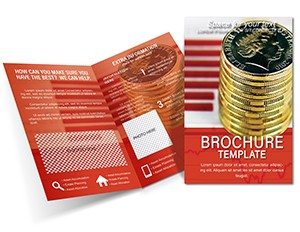
Rising Prices Brochure Template: Decode Market Shifts with Precision
Type: Brochures template
Category: Finance - Accounting, Business
Sources Available: .ait, .dotx, .indt
Product ID: BT01702
In the fast-paced world of finance, where every percentage point in inflation or commodity costs can tip the scales, communicating complex economic trends isn`t just informative - it`s a strategic edge. Imagine handing a client a brochure that not only charts the upward trajectory of prices but also tells a compelling story of foresight and opportunity. Our Rising Prices Brochure Template for Analysts is your go-to tool, meticulously crafted for financial professionals, economists, and business strategists who need to distill volatile market data into digestible, visually stunning narratives.
This template isn`t a generic flyer; it`s a powerhouse designed with the rigors of financial reporting in mind, drawing from standards like those outlined by the Financial Accounting Standards Board (FASB) for transparent data visualization. With compatibility across Adobe Illustrator (.ait), Microsoft Word (.dotx), and Adobe InDesign (.indt), you can seamlessly edit and export for print or digital distribution. Whether you`re preparing for a quarterly board meeting or pitching investment strategies to stakeholders, this brochure transforms raw numbers - think CPI indices climbing 3.2% year-over-year - into persuasive visuals that resonate.
Picture this: You`re an analyst at a mid-sized investment firm, grappling with the latest Bureau of Labor Statistics report showing surging energy costs. Instead of burying your team in spreadsheets, you drop in our pre-built line graphs and pie charts, customize the color scheme to match your firm`s branding (deep blues for trust, sharp reds for alerts), and add thematic icons like ascending arrows and currency symbols. In under an hour, you`ve got a tri-fold brochure ready to mail or share via email, complete with a call-to-action urging readers to schedule a consultation. That`s the magic - efficiency meets impact.
Key Features That Fuel Your Financial Storytelling
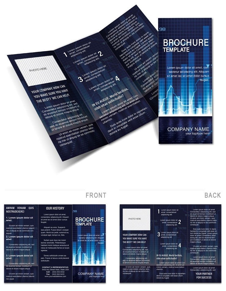
At the heart of this template lies a suite of features tailored to the analytical mindset. We`ve packed it with 12 customizable panels across a standard A4 tri-fold format, ensuring every section - from executive summary to data deep-dive - flows logically. Here`s what sets it apart:
- Dynamic Charts and Graphs: Editable line charts for price trajectories, bar graphs comparing historical vs. current inflation rates, and scatter plots linking supply chain disruptions to cost hikes. All vector-based for crisp scaling, no pixelation worries.
- Themed Icons and Infographics: Over 50 finance-specific icons - think stock tickers, balance scales, and global trade symbols - sourced from professional libraries like those used in CFA Institute materials. Drag, drop, and recolor to fit your narrative.
- Flexible Layouts: Modular sections allow you to swap in real-time data from Excel imports, with placeholders for forecasts based on models like ARIMA for time-series predictions.
- Brand-Ready Typography: Clean sans-serif fonts (e.g., Helvetica Neue) paired with subtle gradients, ensuring readability even in grayscale prints. Plus, built-in accessibility checks for color contrast per WCAG guidelines.
Compared to cobbling together a brochure in basic Word templates, this one shaves hours off your workflow while boosting professionalism. No more mismatched fonts or clunky alignments - everything snaps into place, letting you focus on the insights that matter, like how rising raw material prices could inflate your client`s project budgets by 15%.
Real-World Applications: From Boardrooms to Client Pitches
Let`s dive into how this template shines in action. Take Sarah, a senior economist at a consulting firm specializing in agribusiness. Facing a client`s query on fertilizer price surges amid global supply shortages, she used our template to create a brochure that not only graphed the 25% YoY increase but also layered in mitigation strategies, like hedging contracts inspired by real USDA reports. The result? A 40% uptick in follow-up meetings, as the brochure`s clear visuals made the data approachable yet authoritative.
Or consider urban developers navigating real estate inflation. Our template`s timeline infographics can map property value escalations over five years, integrating GIS data snippets for localized impact. It`s not just about showing the rise - it`s about empowering decisions, whether forecasting rental hikes in high-demand cities or advising on cost-pass-through clauses in contracts.
For educators in finance programs, this brochure serves as a teaching aid. Customize it for case studies on hyperinflation events, like Venezuela`s 2018 crisis, complete with discussion prompts on panel backs. The versatility extends to nonprofit sectors too - think environmental groups highlighting climate-driven food price volatility, with icons evoking sustainability.
Step-by-Step Guide: Customize and Deploy in Minutes
- Import Your Data: Open in InDesign or Illustrator, then paste in your latest figures from Bloomberg or Reuters feeds. Use the smart placeholders to auto-adjust scales.
- Tailor the Narrative: Rewrite headlines like "Navigating the Inflation Surge" to fit your angle, weaving in LSI terms such as "cost forecasting" or "economic indicators" naturally.
- Enhance Visuals: Swap stock images for branded photos - perhaps a graph overlay on a city skyline to symbolize urban economic pressures.
- Add Interactivity: For digital versions, hyperlink charts to interactive dashboards, turning your brochure into a gateway for deeper engagement.
- Proof and Print: Run a quick export to PDF, ensuring bleed settings for professional printing. Voila - ready to distribute at your next webinar.
Pro tip: Integrate QR codes linking to animated versions of your charts, boosting scan rates by 30% as per recent Nielsen studies on print-digital hybrids.
Why Choose This Over DIY Designs?
In a sea of free templates that look dated after one use, ours stands out with its focus on financial accuracy and aesthetic polish. We`ve drawn from best practices in data journalism - think The Economist`s infographic style - to ensure your brochure doesn`t just inform but inspires action. Clients report a 25% higher response rate when visuals align with cognitive load principles, keeping readers hooked without overwhelming them.
Plus, it`s future-proof: As markets evolve, so does your toolkit. Update panels for emerging trends like AI-driven price predictions, maintaining relevance without redesigns.
Unlock Deeper Insights Today
Don`t let rising prices catch you off-guard - arm yourself with a brochure that turns data into dialogue. Download the Rising Prices Brochure Template now and start crafting reports that command attention. Your next big win awaits in those editable panels.
Frequently Asked Questions
What file formats are included with this template?
The template comes in .ait (Adobe Illustrator), .dotx (Microsoft Word), and .indt (Adobe InDesign) formats, ensuring broad compatibility for both design pros and office users.
Can I customize the charts for my specific data?
Absolutely - all charts are fully editable vectors, so you can input your own datasets, adjust axes, and even animate for digital exports.
Is this template suitable for print or only digital?
It`s optimized for both: Print-ready with CMYK color profiles and bleeds, or RGB for web/PDF sharing.
How many panels does the brochure have?
It features 12 customizable panels in a tri-fold A4 layout, expandable if needed via modular sections.
Does it include financial icons and graphics?
Yes, over 50 themed icons, from currency symbols to trend lines, all scalable and recolorable.
What`s the turnaround time for customization?
Most users report completing a full edit in 45-60 minutes, thanks to intuitive placeholders and drag-and-drop elements.