AI Won't Replace Presentation Designers — Designers Who Use AI Will
The designers losing work aren't losing it to a chatbot — they're losing it to a colleague who figured out the workflow first.
Design tips, tutorials, product updates, and industry insights.
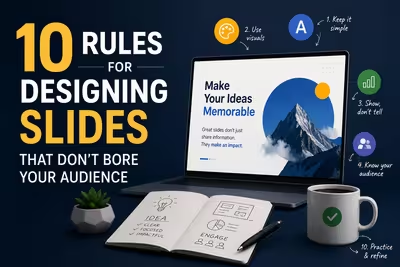
Tired of blank stares during your presentations? These 10 practical slide design rules help you keep attention without gimmicks or clutter.

Learn what separates pitch decks investors fund from ones that get ignored — structure, pacing, and the slides founders usually get wrong.
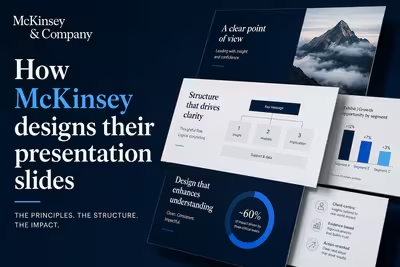
McKinsey's slide design isn't about polish — it's a structured argument system. Here's how the Pyramid Principle actually works in practice.

The designers losing work aren't losing it to a chatbot — they're losing it to a colleague who figured out the workflow first.

A $20 presentation template can make a slide look polished in minutes. But does polished automatically mean professional? Usually, the answer is more complicated.

Learn how to structure a business recovery program presentation that turns damage assessment, funding needs, priorities, and timelines into a clear recovery case.
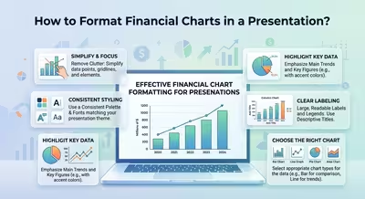
Learn how to format financial charts in a presentation so trends, variances, forecasts, and cash flow are clear, credible, and easy to read.
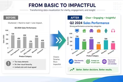
A strong before-and-after infographic does more than show two states. Learn how to structure the comparison so the change is instantly understood.
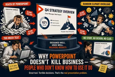
PowerPoint rarely causes bad business decisions. Bad thinking, weak storytelling, and poorly constructed slides do.
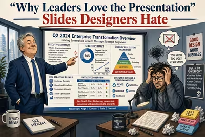
Why do executives prefer “boring” presentation slides? Discover why clarity, speed, structure, and decision-making often beat impressive visual design.
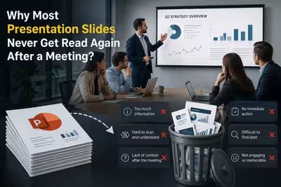
A presentation can work perfectly in the meeting and still become useless afterward. Here is why people rarely reopen business decks—and what makes a presentation worth revisiting.
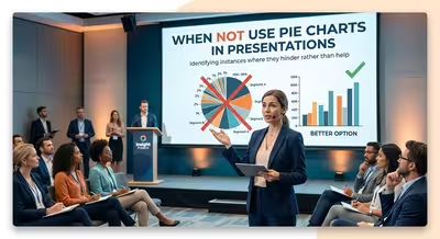
Pie charts can make a slide look polished while making the underlying comparison harder to understand. Here are the situations where another chart works better.