A PowerPoint deck can look inconsistent even when every slide uses the same colors and fonts. The usual culprit is not the color palette — it is the structure underneath the slides.
If you are creating a presentation with repeated titles, footers, page numbers, logos, content areas, or recurring visual patterns, Slide Master is the part of PowerPoint that lets you control those elements centrally. The trick is knowing what belongs on the master, what belongs on a layout, and what should remain editable on an individual slide.
What Slide Master Actually Controls
Think of Slide Master as the structural layer behind your presentation rather than a formatting shortcut.
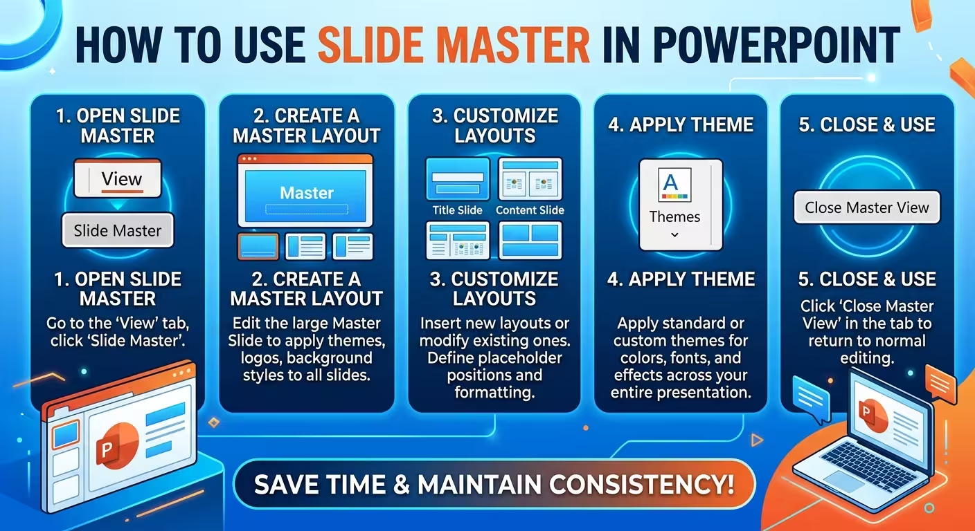
When you open View > Slide Master, PowerPoint shows a large master slide followed by a group of layouts associated with it. Changes made to the master can affect slides that use its layouts, while each layout can define a more specific arrangement of placeholders and recurring elements.
This distinction matters. A master might establish the overall typography, background treatment, or position of a persistent brand element. A layout might then define a two-column content structure, a title-and-chart arrangement, or a section divider.
Microsoft describes layouts as containing the formatting, positioning, and placeholders used for slide content. That makes layouts the more useful level for controlling how a particular type of slide is constructed.
A practical hierarchy is:
- Slide Master: presentation-wide rules and recurring structural elements.
- Layout: the reusable architecture for a specific kind of slide.
- Normal view: the actual content and one-off adjustments on individual slides.
Once you see those three levels separately, Slide Master becomes much easier to use.
How to Open and Edit Slide Master
Start with a presentation where you already know the visual direction. Then go to View > Slide Master.
The large thumbnail at the top is the master. The smaller thumbnails beneath it are its layouts. Microsoft recommends making master and layout changes before building the individual slides when possible, because later changes may require existing slides to have their layouts reapplied.
Before changing anything, scan the existing layouts. You will often find several variations that look almost identical. That is a good moment to simplify rather than immediately start editing.
For a professional deck, I would usually establish these elements first:
- theme fonts and the basic typography hierarchy;
- theme colors and background treatment;
- persistent footer or page-number positions;
- brand elements that genuinely need to repeat;
- the approximate content boundaries of the main layouts.
PowerPoint allows you to change colors, fonts, effects, placeholders, backgrounds, and other master-level settings from Slide Master view.
Then select Close Master View and return to Normal view to test the result.
Use Layouts for Structure, Not Just Decoration
This is where many Slide Master setups become unnecessarily complicated.
Suppose your presentation needs three recurring slide types: a standard text slide, a slide with a large chart, and a section divider. You do not need three completely different visual systems. You need three layouts built from the same underlying design language.
For example, a chart layout might reserve a wide area for the chart and a smaller region for the takeaway. A comparison layout might create two equal content zones. A section layout might remove most content placeholders and give the title much more space.
The important part is that the layout describes the job of the slide. It should not simply be a collection of decorative arrangements.
To create or modify one, stay in Slide Master view and select an existing layout or use Insert Layout. You can add, remove, resize, or reposition placeholders there.
Then, in Normal view, select a slide and choose Home > Layout to apply the structure you created.
This workflow is much more reliable than manually drawing text boxes and content areas on every slide. If the layout needs to change later, you have one definition to update instead of a collection of individually positioned objects.
Know What Belongs on the Master — and What Does Not
The easiest way to damage a useful Slide Master is to put too much on it.
A logo that must appear on every slide may belong there. A page-number position may belong there. A fixed background element may belong there.
But a decorative object that only makes sense on one particular slide usually should not be locked into the master just because it looks good in the first draft.
There is a useful test: if a presenter might reasonably need to change, remove, or reposition the object on one slide, think twice before putting it on the master.
This is especially important with charts, illustrations, callout boxes, and section-specific graphics. Putting them on the master can make a deck appear consistent while quietly making it harder to edit.
There is another practical warning: when an element seems impossible to select in Normal view, check Slide Master. It may be defined by the master or one of its layouts rather than being a normal slide object. Microsoft specifically identifies this as a common reason an element cannot be edited directly on a slide.
How to Apply a Slide Master to Existing Slides
This is where the difference between designing a template and repairing an existing deck becomes obvious.
If you modify a layout after slides have already been created, those slides do not necessarily behave exactly as you expect. Microsoft notes that existing slides may need the changed layout to be reapplied after a layout master is modified.
A practical workflow is:
- Open View > Slide Master.
- Modify the required master or layout.
- Close Master View.
- Select the existing slide or group of slides.
- Open Home > Layout.
- Select the appropriate layout again.
- Check the slide for content that may have been repositioned or resized.
Do not blindly reapply layouts to an entire deck and assume the job is finished. A layout controls the structure, but the content still has to fit that structure. A title that was manually forced into an unusual position, for example, may move when the underlying layout is reapplied.
For large presentations, I prefer to fix the layout system first and then inspect representative slides from each section rather than manually repairing slides one by one from the beginning.
When One Slide Master Is Not Enough
There is a temptation to treat one master as a rule that every slide in the presentation must obey. That is not how PowerPoint has to work.
PowerPoint supports multiple slide masters in the same presentation. Microsoft documents this as a way to use different themes or visual systems within one file. :contentReference[oaicite:8]{index=8}
This can be useful when a deck genuinely contains different visual environments. A corporate presentation might use one master for the main business narrative and another for an appendix with a different information density. A training deck might separate instructional slides from assessment or activity slides.
The important word is genuinely. Multiple masters should solve a structural problem, not compensate for uncontrolled formatting.
If two sections only need different layouts, keep them under the same master. If they require fundamentally different themes, typography, backgrounds, or design rules, a second master may be justified.
Turn a Good Slide Master into a Reusable Template
Once the master and layouts are stable, you can turn the presentation structure into a reusable PowerPoint template.
Microsoft's template workflow uses a modified slide master and its layouts, which can then be saved as a .potx PowerPoint template.
This is where Slide Master becomes more than a cleanup tool. A well-built master can become the foundation for recurring reports, sales decks, internal reviews, proposals, or other presentation formats where the same structural decisions appear repeatedly.
If you are starting from a professionally designed PowerPoint file rather than building the visual system from scratch, the same principle applies. Browse PowerPoint presentation templates for a starting structure, then inspect how the master and layouts support the slides you actually need.
For example, a technology-focused deck may benefit from a template with layouts already designed around diagrams, process flows, or technical content rather than forcing every slide into a generic title-and-content structure. ImagineLayout's Computer Software PowerPoint template is one example of a presentation asset built around a specific subject rather than a completely neutral slide system.
The Slide Master Workflow I Would Use on a Real Deck
If I were setting up a new presentation from scratch, I would resist the urge to design every possible layout immediately.
I would start with the slides the presentation actually needs, identify the repeated structures, and then build the master around those patterns.
A practical sequence looks like this:
- Define the visual system: typography, colors, background, and persistent elements.
- Identify recurring slide jobs: title, section divider, standard content, comparison, chart, diagram, closing, and so on.
- Create only the layouts that solve those jobs.
- Build a few real slides using the layouts.
- Look for friction: placeholders that are too small, titles that collide with content, or layouts that force awkward compositions.
- Refine the layouts rather than fixing the same problem manually on every slide.
That last step is the part people often miss. Slide Master is not primarily about making a presentation look consistent. It is about moving repeated design decisions upstream, so that individual slide editing is reserved for decisions that are actually unique to the content.
Once the system is working, the individual slides should become easier to build — not more constrained. If using Slide Master makes every slide feel like it is fighting a template, the problem is usually not that PowerPoint is too restrictive. The master or its layouts are probably carrying decisions that belong at the slide level.
Comments (0)