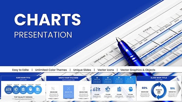
Venn PowerPoint Charts
Formerly known as venn powerpoint chart templates - this collection now covers venn diagrams for business analysis.
A product manager mapping feature overlaps for the next roadmap or a finance analyst comparing quarterly performance across departments can drop their data into the pre-sized circles and keep the entire deck consistent.
The slide master already contains aligned text frames and color palettes so you avoid the manual resizing that usually breaks hierarchy across 20 slides. consistent chart formatting lets departments share the same visual language.
Open the collection and choose the layout that fits your comparison.
 (594)
(594) Business Financial PowerPoint Charts - Drive DecisionsID: #PC01036$25.00
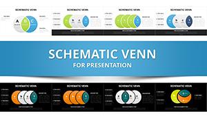 (377)
(377) Schematic Venn Diagram PowerPoint TemplateID: #PC00295$20.00
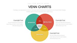 (560)
Venn Diagram PowerPoint Template - Fully Editable | Instant DownloadID: #PC00885$12.00
(560)
Venn Diagram PowerPoint Template - Fully Editable | Instant DownloadID: #PC00885$12.00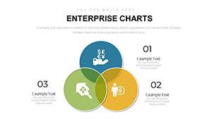 (692)
(692) Enterprise PowerPoint Charts Template: Elevate Business InsightsID: #PC00883$14.00
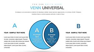 (533)
(533) Venn Diagram PowerPoint Charts - Editable PPTX | ImagineLayoutID: #PC00873$18.00
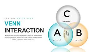 (478)
Graphic Venn PowerPoint Charts Template: Visualize Connections EffortlesslyID: #PC00871$22.00
(478)
Graphic Venn PowerPoint Charts Template: Visualize Connections EffortlesslyID: #PC00871$22.00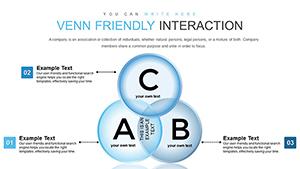 (665)
Venn Friendly Interaction PowerPoint Charts Template: Foster Engaging DialoguesID: #PC00870$22.00
(665)
Venn Friendly Interaction PowerPoint Charts Template: Foster Engaging DialoguesID: #PC00870$22.00 (1057)
Customizable PowerPoint Charts Template: Master Data VisualizationID: #PC00867$17.00
(1057)
Customizable PowerPoint Charts Template: Master Data VisualizationID: #PC00867$17.00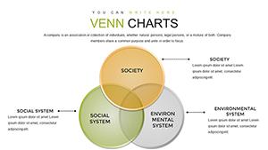 (1071)
Science Technology Society Venn PowerPoint Charts: Uncover IntersectionsID: #PC00863$20.00
(1071)
Science Technology Society Venn PowerPoint Charts: Uncover IntersectionsID: #PC00863$20.00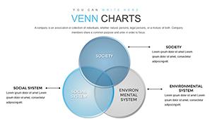 (231)
Venn Diagrams PowerPoint Charts: Unlock Problem-Solving PotentialID: #PC00862$19.00
(231)
Venn Diagrams PowerPoint Charts: Unlock Problem-Solving PotentialID: #PC00862$19.00 (508)
Superimposed Boundary Sheets PowerPoint Charts - Instant Download | ImagineLayoutID: #PC00849$14.00
(508)
Superimposed Boundary Sheets PowerPoint Charts - Instant Download | ImagineLayoutID: #PC00849$14.00 (652)
4CS and 7PS Marketing Mix PowerPoint Charts TemplateID: #PC00833$15.00
(652)
4CS and 7PS Marketing Mix PowerPoint Charts TemplateID: #PC00833$15.00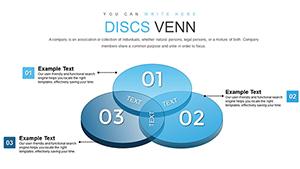 (1174)
3D Venn PowerPoint Charts Template: Visualize Relationships DynamicallyID: #PC00811$22.00
(1174)
3D Venn PowerPoint Charts Template: Visualize Relationships DynamicallyID: #PC00811$22.00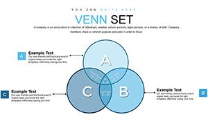 (91)
Venn Unions and Intersections PowerPoint Charts TemplateID: #PC00810$18.00
(91)
Venn Unions and Intersections PowerPoint Charts TemplateID: #PC00810$18.00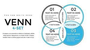 (421)
4-Set Venn PowerPoint Charts - Fully Editable | ImagineLayoutID: #PC00790$20.00
(421)
4-Set Venn PowerPoint Charts - Fully Editable | ImagineLayoutID: #PC00790$20.00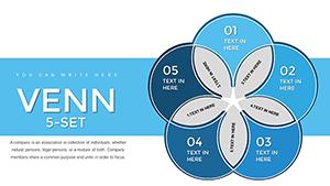 (441)
5-Set Venn Diagram PowerPoint - Fully Editable PPTX | ImagineLayoutID: #PC00789$20.00
(441)
5-Set Venn Diagram PowerPoint - Fully Editable PPTX | ImagineLayoutID: #PC00789$20.00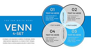 (595)
4-Set Venn Diagram PowerPoint Template: Visualize Complex IntersectionsID: #PC00788$22.00
(595)
4-Set Venn Diagram PowerPoint Template: Visualize Complex IntersectionsID: #PC00788$22.00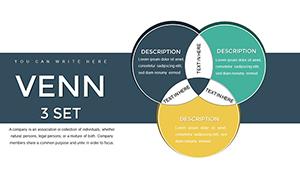 (43)
Venn - 3 Set PowerPoint ChartsID: #PC00787$22.00
(43)
Venn - 3 Set PowerPoint ChartsID: #PC00787$22.00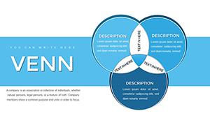 (673)
Professional Venn Diagram PowerPoint Template | Editable Charts for Business PresentationsID: #PC00786$22.00
(673)
Professional Venn Diagram PowerPoint Template | Editable Charts for Business PresentationsID: #PC00786$22.00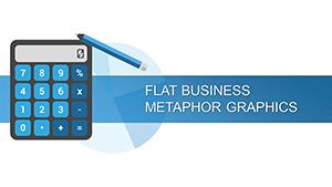 (93)
Flat Business Metaphor Graphics PowerPoint Charts TemplateID: #PC00712$22.00
(93)
Flat Business Metaphor Graphics PowerPoint Charts TemplateID: #PC00712$22.00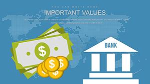 (898)
Banking PowerPoint Charts TemplateID: #PC00703$24.00
(898)
Banking PowerPoint Charts TemplateID: #PC00703$24.00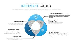 (482)
Venn PowerPoint Charts: Visualize Overlaps with EaseID: #PC00668$22.00
(482)
Venn PowerPoint Charts: Visualize Overlaps with EaseID: #PC00668$22.00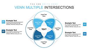 (639)
Venn Intersection PowerPoint Charts: Illuminate Overlaps and ConnectionsID: #PC00625$14.00
(639)
Venn Intersection PowerPoint Charts: Illuminate Overlaps and ConnectionsID: #PC00625$14.00 (84)
Research and Innovation PowerPoint Charts Template: Spark BreakthroughsID: #PC00538$19.00
(84)
Research and Innovation PowerPoint Charts Template: Spark BreakthroughsID: #PC00538$19.00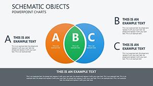 (440)
Circle Venn PowerPoint Charts Template: Master Relationships in VisualsID: #PC00098$16.00
(440)
Circle Venn PowerPoint Charts Template: Master Relationships in VisualsID: #PC00098$16.00 (793)
Dynamic Venn Flow PowerPoint Charts: Visualize Data Relationships EffortlesslyID: #PC00490$17.00
(793)
Dynamic Venn Flow PowerPoint Charts: Visualize Data Relationships EffortlesslyID: #PC00490$17.00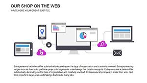 (846)
Web Stores PowerPoint Charts Template: Optimize Your Online OperationsID: #PC00455$18.00
(846)
Web Stores PowerPoint Charts Template: Optimize Your Online OperationsID: #PC00455$18.00 (581)
Venn Animation PowerPoint Charts: Illuminate Data RelationshipsID: #PC00434$18.00
(581)
Venn Animation PowerPoint Charts: Illuminate Data RelationshipsID: #PC00434$18.00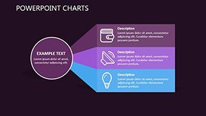 (667)
Mortgage Transfer PowerPoint Charts: Simplify Complex Financial ProcessesID: #PC00421$18.00
(667)
Mortgage Transfer PowerPoint Charts: Simplify Complex Financial ProcessesID: #PC00421$18.00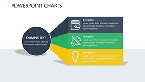 (666)
Transfer Credits PowerPoint Charts: Mastering Financial TransitionsID: #PC00420$18.40
(666)
Transfer Credits PowerPoint Charts: Mastering Financial TransitionsID: #PC00420$18.40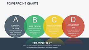 (997)
Personality Types PowerPoint Charts Template: Decode Human DynamicsID: #PC00393$15.00
(997)
Personality Types PowerPoint Charts Template: Decode Human DynamicsID: #PC00393$15.00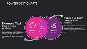 (230)
Choice and Estimation PowerPoint Template: Versatile Charts for Decision-MakingID: #PC00366$14.00
(230)
Choice and Estimation PowerPoint Template: Versatile Charts for Decision-MakingID: #PC00366$14.00 (167)
Analysis Choice PowerPoint Template: Customizable Data Visualization ChartsID: #PC00365$14.00
(167)
Analysis Choice PowerPoint Template: Customizable Data Visualization ChartsID: #PC00365$14.00
Why Teams Turn to Venn Diagrams When Words Alone Fall Short
When three product lines share features but each has unique strengths, a single slide with overlapping circles communicates the relationships faster than bullet lists. These templates give you the structure so the conversation moves to strategy instead of layout fixes.
Do the Templates Handle Four or Five Circle Overlaps Without Layout Breaks?
Yes. Each multi-circle version uses grouped editable shapes that maintain alignment when you resize or recolor. The slide master keeps spacing consistent even when you add or remove circles.
How to Pair Venn Charts With Other Visuals in the Same Deck
Place the Venn slide immediately after a data table or bar chart. The overlapping areas then serve as a summary that ties the numbers together visually for the audience.
Four Real Business Moments These Templates Simplify
The strategy lead at a SaaS company used the three-circle version to show how new features overlapped with competitor offerings. Stakeholders instantly saw the differentiation gaps and approved the roadmap the same meeting.
A market researcher compared customer segments for a retail brand. The four-circle template let her highlight the shared pain points across demographics while keeping unique segments clearly separated.
An operations manager illustrated process overlaps between two departments. Using the Venn layout reduced a 45-minute explanation to one slide that the team referenced for months afterward.
A training facilitator taught set theory concepts to new analysts. The animated reveal version walked through each intersection step by step, making abstract ideas concrete without extra diagrams.
The Hidden Cost of Drawing Venn Circles Manually
You spend time aligning circle centers, matching stroke weights, and ensuring text stays readable inside intersections. These micro-decisions multiply across a 30-slide deck and distract from the actual insight you want to deliver.
Non-Obvious Tip for Long-Term Reuse
Save your customized Venn slide as a separate layout in the slide master. Next quarter you only update the text and data-every alignment and color rule stays locked.
Technical Tip for PowerPoint Users Working With Venn Charts
When linking Excel data to the chart objects, use the "edit data" option rather than paste special. This keeps the circles proportional automatically when source numbers change, preventing manual repositioning later.
What Sets These Versions Apart
They contain only the elements needed for clear communication-no extra decorative icons or unnecessary gradients that compete with your data.
If your work includes printed materials see our holiday postcard templates. For Keynote users explore internet ecommerce Keynote templates or the companion Venn diagram PowerPoint templates.
Pick the layout that matches your next comparison and start editing.
Venn Diagram PowerPoint Templates FAQ
Are these templates compatible with Google Slides as well?
Yes, every file imports cleanly into Google Slides with all circles, text frames, and colors preserved. Minor animation adjustments may be needed but the core editable shapes remain fully functional.
Can I change the number of circles after opening the file?
Yes. All versions use grouped editable shapes so you can duplicate or delete circles while the alignment guides on the slide master keep everything centered and spaced correctly.
Do the files support team editing in PowerPoint?
Yes. Store on OneDrive or SharePoint and co-authoring works seamlessly. Changes to the slide master propagate to every slide for all users simultaneously.
How do I keep fonts consistent when exporting to PDF?
Choose “embed fonts†in the PDF export dialog. This locks the exact typography you chose inside the circles so recipients see the same hierarchy regardless of their PowerPoint version.