Analysis Keynote Diagrams
This collection includes analysis diagram templates for Keynote, built for people who actually present decisions, not just ideas. Think consultants, analysts, product leads. The layouts focus on breaking complex input into something readable in one slide, which is usually the real problem.
In a typical scenario, a strategy manager preparing a quarterly review deck needs to show trade-offs, not just data. That is where these diagrams fit. They structure the thinking before the visuals. And honestly, that saves more time than any design tweak. The column alignment here actually saves you a lot of pain.
Browse the set and find a layout that matches your next working session, not just the final presentation.
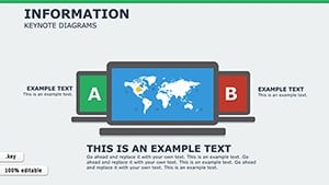 (121)
(121) Information Keynote Diagrams TemplateID: #KD00205$20.00
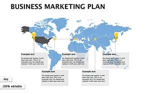 (720)
(720) Business Marketing Plan Keynote TemplateID: #KD00194$18.00
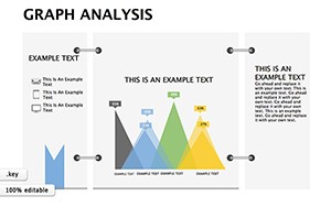 (1054)
Graph Analysis Keynote Diagrams: Illuminating Architectural InsightsID: #KD00185$15.00
(1054)
Graph Analysis Keynote Diagrams: Illuminating Architectural InsightsID: #KD00185$15.00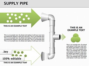 (56)
Supply Pipe Keynote Diagrams: 3D Visuals for Operational FlowsID: #KD00145$25.00
(56)
Supply Pipe Keynote Diagrams: 3D Visuals for Operational FlowsID: #KD00145$25.00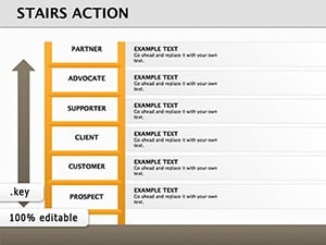 (1115)
 Stairs Action Keynote Diagrams for Progressive Business VisualsID: #KD00141$17.00
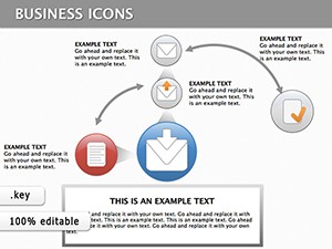 (173)
Keynote Finance Icons DiagramsID: #KD00133$18.00
(173)
Keynote Finance Icons DiagramsID: #KD00133$18.00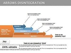 (1171)
Disintegration Arrows Keynote Diagram TemplateID: #KD00123$24.00
(1171)
Disintegration Arrows Keynote Diagram TemplateID: #KD00123$24.00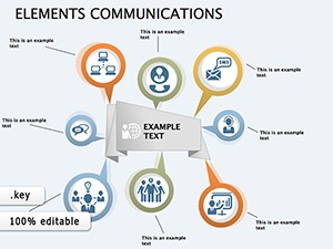 (214)
Communication Diagrams Template for Keynote PresentationsID: #KD00122$18.00
(214)
Communication Diagrams Template for Keynote PresentationsID: #KD00122$18.00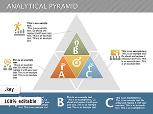 (366)
Analytical Pyramid Keynote TemplateID: #KD00121$24.00
(366)
Analytical Pyramid Keynote TemplateID: #KD00121$24.00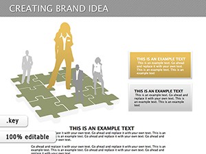 (230)
Creating Brand Idea Keynote Diagrams TemplateID: #KD00117$23.00
(230)
Creating Brand Idea Keynote Diagrams TemplateID: #KD00117$23.00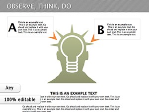 (383)
Observe, Think, Do: Keynote Diagrams Template for PresentationsID: #KD00116$16.00
(383)
Observe, Think, Do: Keynote Diagrams Template for PresentationsID: #KD00116$16.00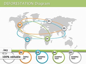 (322)
Causes of Deforestation Keynote Diagram TemplateID: #KD00112$19.00
(322)
Causes of Deforestation Keynote Diagram TemplateID: #KD00112$19.00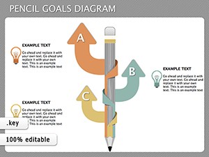 (715)
Pencil Goals Keynote Diagrams - Instant DownloadID: #KD00111$14.00
(715)
Pencil Goals Keynote Diagrams - Instant DownloadID: #KD00111$14.00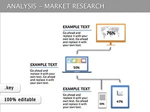 (296)
Market Research Keynote Diagrams: Insightful Visual ToolsID: #KD00110$15.00
(296)
Market Research Keynote Diagrams: Insightful Visual ToolsID: #KD00110$15.00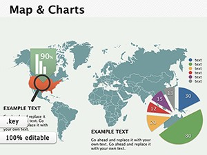 (947)
(947) Map and Charts Keynote diagramsID: #KD00098$24.00
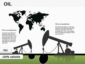 (164)
Oil and Gas Production Presentations with Keynote Diagrams TemplateID: #KD00097$15.00
(164)
Oil and Gas Production Presentations with Keynote Diagrams TemplateID: #KD00097$15.00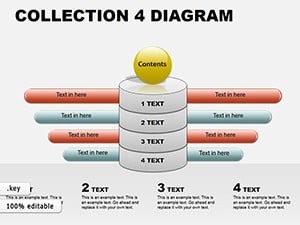 (91)
Keynote Diagram Collection 4: Weave Data into Dynamic NarrativesID: #KD00062$18.00
(91)
Keynote Diagram Collection 4: Weave Data into Dynamic NarrativesID: #KD00062$18.00
What these analysis layouts actually help you decide
These diagrams are not decoration. They exist to support a decision moment. Usually a messy one. When I last used a similar set for a client board review, the real issue was not data accuracy. It was how scattered the logic felt across slides. We switched to a structured analysis layout and compressed five slides into one. It worked because the diagram forced hierarchy.
You see this a lot in consulting work. Inputs everywhere, no structure. These templates impose structure early. Slightly annoying at first, but once you get the logic it becomes second nature.
If you are building a deck for internal alignment, not just presentation, this is where these slides fit. That`s it.
Find the diagram that matches your decision type and build from there.
How these differ from generic diagram slides
Generic diagrams look flexible. In practice, they are vague. These are more opinionated. They assume you are comparing, evaluating, or narrowing options.
I noticed this after working on 40+ decks this year. The more defined the layout, the faster the team aligns. Loose diagrams slow you down. People interpret them differently.
And that difference matters in meetings where time is limited.
Real use cases where these layouts hold up
A product team mapping feature prioritization. They need trade-offs visible, not hidden in notes. The diagram forces that clarity.
A finance lead explaining variance in quarterly numbers. The structure helps show cause, not just outcome.
A marketing manager comparing campaign performance across regions. You drop in your data. Done.
You know that moment when the deck is due at 9am and the summary slide is still empty. This is that moment.
When to use this instead of other diagram categories
If your goal is evaluation or comparison, stay here. If you need process flow, switch to Keynote diagram templates instead. If the focus is numeric trends, charts from Keynote chart templates make more sense.
This category is about thinking structure, not data visualization.
What you notice when you actually edit these
The slide master is consistent. Not flashy. But reliable. Colors swap cleanly across slides. Text placeholders behave. That sounds basic, but many templates fail here.
Honestly, the first time I opened the master I expected a mess. It wasn`t. Clean setup. Works as-is.
But spacing can feel tight on dense slides. You may need to trim content slightly. That is normal.
Navigation tip across related categories
If you move between formats, check PowerPoint diagram templates for similar structures. Same logic, different tool. Keep the structure consistent across tools if your team mixes formats. Anyway, it saves rework later.
FAQ
Can I edit the diagrams directly in Keynote?
Yes, everything is editable. Shapes, text, colors. In most cases you just click and adjust. From experience, the only thing to watch is grouped elements. Sometimes you need to ungroup once to move a single part. After that, it behaves normally.
Are these compatible with PowerPoint?
Usually yes, but depends a bit on export. Keynote files can be opened in PowerPoint after conversion. Layouts stay intact, though minor spacing shifts can happen. Nothing major. Works fine for most business decks.
Can I add more elements to a diagram?
So basically, yes. You can duplicate shapes and extend the layout. Just keep alignment consistent. I have seen people break spacing by adding items unevenly. Stick to the grid and it holds up.
What license applies to these templates?
It`s the same license most marketplaces use. One buyer, one project, commercial use included. No surprises here. You can reuse internally, but redistribution is not allowed.
Do these work for team collaboration?
Yes. Keynote supports shared editing. Just keep versions aligned. Honestly, version mismatches cause more issues than the templates themselves. Oh, and you can also export to PDF from there.