Free Templates PowerPoint templates
This collection contains free PowerPoint templates built for real business presentations. Product managers consultants and marketing teams reach for these when a quarterly roadmap or client update is due tomorrow and the slide master color palette and font hierarchy must already be correct.
A solutions architect preparing a pre-sales deck for a mixed technical and executive audience has the structure already defined: title slide content layouts comparison slides data placeholders and closing summary. Duplicating any slide keeps the same rules so formatting stays consistent across 30 slides without manual alignment.
Start with the template that matches your next meeting deliverable.
 (11)
(11) Plant Ecology Diagrams - Free Editable PPTX | ImagineLayoutID: #PP04030free
 (13)
USA Protests PowerPoint Template - Fully Editable | Instant Download | ImagineLayoutID: #PP04011free
(13)
USA Protests PowerPoint Template - Fully Editable | Instant Download | ImagineLayoutID: #PP04011free (10)
(10) Facebook Business Manager PowerPoint Template - Ads Optimization Presentation | Fully Editable | ImagineLayoutID: #PP03991free
 (16)
Financial Market Analysis PowerPoint Template - Data-Driven Charts | Instant Download | ImagineLayoutID: #PP03988free
(16)
Financial Market Analysis PowerPoint Template - Data-Driven Charts | Instant Download | ImagineLayoutID: #PP03988free (13)
Abstract Project Proposal PowerPoint Template - Fully Editable | Instant Download | ImagineLayoutID: #PP03986free
(13)
Abstract Project Proposal PowerPoint Template - Fully Editable | Instant Download | ImagineLayoutID: #PP03986free (13)
Digital Marketing PowerPoint Template for Agencies - Fully Editable | Instant Download | ImagineLayoutID: #PP03984free
(13)
Digital Marketing PowerPoint Template for Agencies - Fully Editable | Instant Download | ImagineLayoutID: #PP03984free (9)
Neural Network PowerPoint Template for AI - Fully Editable | Instant Download | ImagineLayoutID: #PP03981free
(9)
Neural Network PowerPoint Template for AI - Fully Editable | Instant Download | ImagineLayoutID: #PP03981free (8)
Bitcoin Market Analysis PowerPoint Template - Crypto Insights | Instant Download | ImagineLayoutID: #PP03975free
(8)
Bitcoin Market Analysis PowerPoint Template - Crypto Insights | Instant Download | ImagineLayoutID: #PP03975free (8)
Cybersecurity PowerPoint Template - 28 Editable Diagrams | Instant DownloadID: #PP03969free
(8)
Cybersecurity PowerPoint Template - 28 Editable Diagrams | Instant DownloadID: #PP03969free (15)
5G Technology PowerPoint Template - Free Editable Diagrams | Instant DownloadID: #PP03966free
(15)
5G Technology PowerPoint Template - Free Editable Diagrams | Instant DownloadID: #PP03966free (15)
ChatGPT PowerPoint Template - Free AI Diagrams | Instant DownloadID: #PP03965free
(15)
ChatGPT PowerPoint Template - Free AI Diagrams | Instant DownloadID: #PP03965free (15)
Digital Transformation PowerPoint Template - Free Editable Diagrams | Instant DownloadID: #PP03962free
(15)
Digital Transformation PowerPoint Template - Free Editable Diagrams | Instant DownloadID: #PP03962free (8)
Digital Assets PowerPoint Template - Editable Crypto Diagrams | Instant DownloadID: #PP03958free
(8)
Digital Assets PowerPoint Template - Editable Crypto Diagrams | Instant DownloadID: #PP03958free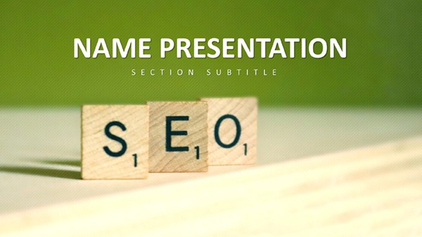 (10)
SEO Marketing PowerPoint Template - 28 Editable Diagrams | Instant DownloadID: #PP03955free
(10)
SEO Marketing PowerPoint Template - 28 Editable Diagrams | Instant DownloadID: #PP03955free (15)
Bitcoin PowerPoint Template - 28 Editable Crypto Diagrams | Instant DownloadID: #PP03954free
(15)
Bitcoin PowerPoint Template - 28 Editable Crypto Diagrams | Instant DownloadID: #PP03954free (10)
Fruit Cocktail PowerPoint Template - 28 Editable Health Diagrams | Instant DownloadID: #PP03953free
(10)
Fruit Cocktail PowerPoint Template - 28 Editable Health Diagrams | Instant DownloadID: #PP03953free (178)
Free Religious PowerPoint Template - Journey of Faith Edition | Instant DownloadID: #PP03943free
(178)
Free Religious PowerPoint Template - Journey of Faith Edition | Instant DownloadID: #PP03943free (59)
Free Religious PowerPoint Template - Spiritual Journey Edition | Instant DownloadID: #PP03942free
(59)
Free Religious PowerPoint Template - Spiritual Journey Edition | Instant DownloadID: #PP03942free (212)
Religious PowerPoint Template for Worship Gatherings - Temporary Altar | Fully Editable | Instant DownloadID: #PP03938free
(212)
Religious PowerPoint Template for Worship Gatherings - Temporary Altar | Fully Editable | Instant DownloadID: #PP03938free (355)
Programming Language PowerPoint Template - 28 Editable Diagrams | Instant DownloadID: #PP03926free
(355)
Programming Language PowerPoint Template - 28 Editable Diagrams | Instant DownloadID: #PP03926free (313)
Folders of New Ideas: Free Creative PowerPoint TemplateID: #PP03917free
(313)
Folders of New Ideas: Free Creative PowerPoint TemplateID: #PP03917free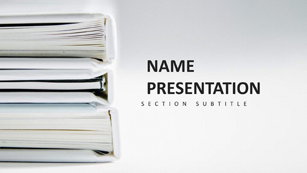 (374)
Stack Books: Learning Made Easy PowerPoint Template PresentationID: #PP03915free
(374)
Stack Books: Learning Made Easy PowerPoint Template PresentationID: #PP03915free (255)
Abstract Geometric PowerPoint Template: Geometry Meets Data MasteryID: #PP03910free
(255)
Abstract Geometric PowerPoint Template: Geometry Meets Data MasteryID: #PP03910free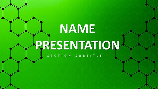 (256)
Modern Green Molecular PowerPoint Template: Download Free Design for PresentationsID: #PP03908free
(256)
Modern Green Molecular PowerPoint Template: Download Free Design for PresentationsID: #PP03908free (282)
(282) Chem Lab Report PowerPoint TemplateID: #PP03906free
 (314)
Molecular Structure Education PowerPoint TemplateID: #PP03905free
(314)
Molecular Structure Education PowerPoint TemplateID: #PP03905free (160)
Innovative Science and Technology PowerPoint TemplateID: #PP03904free
(160)
Innovative Science and Technology PowerPoint TemplateID: #PP03904free (26)
Scientific PowerPoint Template: Equations to EnlightenmentID: #PP03903free
(26)
Scientific PowerPoint Template: Equations to EnlightenmentID: #PP03903free (157)
Chemical Structure PowerPoint Template: Reacting with RelevanceID: #PP03902free
(157)
Chemical Structure PowerPoint Template: Reacting with RelevanceID: #PP03902free (144)
Modern Laboratory Design: PowerPoint Template - Download FreeID: #PP03901free
(144)
Modern Laboratory Design: PowerPoint Template - Download FreeID: #PP03901free (277)
Molecular View of Innovation PowerPoint TemplateID: #PP03898free
(277)
Molecular View of Innovation PowerPoint TemplateID: #PP03898free (382)
Global Digital Health Solutions PowerPoint TemplateID: #PP03897free
(382)
Global Digital Health Solutions PowerPoint TemplateID: #PP03897free (304)
Visualize Health: Human Anatomy PowerPoint TemplateID: #PP03894free
(304)
Visualize Health: Human Anatomy PowerPoint TemplateID: #PP03894free
How Structured Slide Masters Keep Focus on the Argument Instead of Alignment
When you build a 30-slide deck from blank slides the first hour disappears adjusting column widths matching bullet levels and lining up chart colors. These free templates define the slide master font stack color palette and placeholder behavior before you add content. A product manager updating the quarterly roadmap can duplicate the comparison layout and the new slide inherits the exact spacing and hierarchy so the executive team sees the data not the formatting effort.
Real-World Scenarios Where Free Templates Save Hours Before Leadership Reviews
The HR team must deliver onboarding slides for 40 new hires by Thursday. Instead of opening PowerPoint and wrestling with bullet alignment across 12 slides the free template already contains title content and summary layouts with consistent 16:9 aspect ratio and embedded fonts. The account manager pulling together a client update between calls uses the data-driven chart layouts so numbers update without breaking the visual hierarchy.
Technical Tips for Working with PPTX Slide Masters and Editable Vectors
Open the file in Microsoft PowerPoint the slide master already sets the 16:9 widescreen ratio used by modern projectors and laptop displays. All shapes charts and icons are editable vectors so you can recolor or scale them without quality loss. When you link an Excel chart the placeholder maintains the corporate color palette automatically. Export to PDF preserves the embedded fonts so the file looks identical on any viewer`s screen.
Use Cases Across Tech Finance Marketing and Science Teams
A cybersecurity analyst briefing the board on quarterly threat exposure uses the dedicated diagrams to show risk levels without building icons from scratch. The digital marketing team preparing an agency pitch drops campaign metrics into the SEO and social layouts that already balance headline supporting data and next steps. The data science lead explaining neural networks or 5G technology finds the vector illustrations and chart placeholders already arranged for technical yet executive audiences.
Why These Free Templates Deliver Corporate Usability Over Decorative Slides
Generic free decks often add decorative elements that must be removed before a board meeting. These layouts start from the corporate storytelling need: clear visual hierarchy reusable reporting slides and consistent formatting shared across departments. The design decisions are made once so every user spends time on the message not the layout.
If you need more advanced chart or diagram options explore our chart templates or diagram templates. For the complete paid catalog see PowerPoint templates.
Download the free PPTX file that matches your next internal review or client briefing.
Are these free PowerPoint templates compatible with Microsoft PowerPoint 2016 and later?
Yes every file is saved in native PPTX format and opens without conversion in PowerPoint 2016 2019 2021 and Microsoft 365. The slide master is fully functional so layouts aspect ratio 16:9 and embedded fonts behave exactly as expected. If you open the file in an older version some advanced vector editing may be limited but the core structure and placeholders remain intact.
Can I edit the charts and icons in these templates?
All charts icons and shapes are native PowerPoint objects not flattened images. You can recolor change data values or replace icons directly on the slide. When you update an embedded Excel chart the color palette stays consistent with the template`s slide master. Grouped elements can be ungrouped for custom adjustments while preserving the overall visual hierarchy.
Do the free templates include a slide master and 16:9 aspect ratio?
Yes every template ships with a complete slide master already configured for 16:9 widescreen the standard used by modern projectors and laptop displays. Font hierarchy placeholder positions and corporate color palette are locked in so duplicated slides inherit the same rules automatically. You can still customize the master if your company requires additional branding elements.
Can I share these free templates with my team?
Yes the download includes a standard commercial-use license that allows internal team sharing and editing. You can distribute the PPTX files within your organization for presentations reports and client materials. Each user can customize the content while the core layout structure remains consistent across the department.
How do I update the color palette to match my company branding?
Open the slide master view and edit the theme colors directly in PowerPoint. Because all charts icons and shapes reference the theme palette your changes apply automatically across every slide. Save the updated theme as a new template file if your team uses it regularly. The vector elements scale and recolor without quality loss after the palette update.