Agriculture & Animals PowerPoint templates
This collection brings together Agriculture & Animal PowerPoint templates built for reporting farm activity, livestock performance, and production planning. It`s aimed at farm managers, agri analysts, and consultants who need to turn field data into something a board or supplier meeting can actually read without reworking every slide from scratch.
In practice, this shows up in monthly agricultural review decks - for example, a livestock operations manager presenting feed efficiency and herd health to regional stakeholders. The structure matters more than decoration here; a poorly aligned table or unclear timeline can make yield data harder to interpret than it already is.
And honestly, the layout does most of the heavy lifting before you even touch the content. You drop in crop cycles, inventory numbers, or production variance, and the slide already knows how to carry it. Field-to-slide clarity is the point.
Use this set when agricultural reporting needs to move beyond spreadsheets into something presentable for decisions, not just records.
 (334)
(334) Bamboo PowerPoint Template: Rooted in Natural HarmonyID: #PP03888free
 (13)
Eco-Friendly Growth PowerPoint Template: Cultivate Sustainable StoriesID: #PP03697$12.00
(13)
Eco-Friendly Growth PowerPoint Template: Cultivate Sustainable StoriesID: #PP03697$12.00 (439)
Vitamin E Rich Foods PowerPoint TemplateID: #PP03685$12.00
(439)
Vitamin E Rich Foods PowerPoint TemplateID: #PP03685$12.00 (873)
(873) Fresh and Delicious Fruit PowerPoint Template: Harvest Insights with ZestID: #PP03675$12.00
 (1060)
 Vegetables and Greengrocery PowerPoint Template: Root Your Ideas in Fresh DesignID: #PP03674$12.00
 (1147)
Grow Your Narrative in the Shade of the Bamboo Grove PowerPoint TemplateID: #PP03636$10.00
(1147)
Grow Your Narrative in the Shade of the Bamboo Grove PowerPoint TemplateID: #PP03636$10.00 (764)
(764) Growth and Development PowerPoint Template: Cultivating Compelling Agriculture StoriesID: #PP03541$12.00
 (457)
Pet Dog PowerPoint Template: Tails of Breed BrillianceID: #PP03384$12.00
(457)
Pet Dog PowerPoint Template: Tails of Breed BrillianceID: #PP03384$12.00 (546)
Growing Tomatoes PowerPoint Template - Agriculture & Botany Presentation | Fully Editable | Instant Download | ImagineLayoutID: #PP03332$10.00
(546)
Growing Tomatoes PowerPoint Template - Agriculture & Botany Presentation | Fully Editable | Instant Download | ImagineLayoutID: #PP03332$10.00 (802)
Complete Guide to Caring for Dogs PowerPoint templateID: #PP03317$12.00
(802)
Complete Guide to Caring for Dogs PowerPoint templateID: #PP03317$12.00 (768)
Gardening for Beginners PowerPoint templateID: #PP03309$12.00
(768)
Gardening for Beginners PowerPoint templateID: #PP03309$12.00 (87)
Botany - Plant Science PowerPoint templateID: #PP03308$12.00
(87)
Botany - Plant Science PowerPoint templateID: #PP03308$12.00 (486)
Ecobiology Plants PowerPoint templateID: #PP03297$12.00
(486)
Ecobiology Plants PowerPoint templateID: #PP03297$12.00 (1004)
Ecology and Biology PowerPoint TemplateID: #PP03296$12.00
(1004)
Ecology and Biology PowerPoint TemplateID: #PP03296$12.00 (50)
Flora Sprout Plants PowerPoint templateID: #PP03294$12.00
(50)
Flora Sprout Plants PowerPoint templateID: #PP03294$12.00 (908)
Veterinary Emergency Clinic PowerPoint templateID: #PP03273$12.00
(908)
Veterinary Emergency Clinic PowerPoint templateID: #PP03273$12.00 (634)
Pet Vet Doctor PowerPoint Template: PresentationID: #PP03272$12.00
(634)
Pet Vet Doctor PowerPoint Template: PresentationID: #PP03272$12.00 (753)
Animal Disease and Services Veterinary Clinics PowerPoint templateID: #PP03271$12.00
(753)
Animal Disease and Services Veterinary Clinics PowerPoint templateID: #PP03271$12.00 (243)
Dog Disease and Veterinarian PowerPoint templateID: #PP03270$12.00
(243)
Dog Disease and Veterinarian PowerPoint templateID: #PP03270$12.00 (553)
Treatment Of Animals In Veterinary Clinic PowerPoint templateID: #PP03269$12.00
(553)
Treatment Of Animals In Veterinary Clinic PowerPoint templateID: #PP03269$12.00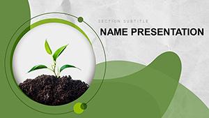 (40)
Plant Ecology PowerPoint Template: Ignite Your Environmental StoryID: #PP03268$12.00
(40)
Plant Ecology PowerPoint Template: Ignite Your Environmental StoryID: #PP03268$12.00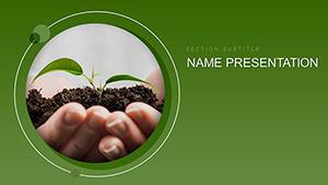 (926)
Eco Friendly Plants PowerPoint templateID: #PP03232$12.00
(926)
Eco Friendly Plants PowerPoint templateID: #PP03232$12.00 (498)
Eco Soil Resources PowerPoint templateID: #PP03231$12.00
(498)
Eco Soil Resources PowerPoint templateID: #PP03231$12.00 (506)
Sea Fish PowerPoint Template - PresentationID: #PP02776$12.00
(506)
Sea Fish PowerPoint Template - PresentationID: #PP02776$12.00 (132)
Shark Themed PowerPoint TemplateID: #PP02775$12.00
(132)
Shark Themed PowerPoint TemplateID: #PP02775$12.00 (290)
Interesting About Vegetables PowerPoint TemplatesID: #PP02771$12.00
(290)
Interesting About Vegetables PowerPoint TemplatesID: #PP02771$12.00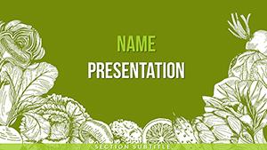 (1089)
Vector Vegetables PowerPoint TemplatesID: #PP02770$12.00
(1089)
Vector Vegetables PowerPoint TemplatesID: #PP02770$12.00 (6)
Download Apple Fruit PowerPoint Template, PPTID: #PP02751$10.00
(6)
Download Apple Fruit PowerPoint Template, PPTID: #PP02751$10.00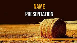 (552)
Crop Yield PowerPoint TemplatesID: #PP02733$12.00
(552)
Crop Yield PowerPoint TemplatesID: #PP02733$12.00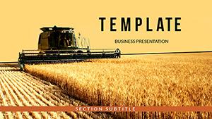 (372)
Agriculture Conference PowerPoint Template | Professional Farming Presentation SlidesID: #PP02692$10.00
(372)
Agriculture Conference PowerPoint Template | Professional Farming Presentation SlidesID: #PP02692$10.00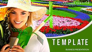 (917)
Orchard and Garden: Useful Advice PowerPoint templatesID: #PP02595$12.00
(917)
Orchard and Garden: Useful Advice PowerPoint templatesID: #PP02595$12.00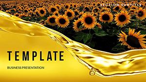 (825)
Sunflower Oil Production PowerPoint templatesID: #PP02591$12.00
(825)
Sunflower Oil Production PowerPoint templatesID: #PP02591$12.00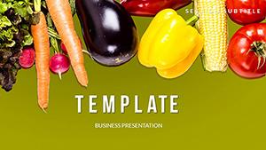 (105)
Healthy Life Vegetable PowerPoint Template - Editable PPTX | ImagineLayoutID: #PP02553$8.00
(105)
Healthy Life Vegetable PowerPoint Template - Editable PPTX | ImagineLayoutID: #PP02553$8.00
What this agriculture slide set is actually built for
These templates are structured for operational agriculture reporting - not general business storytelling. The layouts assume you`re working with irregular data: seasonal yield changes, livestock counts, irrigation cycles, or supply inputs that don`t fit neat marketing-style visuals.
A farm operations analyst, for example, might use these slides during a quarterly review with procurement teams. Instead of rebuilding charts every time the harvest data shifts, the table and timeline structures already handle variable inputs. You`re basically working inside a pre-aligned system instead of forcing Excel outputs into slides.
I liked how the column spacing holds even when the numbers get dense. It sounds minor, but in real agricultural reporting - especially when comparing multiple fields or herds - misalignment becomes noise fast.
Oh, and the aspect ratio is 16:9 by default, which matters more than it sounds when you`re projecting in warehouse or field office setups.
Where these layouts outperform generic business templates
Agriculture data tends to be multi-variable: soil condition, feed type, yield output, weather impact. Generic business templates usually assume single-axis comparison. These layouts don`t. They allow stacked comparisons without collapsing readability.
A livestock supervisor presenting herd health metrics to regional managers would typically struggle in standard chart slides because everything gets flattened into a single trend line. Here, multiple rows of data remain visible at once without forcing aggregation.
And when I`ve seen these used in real project work, the biggest win is not speed - it`s reduced reinterpretation. People stop arguing about what the slide means and start discussing what to do about it.
When to use this category instead of nearby templates
If you compare this with general PowerPoint templates, those are better for narrative-heavy business decks. But they break down quickly when you introduce field data density.
Compared to chart templates, those are stronger for trend storytelling but weaker when you need multiple simultaneous variables like livestock feed, output, and cost per cycle.
This category sits in between - structured enough for reporting, flexible enough for raw agricultural inputs.
Why starting from scratch slows agricultural reporting
Building farm reporting slides manually sounds harmless until you deal with repeated seasonal updates. Every new cycle means re-aligning tables, re-spacing labels, and fixing overflow in long field names.
The real friction isn`t design - it`s consistency across reporting cycles. One quarter your irrigation data fits neatly; the next it spills across rows and breaks alignment.
These templates remove that rebuild loop. You adjust numbers, not structure.
Technical note: tables vs grouped shapes in agri decks
Native PowerPoint tables behave differently than grouped rectangles when resized. Tables keep row integrity; shapes drift. In agricultural reporting where you update values frequently, that difference matters more than it should.
If you export to PDF for suppliers or regulators, tables also preserve alignment better than manual grids.
How this collection fits into ImagineLayout workflows
This set is designed for operational reporting rather than marketing decks. It connects naturally with broader reporting tools like Word templates when you need written summaries alongside slides, or brochure templates when turning agricultural data into stakeholder updates.
The idea is simple: slides carry structure, documents carry explanation.
You don`t need to redesign the system every quarter. You just update the inputs.
FAQ
Can I add more rows to agricultural tables without breaking layout?
Yes, in most cases you can extend table rows without breaking structure because the layouts use native PowerPoint table objects rather than grouped shapes. The main thing to watch is vertical spacing when you exceed 12-15 rows, since readability starts to drop on standard 16:9 screens. I`ve seen this trip up even experienced users, but the fix is usually just increasing row height slightly or splitting data into two slides.
Are these templates suitable for livestock performance tracking?
The short answer is yes, but it depends a bit on how complex your tracking is. For standard metrics like weight gain, feed ratio, or herd counts, these layouts work fine. When you start layering veterinary history or multi-variable environmental data, you may need to split across multiple slides. No issues with compatibility in PowerPoint 2016 and newer.
Can I export these agriculture slides to PDF for suppliers?
Yes. Export works cleanly because the layouts rely on standard PowerPoint objects. Tables, in particular, preserve alignment well in PDF format, which is important when suppliers are reviewing production or delivery schedules. Honestly, I usually export a test PDF first just to check label wrapping before sending anything externally. Works fine.
What happens if I resize slides or change aspect ratio?
Most layouts are optimized for 16:9, so switching to 4:3 can cause spacing shifts, especially in dense tables. You may need to adjust column widths manually after conversion. From experience, this is the only part that requires a bit of cleanup, but it`s predictable rather than random, which makes it manageable.
Can I combine these slides with Word reports?
Yes, and this is actually a common workflow. Slides handle structured comparison (yield, cost, output), while Word templates are used for narrative explanation. It`s the same license model most marketplaces use - one project, commercial use included. That`s basically it.