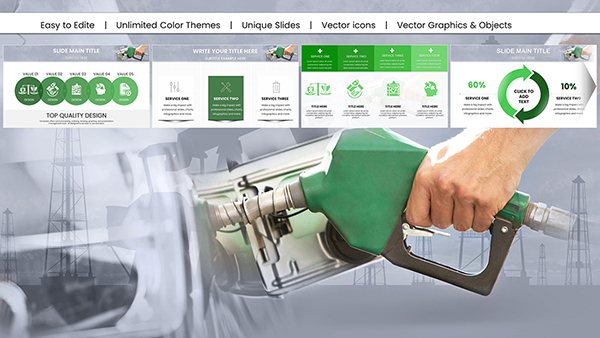
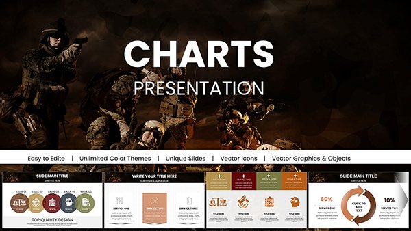
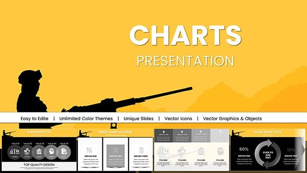
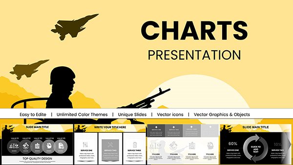
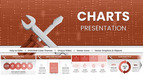
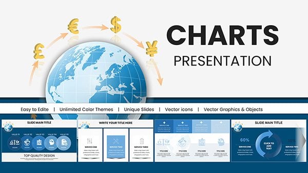
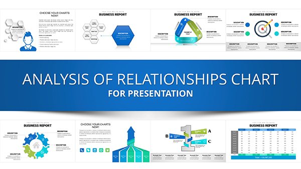
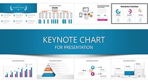
Charts are the backbone of persuasive presentations, and our Keynote-specific templates make data visualization a breeze. Geared toward data enthusiasts, managers, and speakers, these designs distill complex datasets into intuitive graphics that inform and persuade.
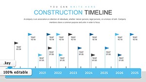
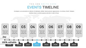
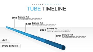
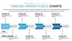
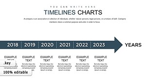
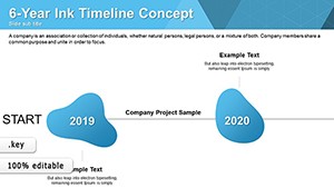
From pie charts bursting with color to timelines weaving stories, each template supports native Keynote animations for smooth reveals. Analysts save time on formatting, focusing instead on interpretation and strategy.
Standout perks: Responsive scaling for any screen and accessibility features like color-blind modes. Elevate your data game without the technical hurdles.
Delve into our chart library and grab the tool that clarifies your message. Make every slide a data masterpiece.


Financial advisors plot growth trajectories with line chart templates, overlaying benchmarks for client reassurance - more dynamic than static Excel exports. Marketers track campaign ROI via donut breakdowns, highlighting top performers visually.
Educators illustrate population trends with area maps, engaging students through interactive zooms.
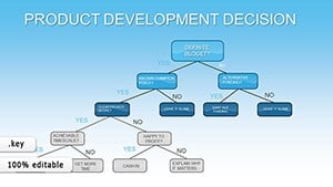
Teams in operations use funnel charts to diagnose drop-offs, with phased animations revealing bottlenecks step-by-step. Superior to built-in tools, our templates include customizable axes and legends for precision.
Pro advice: Layer subtle gradients to denote categories without overwhelming the viewer.
Researchers present survey results in stacked bars, color-coded by demographics for quick correlations. These outpace generic charts with exportable SVGs for publications.
Maintain neutrality by avoiding 3D effects that distort perceptions.
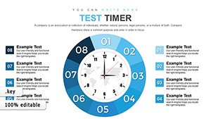
Our charts boast build orders for sequential data entry, plus formula-linked cells for live updates. Unique: Themed packs like oceanic blues for environmental data.
Integrate now and watch comprehension soar. Download to animate your analytics.
Curate your ideal set from our evolving selection.
Pie, bar, line, radar, and more, with hybrids like combo charts for multifaceted data.
Yes, paste data directly; templates auto-adjust scales and labels.
Fully, with options for wipe, dissolve, or custom paths in Keynote.
Use locked formulas and validation rules embedded in the slides.
Optimized for up to 10,000 points, with aggregation tools for summaries.
Copyright © 2009-2026 ImagineLayout All rights reserved.