Turn aspirations into reality with our curated collection of vision board templates for PowerPoint.
These motivational designs combine goal-setting charts, inspirational layouts, and visual planning tools to help individuals and teams map their future success. Perfect for personal development workshops, career planning, or company vision sessions.
Features include timeline trackers, milestone markers, quote integrations, and image placeholders for personalized collages. Each template balances creativity with structure to keep focus on achievable outcomes.
Explore uplifting designs and download the ones that align with your journey.
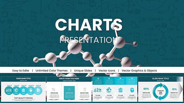
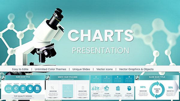
Pro Chemical & Biochemical Education PowerPoint Charts
ID: #PC01062
$22.00
(943)
Online Education PPT Charts Template Download
ID: #PC01046
$15.00
(154)
Chemical and Biochemical Engineering PowerPoint Charts: Precision Tools for Complex Insights
ID: #PC01041
$18.00
(621)
Educational PowerPoint Charts: Igniting Minds with Visuals
ID: #PC01037
$15.00
(594)
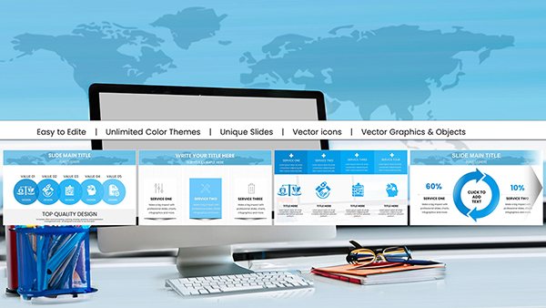
Business Financial PowerPoint Charts - Drive Decisions
ID: #PC01036
$25.00
(1009)
Judge and Laws PowerPoint Charts for Impactful Delivery
ID: #PC01032
$25.00
(921)
Flying Drone PowerPoint Charts Presentation: Capture Aerial Perspectives in Your Slides
ID: #PC01019
$18.00
(26)
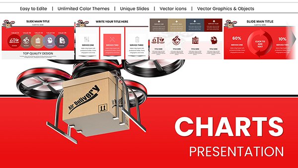
Heavy Cargo Drone Delivery PowerPoint Charts - Download Logistics Templates
ID: #PC01014
$20.00
(958)
Drone Delivery PowerPoint Charts Presentation: Chart the Course of Modern Logistics
ID: #PC01013
$22.00
(743)
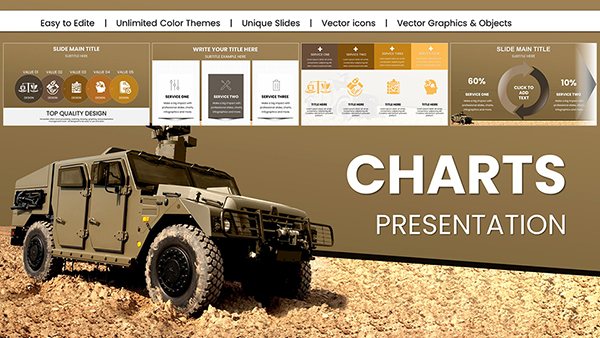
Military Vehicle PowerPoint Charts Template
ID: #PC01008
$20.00
(1177)
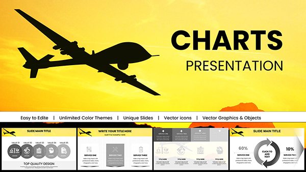
Military Technology Drone Warfare PowerPoint Charts Template
ID: #PC00997
$18.00
(1136)
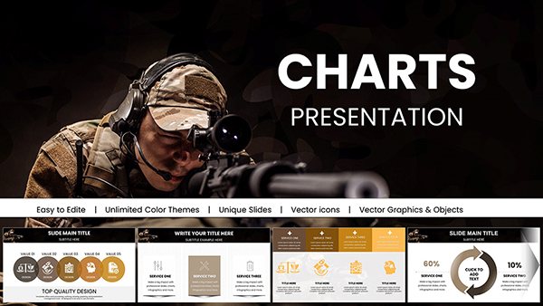
Sharpshooter PowerPoint Charts Template for Precision Presentations
ID: #PC00995
$18.00
(627)
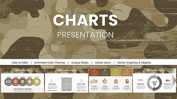
Military Camouflage PowerPoint Charts Templates
ID: #PC00994
$18.00
(666)
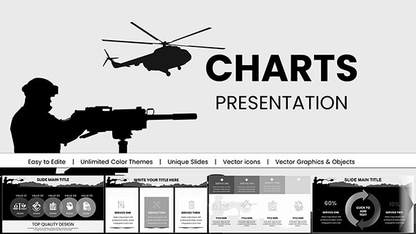
War Armed Forces PowerPoint Charts - Download Presentation
ID: #PC00993
$16.00
(901)
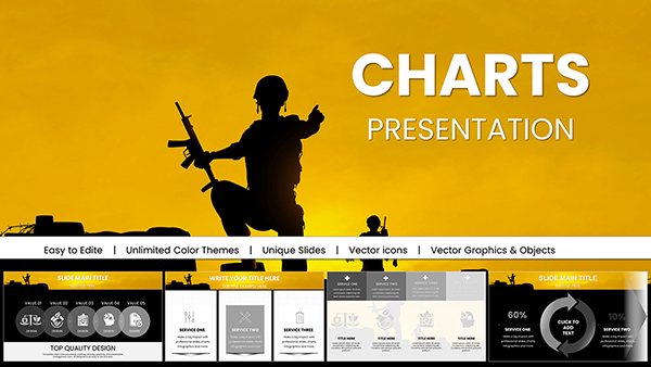
Battle Military PowerPoint Charts Template - Instant Download | Tactical Briefing Slides for Defense & Operations
ID: #PC00992
$15.00
(309)
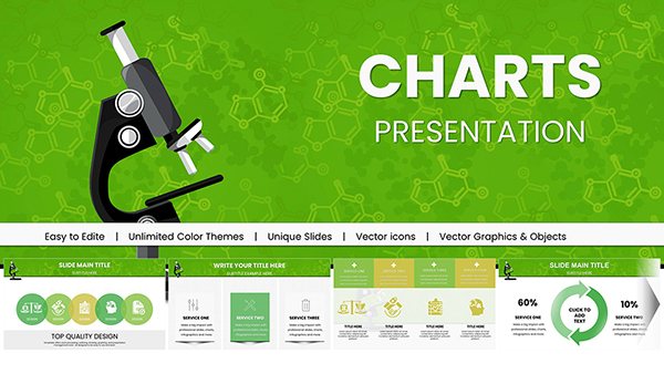
Chemistry Lessons PowerPoint Charts and Templates: Revolutionize Your Teaching
ID: #PC00976
$20.00
(747)
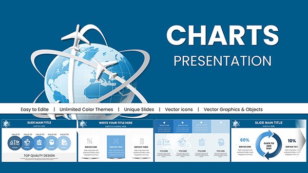
International Flights PowerPoint Charts: Navigate Aviation Data Effortlessly
ID: #PC00974
$20.00
(1007)
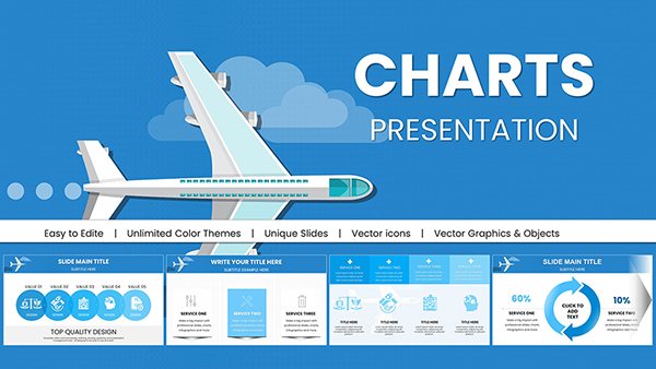
Airplane Flights PowerPoint Charts: Elevate Your Aviation Presentations
ID: #PC00972
$18.00
(585)
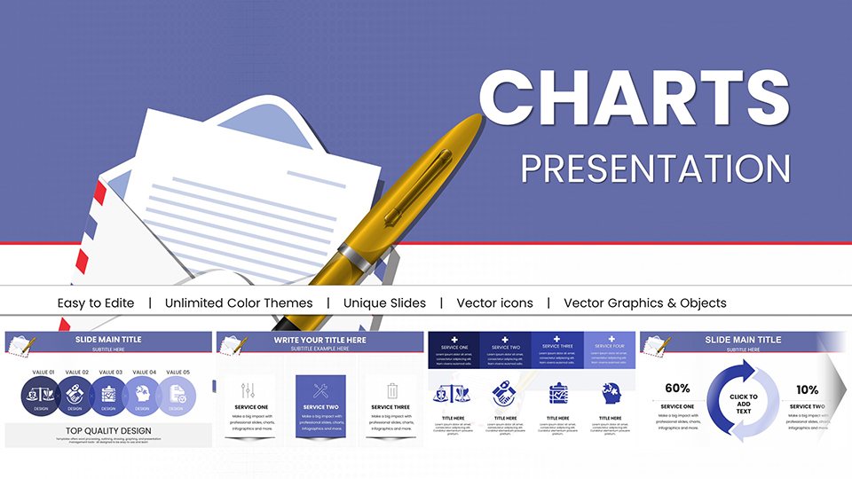
Business Correspondence PowerPoint Charts: Pro PPTX
ID: #PC00957
$20.00
(112)
Professional Business Report PowerPoint Charts Template
ID: #PC00938
$25.00
(377)
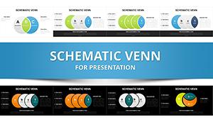
Schematic Venn Diagram PowerPoint Template
ID: #PC00295
$20.00
(574)
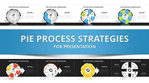
Pie Process Strategies PowerPoint Charts Template - Presentation PPT
ID: #PC00293
$24.00
(1055)
Business Analyst PowerPoint Charts Template for Impactful Presentations
ID: #PC00292
$25.00
Components of Effective Vision Boards
Strong vision boards blend imagery, affirmations, specific goals, and progress indicators. These templates provide frameworks for all elements while allowing complete personalization.
Types of Vision Templates Included
Personal growth collages
Career milestone maps
Company vision statements
Yearly goal planners
Habit tracking charts
Benefits of Visual Goal Setting
Visualizing success increases motivation and accountability. Regular exposure to your vision board reinforces commitment and clarifies priorities.
Customization Best Practices
Add personal photos and meaningful quotes
Use color psychology for energy
Include specific, measurable targets
Update quarterly to reflect progress
Applications Across Contexts
Ideal for life coaching sessions, corporate strategy meetings, student planning, or family goal setting. These adaptable designs support any vision-sharing scenario.
Start visualizing your future - browse the collection today.
Frequently Asked Questions
How often should I update my vision board?
Review and refresh every 3-6 months as goals evolve.
Can teams create shared vision boards?
Yes - collaborative templates work great for group alignment.