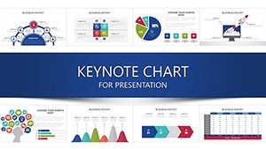
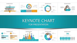
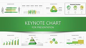
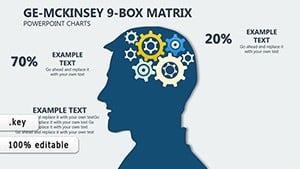
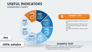
Delve into our value-driven Keynote charts collection, where data meets design to highlight worth, growth, and returns in crystal-clear visuals. Tailored for executives, analysts, and consultants, these charts transform raw numbers into narratives that underscore ROI, customer lifetime value, and performance metrics with elegance and precision.
From pie charts segmenting market shares to line graphs tracking value appreciation, each element is optimized for Keynote`s native tools, ensuring fluid animations and responsive scaling. Benefit from reduced cognitive load as audiences grasp key takeaways faster, leading to more informed decisions and persuasive arguments. Move beyond cluttered spreadsheets to polished slides that command attention and respect.
Uncover the power of visual value - browse these charts and integrate them into your workflow for presentations that deliver real impact.

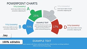

Value charts in Keynote prove essential across industries, starting with finance where waterfall diagrams dissect profit margins, revealing levers for cost optimization. Sales teams deploy funnel visuals to map conversion paths, color-coding stages from lead to loyal advocate, spotlighting value at each touchpoint.
In marketing, radial gauges measure campaign ROI, with needles pointing to uplift percentages amid brand equity icons. Non-profits utilize stacked bars to illustrate donor impact, layering funds allocated to programs versus overhead for transparent storytelling that builds trust.
Stock Keynote charts often suffer from uniform styling that drowns data in monotony, whereas value-specific ones employ thematic hues - like greens for gains and oranges for opportunities - to intuitively signal positivity. Pre-configured legends and tooltips save hours of manual tweaking, and vector-based scalability prevents pixelation in exports. This elevates comprehension, turning passive viewers into active stakeholders through relatable, benefit-oriented designs.
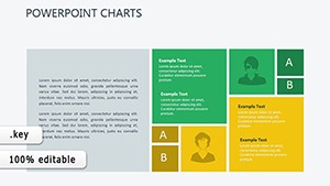
Each template pack offers 15+ chart types, from donut breakdowns of value propositions to bubble plots correlating price and perceived worth. Integration with Keynote`s formula builder allows live data pulls, keeping visuals evergreen. Accessibility features like high-contrast modes and screen-reader friendly labels ensure inclusivity without compromising style.
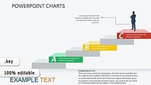
Adopt best practices by aligning chart axes to your story`s scale - use logarithmic for exponential growth to avoid skewing perceptions. Pair with concise annotations, limiting to three insights per slide, and test with focus groups for clarity validation.
A retail analyst might animate a heat map of store performance, hotspots glowing to denote high-value locations ripe for expansion. In HR, pyramid charts delineate talent hierarchies, apexes shining for top performers` contributions. Sustainability reports employ Sankey diagrams to flow resource values from input to output, minimizing waste visually. These innovations make abstract values concrete, fostering discussions that drive strategy.
Peruse options and pick charts that amplify your message - your data deserves to shine.
Maximize value charts by embedding hyperlinks to source dashboards, enabling deeper dives mid-presentation. Choose sans-serif fonts for labels to enhance readability at a glance, and incorporate subtle shadows for 3D depth without overwhelming flat data. Regularly audit for bias, ensuring scales fairly represent variances.
These techniques, favored by data viz experts, ensure your charts not only inform but persuade.
Transform numbers into narratives with our value Keynote charts - download now and chart your path to compelling presentations.
Copyright © 2009-2026 ImagineLayout All rights reserved.