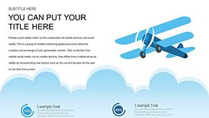
The transportation and logistics sector moves fast, and your presentations should keep pace. Our collection of over 100 transport chart templates for PowerPoint and Keynote delivers industry-relevant visuals that communicate complex operations clearly and confidently.
Tailored for the field, these templates include vehicle icons, route maps, flow diagrams, and themed color schemes that resonate with mobility professionals. Fully editable with modern designs and optional animations.
Free templates available alongside premium options packed with specialized elements. Ready-to-use for reports, proposals, and strategic reviews.
Browse the collection and find the right template to drive your message home.
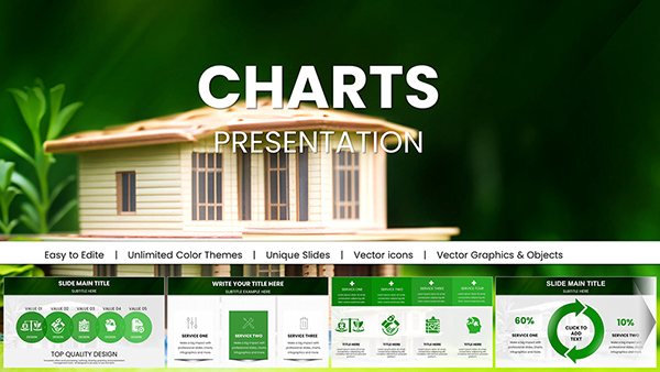
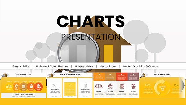
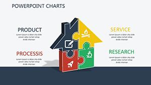
Houses for Rent PowerPoint Charts Template: Captivate in Real Estate
ID: #PC00384
$18.00
(666)
Criteria and Metrics PowerPoint Charts: Blueprint Your Project Evaluations
ID: #PC00353
$19.00
(488)
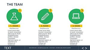
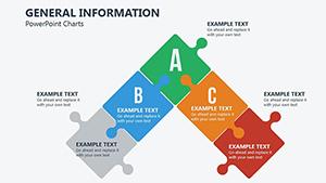
General Information PowerPoint Charts Template: Versatile Tools for Clear Communication
ID: #PC00285
$18.00
(112)
Business Development Organizational PowerPoint Charts Template
ID: #PC00260
$19.00
(1144)
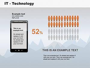
IT Technology PowerPoint Charts: Revolutionize Your Data Storytelling
ID: #PC00136
$28.00
Why Transport-Specific Charts Matter
Generic charts can`t capture the nuances of logistics, fleet management, or mobility planning. Industry-themed visuals build instant context and credibility. Our templates combine accurate data display with relevant icons and layouts that speak your audience`s language.
High-quality vector graphics ensure everything looks professional on large screens or printed handouts.
Real-World Use Cases
Logistics and Supply Chain Reports
Visualize shipment volumes, route efficiency, or warehouse throughput with charts featuring truck, ship, and plane icons that immediately convey meaning.
Fleet Management Presentations
Track vehicle utilization, maintenance schedules, or fuel efficiency using themed dashboards that make patterns obvious at a glance.
Urban Planning and Infrastructure
Present traffic flow, public transit usage, or infrastructure projects with integrated maps and transport mode comparisons.
Benefits of Themed Templates
Standard templates lack industry context. Ours deliver:
Relevant vehicle and infrastructure icons
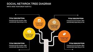
Pre-built route and network diagrams
Color schemes inspired by transport branding
Editable map elements
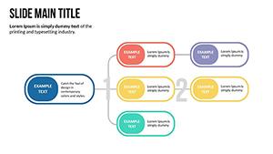
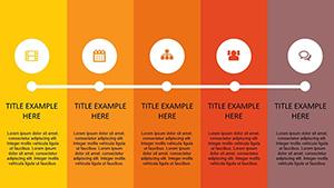
Professional flow and timeline layouts
These details help you communicate faster and more effectively.
Design Tips for Transport Charts
Maximize clarity with these practices:
Use arrows and lines to show movement and routes
Differentiate transport modes with distinct colors
Incorporate simple maps as backgrounds when helpful
Highlight key metrics with larger icons or callouts
Keep labels concise but informative
Our templates already follow these guidelines, giving you a head start.
Ready to accelerate your presentations? Explore our transport chart collection and download the perfect templates today.