Charts are the lifeblood of transport presentations, turning raw data into actionable stories. Our Keynote chart templates cater to the mobility sector, providing tools for everything from urban traffic analysis to global shipping trends.
With built-in animations and responsive designs, these charts adapt to your narrative, whether highlighting emission reductions or route optimizations. Professionals in consulting, government, and fleet management will find them indispensable for boardroom impact.
Benefits include drag-and-drop editing and compatibility with Apple`s ecosystem, ensuring seamless integration into your workflow. Say goodbye to bland spreadsheets and hello to engaging visuals that drive decisions.
Discover our transport Keynote charts and bring your data to life.


From city planners mapping commute flows to executives reviewing supply chains, these charts illuminate complex transport dynamics with precision.
Urban developers can deploy line graphs to forecast infrastructure demands, while airlines use radar charts for seasonal load factors. Each template is optimized for Keynote`s fluid transitions, making data exploration interactive.
Keynote`s default charts lack transport-specific styling, like gradient scales mimicking speedometers. Our templates fill this gap with thematic axes and legends, cutting customization time by half and enhancing comprehension for non-expert audiences.
Standout elements include color-coded series for multi-modal comparisons - trains in blue, buses in green - and export options for web sharing. Best practices: Limit data points per chart to five for focus, and use build effects to reveal insights sequentially.
Creative example: A transit authority visualized equity in service coverage with heat maps, influencing policy changes and community buy-in.
Empower your insights with tailored charts - download and integrate today.
Picture a consultant charting e-commerce delivery delays; our waterfall template breaks down bottlenecks, from warehouse to doorstep. Port operators employ combo charts blending volume bars with trend lines for trade forecasting.
Techniques involve layering icons over bars for context, like truck symbols on mileage metrics, turning stats into narratives.
In education, instructors use these for transport economics lectures, animating supply-demand curves. Creative teams in ad agencies craft campaign performance dashboards with transport metaphors.
Non-profits leverage donut charts for fundraising progress tied to vehicle donations, blending impact with appeal.
For mobile viewing, opt for simplified axes; test on iPad for touch-friendly interactions. Collaborate via iCloud for team refinements, ensuring alignment on key metrics.
Chart the course to clearer communications - explore our collection.
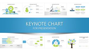
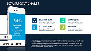
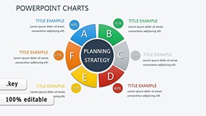
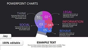
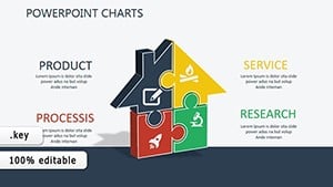
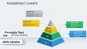
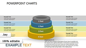
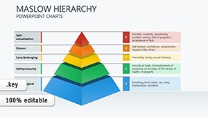
A variety including bar, line, pie, and specialized ones like flow and radar for transport data.
Use the data editor or paste from Excel; templates auto-format for consistency.
Yes, adjust timing and effects in Keynote`s build inspector for tailored pacing.
Export as images, PDFs, or videos for versatile sharing beyond Keynote.
Templates include variants for light and dark themes, ensuring readability in any setting.
Copyright © 2009-2026 ImagineLayout All rights reserved.