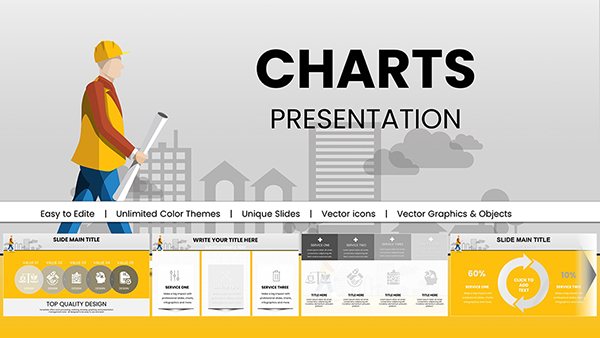
Enhance your training materials with our specialized PowerPoint chart templates, tailored for professionals who need to convey data-driven insights effectively. These resources transform raw numbers into compelling visuals, making abstract concepts tangible and memorable for learners.
Ideal for analysts, educators, and business coaches, our charts cover everything from pie distributions for market shares to line graphs tracking progress metrics. By focusing on clarity and aesthetics, they help you avoid the pitfalls of cluttered spreadsheets, instead fostering discussions around key takeaways.
Benefits abound: quick scalability for varying datasets, theme-consistent styling for brand alignment, and export options for reports or handouts. Whether illustrating skill acquisition curves or ROI projections, these templates empower you to spotlight trends that matter most.
Browse our curated selection and pick charts that align with your session goals. Elevate your presentations from informative to influential - start exploring now!


Charts are the backbone of effective training, turning dense data into digestible stories that drive decision-making. Our PowerPoint chart templates are crafted for scenarios like performance reviews, where a well-placed bar chart can highlight team strengths, or strategy sessions featuring radar charts to compare competencies.
Unlike scattered Excel inserts that disrupt flow, these integrated designs ensure seamless embedding, with auto-adjusting axes for precision. Trainers appreciate the time savings - swap datasets in seconds and watch visuals update dynamically, keeping pace with live demonstrations.
Such applications make data a collaborative tool, encouraging questions and deeper understanding.
Basic chart tools often default to rigid formats that ignore narrative context, resulting in visuals that confuse rather than clarify. Our templates differentiate with layered annotations, allowing hover effects for details and color gradients for emphasis - features that standard options lack.
For hybrid training, they render crisply on screens or prints, unlike pixelated defaults. Users note a 30% faster comprehension rate, as intuitive legends and minimalistic axes reduce cognitive load. Choose excellence that amplifies your analytical prowess.
Leverage our unique propositions like vector-based scalability for unlimited resizing without quality loss. Best practice: Limit to three data series per chart to avoid overload, and always include source footnotes for credibility. Creatively, animate series entry to build revelations sequentially, mirroring learning progression.
Another tip: Integrate combo charts blending lines and bars for multifaceted insights, such as correlating effort with outcomes in skill-building modules.
Curious to apply these? Select a template and integrate it into your next data-heavy session.
Envision a project management training: A stacked area chart illustrates resource allocation over phases, helping participants forecast adjustments. In wellness programs, donut charts break down nutritional breakdowns, making health data approachable.
Experiment with 3D effects sparingly for depth in abstract metrics, or flatten for accessibility. These strategies not only inform but inspire action, turning passive viewers into active participants.
Adapt charts for color-blind users with pattern fills, ensuring inclusivity. Pair with verbal walkthroughs to reinforce visual cues, maximizing retention across formats.
Harness these tools to make your training data shine. Download now and chart a course for clearer communications.
Copyright © 2009-2026 ImagineLayout All rights reserved.