Time PowerPoint Charts
Decode data over time with our specialized PowerPoint chart templates, engineered for accuracy and visual punch. Perfect for data enthusiasts, analysts, and executives who need to spotlight patterns in timelines and metrics.
Encompassing line graphs with date scales, bar sequences, and pie evolutions, these templates streamline complex datasets into digestible slides. PowerPoint-native for fluid modifications.
Select from clean corporates to vibrant analytics, all primed for insight delivery. Make your data dance through time.
Chart your course - download at once.
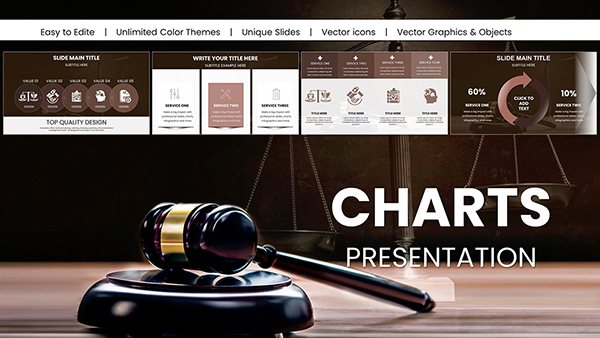
Judge and Laws PowerPoint Charts for Impactful Delivery
ID: #PC01032
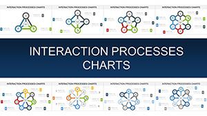
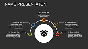
Interaction Processes PowerPoint Charts for Dynamic Presentations
ID: #PC00914
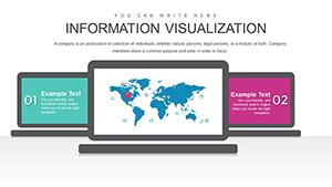
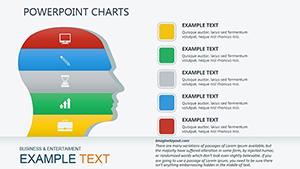
Information Visualization PowerPoint Template
ID: #PC00876
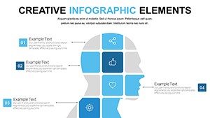
Free Creative PowerPoint Chart Presentation Template for Matrices
ID: #PC00622
Creative Ideas PowerPoint Charts Template: Ignite Innovation in Your Presentations
ID: #PC00573
Dynamics of Development PowerPoint Charts: Visualizing Architectural Growth Trajectories
ID: #PC00542
Relationship PowerPoint Charts: Compare Data Effortlessly
ID: #PC00521
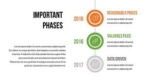
Important Information PowerPoint Chart Template: Organize Data Effectively
ID: #PC00491
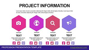
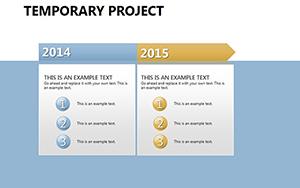
Powerful Project Information PowerPoint Charts Template
ID: #PC00466
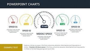
Efficient Speed PowerPoint Charts Template Download
ID: #PC00450
Dynamic Product Development Charts - Fully Editable PPTX | ImagineLayout
ID: #PC00447
Functional Purpose Animation PowerPoint Charts Template: Animate Your Processes
ID: #PC00443
Professional Goods Concept PowerPoint Charts - Visualize Product Ideas
ID: #PC00441
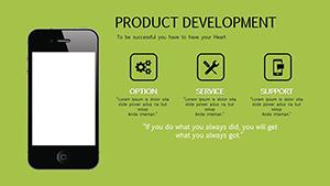
Product Development Charts - Editable PPTX
ID: #PC00440
Implementation System PowerPoint Charts Template: Elevate Your Data Storytelling
ID: #PC00425
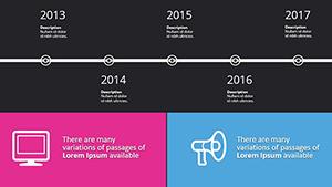
Stories Archive Dark PowerPoint Template: Editable Timelines for Historical Narratives
ID: #PC00364
Business Ideas Charts: PowerPoint Slides
ID: #PC00333
Gantt Timeline PowerPoint Chart Template: Visualize Project Success
ID: #PC00256
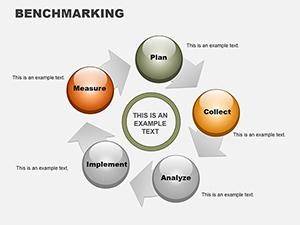
Benchmarking PowerPoint Charts Template: Master Comparisons Effortlessly
ID: #PC00094
Timing Data Visualization Time charts illuminate trajectories, eclipsing flat visuals with contextual depth via axes and annotations.
Targeted Uses Financial Reviews: Plot quarterly revenues.Marketing Analytics: Track campaign durations.Health Metrics: Monitor progress over periods.Sales Forecasts: Project seasonal peaks. Auto-scaling trumps manual tweaks.
Charting Excellence Overlay trends with smooth lines; label peaks dynamically. "Trend Tracker" auto-adjusts scales.
Bold Innovations HR charts retention; environmentalists time climate data. Versatile power.
Data in motion - secure now.
Chart Sophistication Excel integration for real-time feeds, boosting dynamism.
Advanced Tactics Filter datasets temporally. Animate data points. Embed tooltips. Theme consistently. Amplifies analytical impact.
Domain Delights Logistics time shipments; educators chart learning curves. Sector-spanning.
Forecast boldly - download.
Frequently Asked Questions Chart varieties? Lines, bars, areas timed.
Data import easy? CSV, Excel seamless.
Custom scales? Yes, logarithmic too.
Accessibility? Alt text ready.
Updates frequent? Quarterly enhancements.