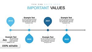
Elevate your Keynote presentations with our target timeline chart templates, crafted to map out goals and milestones with precision and flair. These visuals transform complex project timelines into clear, compelling stories, ideal for business strategists, project managers, and educators who need to convey progress at a glance.
Featuring sleek arrows, progress bars, and milestone markers, each template adapts to your narrative - whether outlining quarterly targets or long-term roadmaps. The clean lines and intuitive layouts ensure your audience stays focused on the journey ahead, not distracted by cluttered graphics.
Designed for seamless integration into Apple`s Keynote, these charts support animations and transitions that bring timelines to life, making dry data feel dynamic and achievable. Tailored for professionals driving results, they save hours of manual design while amplifying your message.
Browse our target timeline charts and download the perfect one for your next pitch.
Target timeline charts are more than mere diagrams; they`re strategic tools that align teams around shared objectives. In Keynote, our templates shine by combining minimalist aesthetics with robust functionality - think curved paths representing growth trajectories or segmented bars highlighting key phases. This approach helps demystify timelines, turning potential overwhelm into organized optimism.
For instance, a sales team can visualize quarterly quotas with color-coded segments, instantly revealing overachievements and areas needing a boost. Unlike static spreadsheets, these charts foster discussion and buy-in during meetings.
These scenarios demonstrate versatility, ensuring your charts resonate across contexts while maintaining a professional polish.
Keynote`s built-in charts are functional but often lack the thematic depth for targeted storytelling. Our templates elevate this with pre-built animations - like smooth fades for phase transitions - that default options require custom coding to achieve. Where basics might default to uniform colors, ours offer thematic palettes (e.g., blues for steady progress, greens for hits) that enhance readability and emotional pull.
Editing is streamlined: drag-and-drop data entry versus manual reshaping, cutting prep time by up to 70%. They`re also responsive, scaling flawlessly on various devices for hybrid presentations.
Customization reigns supreme - swap icons, adjust scales, or embed hyperlinks to supporting docs without breaking the flow. Best practices? Layer timelines hierarchically: high-level overviews on master slides, details on sub-slides. Integrate subtle gradients for depth, avoiding flat looks that dilute impact.
Pro tip: Pair with Keynote`s build effects to reveal targets sequentially, building suspense and emphasis where it counts.
Go beyond basics by embedding interactive elements: hyperlink milestones to drill-down slides for deeper dives. In creative pitches, use metaphorical timelines - like a rocket launch for product rollouts - to captivate investors. For educators, gamify with progress badges that unlock as goals are met.
Examples abound: a startup founder charts funding rounds with upward spirals; a non-profit timelines impact metrics for donor reports. Always test on sample audiences - ensure clarity from afar, as if viewing from the back row.
Transform your timelines - grab a template and chart your path to presentation excellence.
Armed with these tools and tips, your Keynote presentations will not only inform but inspire action. Explore the full range and set your targets in motion today.
Copyright © 2009-2026 ImagineLayout All rights reserved.