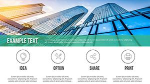
Elevate your business presentations with our strategic management PowerPoint charts. Designed for executives analysts and consultants these charts turn complex data into clear actionable insights. Visualize KPIs portfolio matrices balanced scorecards and trend analyses with precision and style.
Perfect for retail healthcare manufacturing and corporate strategy sessions these charts combine aesthetic appeal with functional clarity. Optimize board meetings and team briefings with visuals that inform persuade and inspire immediate action.
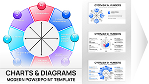
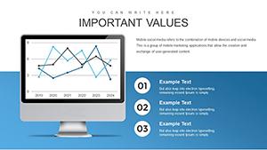
Essential Indicators PowerPoint Charts Template: Visualize Key Metrics with Precision
ID: #PC00568
$17.00
(381)
Positive and Negative Effects of Technology PowerPoint Charts Template
ID: #PC00561
$20.00
(381)
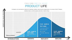
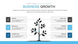
Growth Prospects PowerPoint Charts Template: Propel Your Business Forward
ID: #PC00559
$23.00
(760)
Cause and Effect PowerPoint Charts Template for Presentation
ID: #PC00557
$16.00
(289)
Decode PESTLE Factors with Economic PowerPoint Charts
ID: #PC00544
$15.00
(198)
Graphs of Economic Indicators PowerPoint Charts: Navigating Architectural Financials
ID: #PC00541
$17.00
(559)
Dynamic PowerPoint Charts - Presentation Template
ID: #PC00530
$23.00
(758)
Product Development PowerPoint Charts Template: Streamline Your Innovation Journey
ID: #PC00446
$18.00
(673)
Positive Experience PowerPoint Charts Template for Engaging Viz
ID: #PC00427
$20.00
(120)
World Development Indicators PowerPoint Charts Template
ID: #PC00403
$15.00
Unlock Strategic Insights with Professional Charts
Standard charts often hide critical insights in uniform grids and bland visuals. Our strategic management PowerPoint charts provide adaptive designs with trend lines variance highlights and conditional formatting that dynamically emphasize key metrics.
Real-World Use Cases
Business Reports: Track KPIs and performance metrics across departments
Marketing Presentations: Visualize campaigns and ROI effectively
Education: Teach strategic frameworks with interactive charts
Healthcare: Monitor hospital performance using spider charts
Benefits Over Default Templates
Editable and customizable slides for instant updates
Formula-embedded cells for automated calculations
Professional design optimized for clarity and engagement
Supports animations and interactivity for dynamic storytelling
Creative Tips and Best Practices
Highlight metrics that align with strategic objectives
Use color and contrast to emphasize trends
Integrate benchmarks and targets for context
Combine multiple chart types for comprehensive dashboards
Upgrade your presentations with charts that transform data into actionable insights. Download now and make every slide count.
Frequently Asked Questions
What types of strategic charts are included?
Charts include balanced scorecards KPI radars portfolio matrices trend analyses and spider charts.
Can these charts be customized?
Yes all charts are fully editable including colors fonts data series and layout.
Are these charts suitable for board presentations?
Absolutely designed for executive and board-level reporting with professional visuals.
Do charts support animations?
Yes charts can include animated series and transitions for dynamic storytelling.
Which industries benefit most?
Retail healthcare manufacturing education and corporate strategy teams gain maximum value.