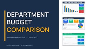
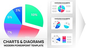
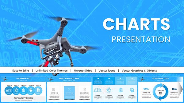
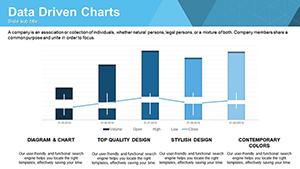
Enhance your analytical edge with PowerPoint charts templates that make data digestible and decisive. From executive summaries to detailed reports, these templates distill complexity into compelling visuals that support your arguments.
Aimed at data enthusiasts in analytics, sales, and research, they deliver precision through aligned axes, legend placements, and trend lines. Replace monotonous tables with charts that spark insight and action.
Optimized for PowerPoint`s charting engine, templates allow effortless data import from Excel. Survey our range and choose the chart that aligns with your objectives - empower your presentations immediately.
Our templates elevate standard charts with combo views - like line-over-bar hybrids - for multifaceted analysis. They include error handling for datasets, preventing rendering issues common in basic inserts.
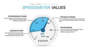
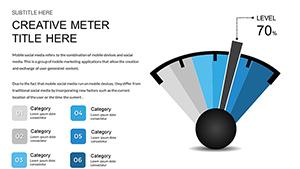
Market researchers plot heatmaps to reveal regional preferences, coloring intensity for quick scans. Finance teams deploy candlestick charts for stock volatility overviews. Fitness coaches use gauge charts to track goal attainment visually.
Advanced Formatting: Gradient fills and 3D rotations for professional depth.
Data Linking: Live updates from linked spreadsheets.
Mobile-Friendly: Scaled for tablet viewing without loss of detail.
Outperforming defaults, these avoid pixelation in exports and support conditional formatting for dynamic highlights.
Industry-Specific Applications
Supply chain managers visualize inventory flows with Sankey diagrams, tracing material paths. Environmental scientists map pollution trends via choropleth charts, shading by severity. Retail analysts forecast demand with exponential smoothing lines.
In sports, radar charts compare player stats across attributes. For policy briefs, box plots summarize survey distributions.
Copy-paste data into the chart source.
Fine-tune series colors for differentiation.
Animate entry effects for sequential reveals.
Guidelines: Cap categories at 10 for scannability and use tooltips for extra context in dense views.
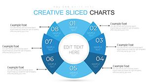
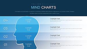
Creative Twists for Engagement
Embed sparklines in tables for micro-trends, or animate paths in flow charts for narrative progression. A tech firm boosted demo conversions by 25% with animated growth curves. Fuse with icons for thematic relevance.
Seize the advantage - download PowerPoint charts templates to visualize victory.
Frequently Asked Questions
What chart varieties are offered?
Column, area, radar, and specialized like waterfall and Pareto for comprehensive coverage.
Support for large datasets?
Yes, optimized to handle thousands of rows without lag.
Integration with Excel?
Direct embedding preserves formulas and pivots.
Customization for themes?
Applies global styles automatically upon theme switch.
Export quality?
High-res vectors for print and digital distribution.