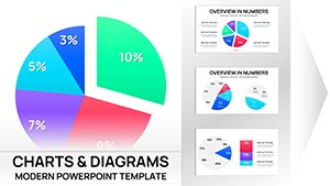
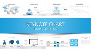
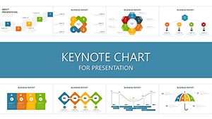
Statistics deserve visuals that are accurate and elegant. Our collection of over 100 statistics chart templates for Keynote offers precise, modern designs for every type of data story.
From classic pie charts to sophisticated box plots and scatter graphs, each template emphasizes clarity and insight.
Fully editable, animated, and research-ready, these charts help analysts, researchers, and educators present numbers with confidence.
Master Market Dynamics with Consumer Confidence Keynote Charts
ID: #KC00541
$17.00
(909)
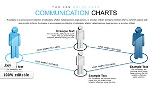
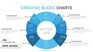
Data Communication Charts Keynote Template: Streamline Your Information Flows
ID: #KC00509
$25.00
(117)
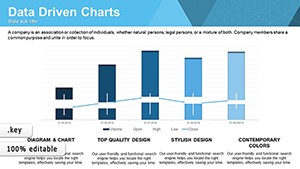
Business Project Keynote Charts: Professional Edge
ID: #KC00505
$20.00
The Art of Statistical Visualization
Good statistical charts reveal truth without distortion. Our templates follow best practices in data visualization while looking contemporary and polished.
Why Choose Specialized Statistics Templates
Accurate scaling and labeling
Multiple statistical chart types
Clean grids and reference lines
Subtle animations that support insight
Common Applications
Research & Academia
Present study results, confidence intervals, or correlations.
Business Analytics
Show survey data, market research, or performance metrics.
Healthcare
Visualize patient outcomes or trial data.
Public Policy
Illustrate demographic trends or program impact.
Find the ideal statistics chart and download it today.
Best Practices for Statistics Charts
Avoid 3D effects that distort perception
Start axes at zero when appropriate
Use clear, descriptive titles
Include source and sample size
Creative Statistical Ideas
Combine distribution plots with summary stats. Use small multiples for comparisons. Overlay trend lines on scatter plots for deeper insight.
Bring your statistics to life - choose a template now.
Frequently Asked Questions
What statistical chart types are included?
Bar, line, pie, scatter, box plots, histograms, heat maps, and more.
Do templates follow visualization best practices?
Yes - accurate scaling, clear labeling, and minimal distortion.
Can I add error bars or confidence intervals?
Yes - elements are pre-built and easy to adjust.
Are free statistics templates available?
Yes, many free options are part of the collection.