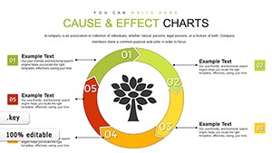
Illuminate your data with stands charts templates optimized for Keynote, ideal for event planners, marketers, and analysts showcasing booth metrics or display impacts. These templates feature modular structures for podium visuals, tiered comparisons, and engaging hierarchies that make numbers narrate stories.
Whether highlighting trade show successes or organizational standings, the designs use clean vectors and smooth transitions to keep audiences hooked. Elevate routine reports into standout exhibits with effortless Keynote compatibility.
From pyramid stacks to leaderboard formats, discover layouts that adapt to your narrative flow. Perfect for fostering discussions and driving decisions.
Explore the stands charts lineup and chart your success.
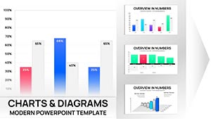
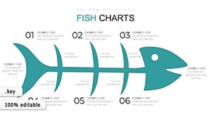
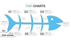


Stands charts excel at visualizing hierarchies and progressions, and our Keynote templates amplify this with interactive builds, shadow effects for depth, and color gradients for emphasis. Crafted for conference recaps, sales hierarchies, or ranking analyses, they surpass basic charts by incorporating stand motifs - like pedestal bases - for thematic relevance.
For exhibitors, VPs, and researchers, perks include rapid assembly, audience-facing animations, and scalability for large screens, turning data dumps into dialogues.
These applications make abstract metrics accessible and actionable.
Standard Keynote charts lack the structural flair for stand-like displays, often flattening hierarchies into bars. Our templates introduce 3D illusions, adjustable heights, and label integrations that maintain proportions dynamically. A plain column chart shows sales, but ours elevates top performers on virtual pedestals, adding narrative punch.
Assembly time drops by 45%, with outputs crisp on Retina displays and exportable to video for social shares.
Follow these for visuals that command attention.
Creativity blooms in customization - envision rotating stands for 360-degree market views or collapsible sections for drill-downs. For product launches, mimic display tiers with product placeholders, immersing viewers in setups.
In education, gamify with podium races for quiz scores, engaging learners interactively. Styles from sleek metallics for corporates to playful pops for creatives cover all vibes.
An event firm used stands templates for ROI decks, securing 18% more bookings via vivid booth breakdowns. A sales team ranked territories, boosting morale and targets by 22%.
These prove charts` power in persuasion.
Download stands charts today - elevate your Keynote game.
Harness these for data dominance.
Copyright © 2009-2026 ImagineLayout All rights reserved.