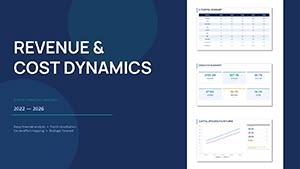
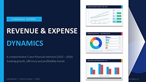
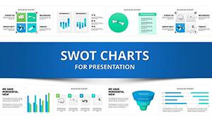
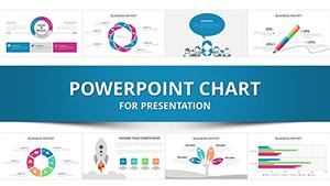
Harness the clarity of data with our service-oriented PowerPoint chart templates, crafted for support teams, managers, and analysts. These designs transform raw numbers into actionable visuals, spotlighting response times, satisfaction scores, and resolution trends in service operations.
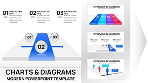
Each template integrates seamless chart builders - bar graphs for ticket volumes, line charts for trend analysis, and pie visuals for issue breakdowns - all within PowerPoint`s familiar interface. Tailored for business reviews or training sessions, they ensure your presentations are precise and persuasive.
Whether optimizing call centers or enhancing client experiences, these tools empower you to communicate findings effectively. With drag-and-drop simplicity, adapt to your dataset in minutes. Browse our assortment and chart a course to better service delivery.


In service industries, data tells the success story - our PowerPoint templates make it vivid and digestible. Equipped with pre-formatted Excel-linked charts, they update dynamically as your metrics evolve, saving recalculations.
Support leads use them for quarterly overviews, plotting escalation rates alongside benchmarks. Consultants design client audits, layering donut charts for sentiment distribution. The modular setup allows stacking multiple views, creating a dashboard-like flow.
Outshining basic PowerPoint inserts, these templates feature themed styling - service blues and greens for trust - and animation sequences that reveal data progressively, holding attention longer.
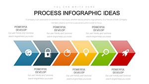
Select chart types wisely: Use waterfalls for ROI breakdowns in service investments. Color-code consistently for quick scans, and annotate peaks with callouts for context. A prime example: A template slide forecasting service demands with predictive lines, aiding resource planning.
These habits amplify insights, driving decisions. Secure your service chart template now and illuminate paths to improvement.
PowerPoint pros appreciate the 100+ slide variants, including dark mode adaptations for virtual meetings. Developed with data viz specialists, they embed accessibility - alt tags and high-contrast modes - ensuring inclusive delivery.
Think of a CRM demo: Sankey diagrams trace query flows, revealing bottlenecks visually. In healthcare services, adapt for patient satisfaction radars, customizing axes for nuanced scoring.
Standard charts lack integration; ours link directly to sources like Google Sheets for live feeds. This real-time capability trumps static alternatives, especially in volatile service environments.
Insight: Balance density - limit to 5 data series per chart - to avoid overload, boosting comprehension by 40% per studies. Clients leverage this for sharper executive summaries.
From bars and lines to Gantt and heatmaps, covering all essentials for service analytics.
Yes, seamless Excel and CSV imports keep your visuals always current.
Optimized for Teams and Zoom, with lightweight files for smooth streaming.
Theme manager lets you apply palettes globally, syncing all elements instantly.
Built-in sequences fade in elements sequentially, enhancing narrative flow.
Navigate service success with charts that clarify and captivate. Pick your template and plot ahead.
Copyright © 2009-2026 ImagineLayout All rights reserved.