Empower your service company pitches with our curated PowerPoint diagrams, crafted to simplify complex operations and highlight value propositions. Targeted at consultants, agencies, and support firms, these visuals use clean lines and intuitive flows to demystify workflows.
From service funnels mapping client journeys to org charts delineating roles, each diagram supports data integration for real-time insights. Built for PowerPoint`s robust tools, they feature editable vectors and color-coded segments for quick brand alignment.
These assets transform dense reports into digestible stories, boosting comprehension and buy-in during board meetings or client reviews. Suited for industries like IT support or consulting, they emphasize efficiency and results.
Clarify your service narrative - explore these PowerPoint diagrams and elevate your decks.
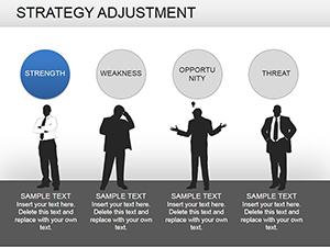
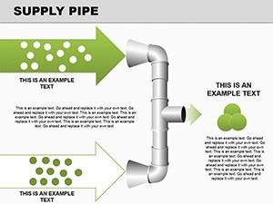

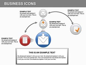
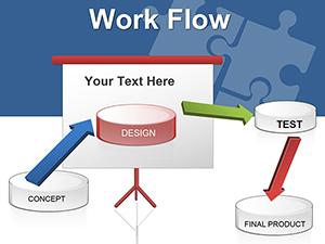
Service company PowerPoint diagrams excel by visualizing intangible processes, a step up from basic charts that often overwhelm with text. Default PowerPoint shapes lack the polish for executive audiences, but our pre-designed sets include layered timelines for project phases and radial maps for dependency webs, ensuring precision without the hassle.
Best practices: Anchor diagrams to key metrics - use bold accents for bottlenecks - to drive discussions. Versus stock libraries, ours integrate seamlessly with animations, revealing layers progressively for narrative control.
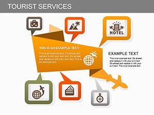
Picture a SaaS pitch: A central hub diagram radiates service tiers, with spokes detailing scalability - clients grasp expansions instantly. Edit hues to match corporate palettes, or embed hyperlinks to appendices for deeper dives.
Unique proposition: Responsive scaling maintains clarity on any screen, vital for remote pitches. Agencies report 30% shorter meeting times, as visuals preempt questions.
Streamline your strategy - download service-focused diagrams and communicate with impact.
Effective designs follow hierarchy: Start with overviews, drill into specifics. Limit nodes to 8 per slide to avoid cognitive overload, pairing with concise legends.
Such refinements yield presentations that not only inform but propel decisions.
Extend utility to quarterly reviews: Animate service KPIs in donut diagrams, revealing trends slice by slice. Consultants leverage them for gap analyses, contrasting current vs. ideal states with side-by-side comparisons.
A support firm case: Switched to our funnel diagrams, cutting explanation time by half and securing a major contract. Tailor for voiceovers by adding note fields with speaker cues.
For international teams, multilingual overlays ensure inclusivity. The adaptability fosters innovation, like hybrid models blending remote and on-site services.
Drive your service story forward - select diagrams that resonate and results follow.
PowerPoint`s natives require manual tweaks; ours arrive presentation-ready, slashing prep by 60%. This efficiency translates to sharper focus on strategy, not styling.
Copyright © 2009-2026 ImagineLayout All rights reserved.