Security Keynote Charts
Security presentations require trust and clarity. Our specialized collection of security chart templates for Keynote helps you communicate risks, threats, and safeguards with professional precision.
From risk assessment matrices to incident timelines, each design is clean, authoritative, and easy to customize.
Modern, animated, and fully editable , these templates are ideal for IT teams, compliance officers, and executives who need to present security topics confidently.
Build credible, impactful slides in minutes.
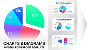
Pie Chart Keynote Template - 46 Editable Slides | ImagineLayout
ID: #KC01076
Online Math Lessons Charts Template for Keynote
ID: #KC01060
Plumbing Charts Keynote Template - Fully Editable 43 Slides | Instant Download
ID: #KC01059
Dynamic Baseball Charts Keynote Template: Hit Data Out of the Park
ID: #KC01058
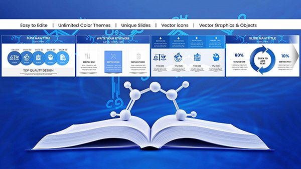
Chemistry Keynote Charts Template for Pros
ID: #KC01048
Innovative Marketing Idea Keynote Charts Presentation
ID: #KC01021
Data Visualization Keynote Charts Template: Illuminate Your Insights
ID: #KC01017
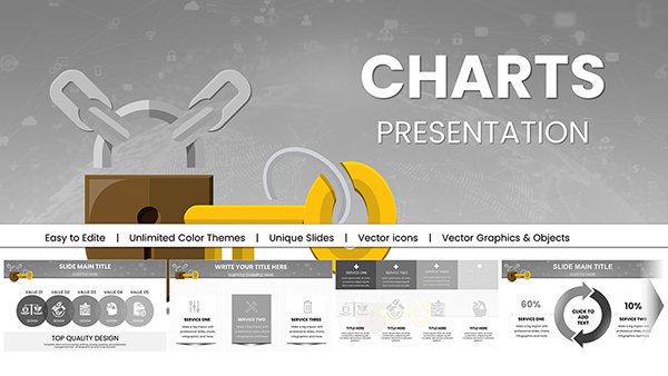
Key Access Control Keynote Template: Secure Presentations with Advanced Visuals
ID: #KC00983
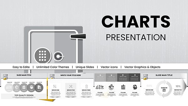
Bank Security Safeguarding: Keynote Charts for Financial Fortification
ID: #KC00981
Brain Five Senses Keynote Charts Template
ID: #KC00948
Illuminate Trends: Mastering Marketing Research with Keynote Charts
ID: #KC00928
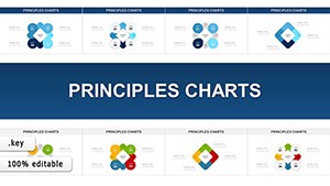
Principles Keynote Charts: Visualize Business Fundamentals with Flair
ID: #KC00917
Process Infographic Ideas Keynote Charts Template
ID: #KC00893
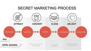
Inbound Marketing Process Keynote Charts: Streamline Your Strategy Visuals
ID: #KC00884
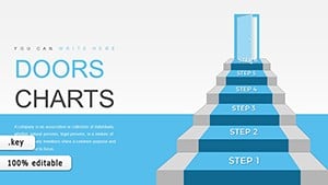
Step-by-Step 3D Stairs Keynote Charts Template
ID: #KC00852
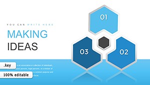
Making Ideas Happen Arrows Keynote Template
ID: #KC00850
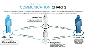
Communication Keynote Charts Template
ID: #KC00826
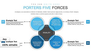
Porter's Five Forces Keynote Charts: Master Competitive Strategy
ID: #KC00825
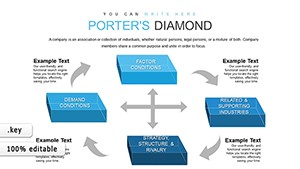
Elevate Strategic Insights with 3D Cubes Porter's Five Forces Charts
ID: #KC00806
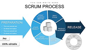
Scrum Process Flow Pie Keynote Charts Template
ID: #KC00795
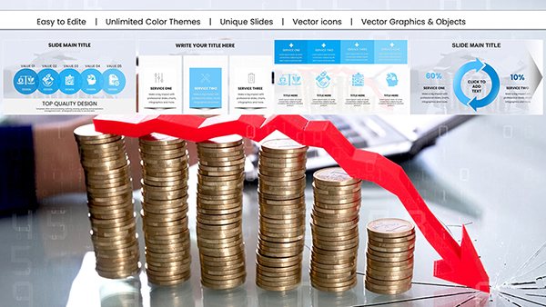
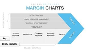
Margin Keynote Charts: Unlock Profitability Insights
ID: #KC00770
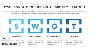
SWOT Analysis Keynote Charts - Fully Editable | ImagineLayout
ID: #KC00752
IT Processes Charts - Editable Keynote | ImagineLayout
ID: #KC00738
Keynote Process Charts - Fully Editable | ImagineLayout
ID: #KC00716
Why Security Presentations Need Strong Visuals Security topics can be complex and alarming. Clear charts help audiences understand threats and solutions without confusion.
Benefits of Dedicated Security Templates Color schemes that convey urgency appropriately Pre-built risk matrices and heat maps Professional icons for threats and controls Subtle animations that maintain a serious tone Typical Use Cases Cybersecurity Reports Show threat landscapes, attack vectors, or incident trends.
Compliance & Audit Present control status, risk levels, or audit findings.
Executive Briefings Summarize security posture and investment needs.
Training & Awareness Illustrate phishing statistics or safe practices.
Choose a security chart template and deliver your message with authority.
Design Tips for Security Charts Use red sparingly and purposefully Prioritize readability over decoration Include clear legends and sources Balance alarm with reassurance Creative Security Visualization Ideas Layer threat icons over maps. Use progression charts for maturity models. Combine matrices with timeline elements for incident response reviews.
Download a template and strengthen your next security presentation.
Frequently Asked Questions What kinds of security charts are available? Risk matrices, heat maps, threat landscapes, compliance dashboards, incident timelines, and control effectiveness charts.
Are the designs appropriately serious? Yes - clean, professional aesthetics with restrained color and animation.
Can I customize colors and icons? Completely - everything is fully editable.
Are free security templates offered? Yes, several free options are included.