Make data accessible and exciting in your classroom using our school PowerPoint chart templates, engineered to simplify complex information through intuitive visuals. These templates cover everything from flowcharts to Venn diagrams, tailored for educational contexts where clarity drives discovery.
Perfect for illustrating survey results in social studies or budgeting in home economics, they feature smooth animations and theme-consistent styling that aligns with your overall presentation flow. Teachers gain confidence in data handling, while students grasp patterns faster through familiar formats.
With one-click data import and resize capabilities, preparation becomes a breeze, allowing focus on interpretation and application rather than formatting frustrations.
Graph your ideas: Survey our school PowerPoint chart templates and add analytical depth to your teaching materials.

In education, charts bridge the gap between numbers and narratives, and our PowerPoint templates amplify this by embedding instructional cues like explanatory footnotes. Vibrant yet subdued palettes prevent sensory overload, ensuring focus remains on insights rather than aesthetics.
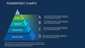
A demographics chart for history classes might use layered bars to depict population shifts, revealing societal evolutions through stacked histories.
Such applications cultivate critical thinking by encouraging data interrogation.
PowerPoint`s native charts suffice for basics but falter in customization depth, often requiring add-ons for educational tweaks. Our templates pre-load with legend toggles and trend lines, streamlining advanced analyses without external tools - unlike defaults that demand tedious adjustments.
They also optimize for projector views with anti-aliasing, delivering sharp edges in dim rooms where standard renders blur.
Implementing these refines presentations into precise teaching instruments.
Innovate with hybrid charts combining mind maps and metrics for brainstorming sessions, or Sankey diagrams tracing energy flows in physics. For literature, character relationship webs visualize dynamics, deepening textual analysis.
School reports gain traction with executive summaries featuring KPI dashboards, impressing boards with concise visuals. Flexibility fuels interdisciplinary blends.
Enhancement: Link charts to live data sources for real-time updates in ongoing studies.
A geography educator in Miami mapped climate impacts with our templates, igniting eco-activism among pupils. A business class simulated markets via waterfall charts, honing forecasting skills effectively.
These experiences underscore charts` role in experiential learning.
A full suite: bars, lines, pies, bubbles, and specialty like waterfalls and radars.
Via linked tables - edit once, and all visuals refresh automatically.
Yes, high-res elements ensure clarity from afar.
Certainly, as images or PDFs for reports or handouts.
Included for scientific accuracy in experimental data.
Alt text and contrast checks built-in for inclusive viewing.
Decode data: Expand your visuals with our broader chart offerings.
Copyright © 2009-2026 ImagineLayout All rights reserved.