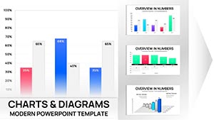
Transform raw numbers into compelling stories with our specialized PowerPoint chart templates, designed to elevate your presentations. Perfect for analysts, educators, and business leaders who need to convey trends, comparisons, and forecasts without overwhelming audiences.
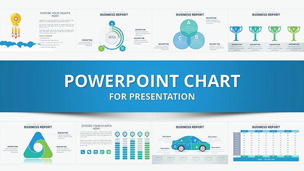
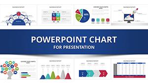
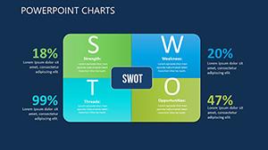
These templates feature a variety of chart types - from interactive pie charts and dynamic bar graphs to sophisticated scatter plots and timelines - each optimized for PowerPoint`s animation capabilities. With pre-built color palettes that ensure accessibility and brand alignment, you can focus on your message rather than formatting frustrations.
Whether you`re preparing a quarterly report, academic lecture, or sales pitch, our charts make data digestible and engaging. Save hours of manual adjustments and deliver slides that hold attention and drive decisions. High-contrast elements and responsive layouts work seamlessly on any screen size.
Ready to chart your success? Browse our collection and download your favorites today!


Our templates stand out by integrating advanced features like data-driven animations and layered structures, allowing real-time updates without redesigning. Compared to PowerPoint`s default charts, which require tedious tweaks for aesthetics, these offer plug-and-play elegance with embedded formulas for automatic recalculations.
Adaptable to themes like corporate blues or vibrant pitches, they support Excel imports for effortless data population.
Default PowerPoint charts often lack polish, resulting in bland visuals that fail to engage. Our versions include smart guides for alignment, customizable legends, and export-ready SVGs for versatility. Teams report 50% faster presentation prep, with visuals that boost comprehension by up to 65%.
Pro tip: Layer transparency on overlapping elements to avoid clutter, and use tooltips for interactive hover effects in presenter view.
Combine multiple chart types into dashboards for holistic views - imagine a slide merging heat maps and line graphs to forecast market shifts. In sales, animate bubble charts to reveal growth trajectories, captivating stakeholders. For sustainability reports, eco-themed icons enhance relevance.
Example: A fintech firm leveraged our radial chart template to illustrate investment diversification, resulting in clearer board approvals and a 25% uptick in investor confidence.
Elevate your next presentation - grab a chart template and visualize like a pro!
Yes, compatible with PowerPoint 2016 and later, including Office 365, with backward-compatible elements for smooth imports.
Link directly to Excel sheets via the data tab; changes update automatically, maintaining accuracy across slides.
Absolutely - pre-set entrance and emphasis effects that you can adjust or remove for subtle or dramatic reveals.
Easily swap palettes using theme colors; includes accessible contrasts meeting WCAG standards.
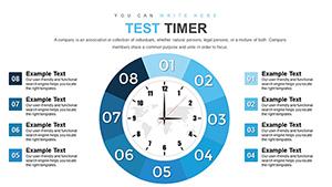
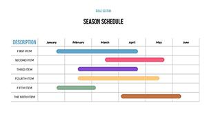
Bar and line charts lead, but infographic hybrids like process flows gain traction for narrative-driven decks.
Selective 3D options for depth, but we recommend 2D for clarity unless emphasizing volume data.
Delving into these resources, with comprehensive examples and tips, equips you to master data storytelling in PowerPoint.
Copyright © 2009-2026 ImagineLayout All rights reserved.