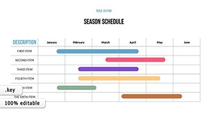
Schedule Keynote charts templates transform chaotic timelines into sleek, interactive visuals that clarify deadlines, milestones, and dependencies at a glance. Tailored for project managers, event planners, and team leads, these charts integrate seamlessly with Apple`s Keynote for effortless updates and animations.
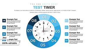
From Gantt-style bars tracking progress to circular timelines highlighting key dates, our designs prioritize usability with color-coded categories, progress indicators, and legend keys. They help audiences grasp complex schedules quickly, reducing misunderstandings and boosting productivity.
Compatible across devices, these templates support real-time collaboration via iCloud, making them perfect for remote teams. Whether outlining quarterly goals or wedding itineraries, start with a ready framework and customize to fit. Download today to bring order and style to your planning sessions.

Schedule Keynote charts go beyond basic tables by employing layered graphics that reveal insights at every zoom level. Default Keynote charts can feel rigid, but ours incorporate fluid animations - like bars filling progressively - to simulate real-time updates, engaging viewers dynamically.
Project coordinators use them to map sprints with swimlane divisions, while marketers plot campaign rollouts via milestone markers. In education, teachers schedule curricula with overlaid resource links, fostering interactive lesson prep.
Superior to free tools, these offer 50+ preset styles and formula-driven calculations for accuracy, cutting setup time in half.
These techniques ensure charts communicate effectively, driving decisions. Try one and watch your organization soar.
Explore integrations: Embed weather APIs for outdoor events or budget trackers for resource allocation. A conference organizer reported 40% fewer last-minute changes after adopting our templates. For enterprises, scalable vectors handle massive datasets without lag.
Customize with themes - minimalist for boardrooms, vibrant for creative briefs. Include voiceover scripts for narrated walkthroughs, enhancing virtual deliveries.
Charts like these turn abstract plans into tangible paths, empowering proactive management. Peruse our library for the ideal starter.
A software team slashed overruns by 35% using waterfall charts with elephantine task flows. An NGO coordinated aid distributions via radial schedules, reaching more beneficiaries efficiently. These wins underscore the power of visual precision.
With drag-and-drop editing, non-designers create pro-level outputs. Bundle with timeline extensions for comprehensive suites.
Yes, Keynote`s table tools allow seamless CSV or direct copy-paste integration.
Fully - adjust speed, direction, and triggers via the build order panel.
Over 20, from linear to cyclical, with mix-and-match options.
Absolutely, all features are local to Keynote for uninterrupted use.
Optimized under 10MB, ensuring quick loads and shares.
Copyright © 2009-2026 ImagineLayout All rights reserved.