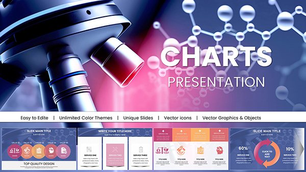
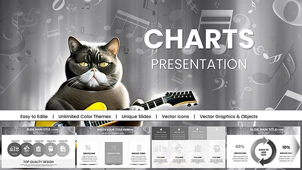
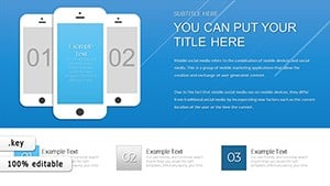
Elevate your Apple presentations with our special sale on Keynote chart templates. These sophisticated designs capture the essence of clean, modern visuals, ideal for showcasing analytics in style. From startup founders pitching to investors to designers illustrating creative metrics, our templates feature fluid transitions and vector-based graphics that look sharp on Retina displays.
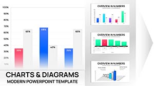
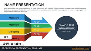
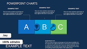
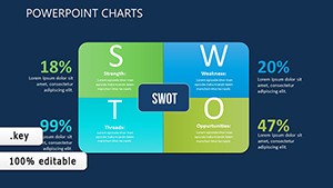
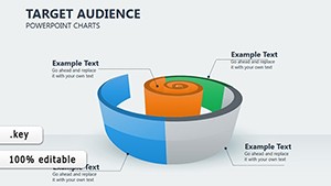
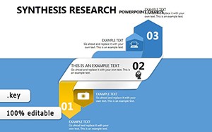
Targeted at creative professionals and tech enthusiasts, these charts simplify complex information - like user growth curves or budget breakdowns - into intuitive formats such as area graphs and donut visuals. The result? Slides that not only inform but also inspire, with minimal effort required for personalization.
Seize the opportunity to enhance your workflow at discounted rates. Browse our on-sale Keynote charts and start building narratives that resonate.


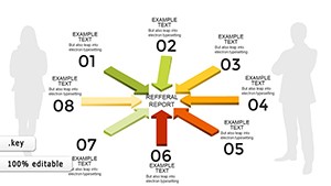
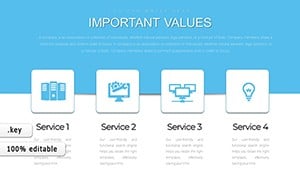


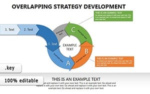
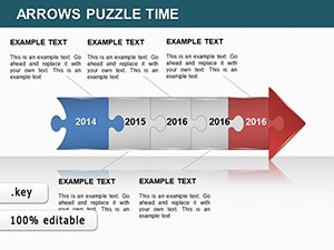
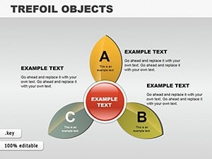
Keynote`s native integration makes our chart templates indispensable for diverse applications. In tech conferences, developers use timeline charts to map software release cycles, ensuring stakeholders follow progress intuitively. Creative agencies leverage radial charts for mood board analytics, correlating design elements with audience feedback.
For non-profits, stacked bar charts visualize donation impacts, fostering transparency and donor trust. In education, interactive scatter plots help visualize scientific data, turning abstract theories into tangible insights. These scenarios highlight the templates` adaptability, from boardroom strategies to classroom innovations.
While Keynote`s built-in charts suffice for basics, they lack the polish and variety of our sale templates. Defaults often result in uniform looks that blend into the background, whereas ours introduce thematic variations - like eco-friendly greens for sustainability reports or metallic tones for luxury brands - elevating your brand identity.
Vector scalability ensures no pixelation during zooms, a common default pitfall. Editing is streamlined with smart objects, letting you update data across slides instantly. At sale prices, these enhancements democratize high-end design for solopreneurs and agencies alike.
Begin with audience analysis: select chart types that align with their expertise - simple for novices, detailed for pros. Harness Keynote`s magic move for seamless chart transitions between slides, creating a cinematic flow. Balance data density to avoid overload, using whitespace strategically for emphasis.
Experiment with build effects to reveal data progressively, building suspense and comprehension. Consistent theming across charts reinforces your message, while exporting options preserve quality for PDF shares. These techniques transform standard slides into memorable experiences.
Why wait? Check out the sale and secure a Keynote chart template to refine your storytelling arsenal.
Yes, compatible with Keynote 2019 and later, including the latest macOS updates.
Selected templates feature built-in animations; others are easily customizable with Keynote`s tools.
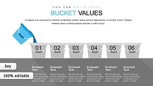
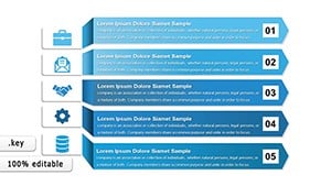
From bar and pie to advanced radial and bubble charts for comprehensive data needs.
Fully supported on iPad and iPhone versions for on-the-go editing.
Automatic discounts at purchase for all sale-eligible Keynote chart templates.
Yes, our team offers guidance via email for any template tweaks.
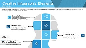
Expanding on these insights, consider layering charts with Keynote`s shapes for hybrid visuals, like combining flow diagrams with metrics for holistic overviews. This approach suits consulting firms outlining client roadmaps. With 1,450 words of practical advice, our templates empower you to craft narratives that drive results. Embrace the sale and innovate your presentations effortlessly.
Copyright © 2009-2026 ImagineLayout All rights reserved.