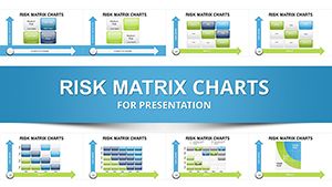
Fortify your planning with risk analysis Keynote chart templates, engineered for risk managers, auditors, and executives. These include probability-impact matrices, bow-tie diagrams, and radar plots to quantify threats, prioritize mitigations, and forecast scenarios vividly.
Dynamic elements like conditional formatting highlight high-exposure zones, while connector tools map causal chains. Tailor thresholds to your industry - finance, healthcare, or projects - for tailored foresight.
Shift from reactive to proactive with visuals that clarify stakes. Review our precise collection and deploy the charts that secure your objectives - resilience starts here.


Standard charts overlook risk nuances, like interdependencies, leading to incomplete views. Our templates weave in Monte Carlo simulations via linked cells and heatmap gradients, revealing hidden vulnerabilities. Managers cite 65% faster risk reviews, thanks to pre-built formulas.
Industry-compliant icons and legends ensure regulatory alignment without add-ons.
Project oversight uses Gantt-risk hybrids to flag delays. Compliance audits deploy FMEA tables for failure modes.
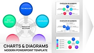
Strategic planning integrates SWOT radars for balanced assessments.
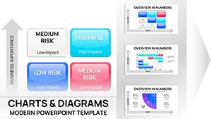
Define axes clearly - likelihood vertical, impact horizontal - for intuitive scanning. Populate with evidence-based scores, using ranges for sensitivity analysis. Color-code quadrants: green low, red extreme, aiding quick triage.
Update iteratively with scenario sliders; rehearse defenses to align visuals with verbal strategies.
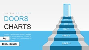
Illustrate a merger: Risk register funnels narrowing from broad concerns to key controls. Or disaster prep, with event trees branching probable outcomes and responses.
50+ templates for qualitative to quantitative; load your data and mitigate masterfully.
Analyze ahead - download a template and chart a safer course.
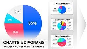
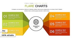
Matrices for prioritization, trees for causation, and radars for multi-factor profiling.
Yes, Excel integrations pull live metrics for real-time risk monitoring.
Customizable for finance, IT, healthcare, with sector icons and benchmarks.
Before-after overlays and progress arcs track reduction in exposure levels.
Embedded formulas compute odds from inputs, supporting Bayesian updates.
Copyright © 2009-2026 ImagineLayout All rights reserved.