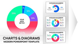
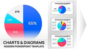
Spotlight your accomplishments with our results PowerPoint chart templates, engineered for business leaders, project managers, and data enthusiasts. These slides convert raw numbers into narrative powerhouses, using sleek visuals to track progress, benchmarks, and forecasts.
From sales funnels to KPI dashboards, they handle everything from quarterly earnings spikes to campaign ROI curves, making quarterly reviews or investor updates a breeze. Embed formulas for auto-updates and color-code for instant insights on wins and opportunities.
Versatile for any industry, with themes from corporate blues to vibrant greens, they ensure your data tells a story of growth and strategy. Simplify complexity, amplify impact.
Chart your triumphs - dive into our results templates and make every metric memorable.


Plain PowerPoint charts can overwhelm with clutter, obscuring key takeaways amid misaligned axes. Our results templates rectify this with smart auto-scaling grids and conditional formatting that highlights outliers, like revenue surges in green or dips in amber, for at-a-glance analysis.
Marketing teams can dissect A/B test outcomes via clustered columns, while HR pros map employee retention trends with survival curves. In R&D, visualize patent filings over time with stacked areas, revealing innovation pipelines clearly.
Unlike ad-hoc inserts, ours come pre-formatted with error bars and trendlines, plus legend toggles for filtered views, streamlining prep for boardroom battles.
Start with a dashboard overview slide aggregating top metrics, then drill into specifics with hyperlinks. Opt for sans-serif labels and limit palettes to 5 colors for cognitive ease, always annotating anomalies with callout bubbles.
Our innovation? Plug-and-play Excel links that refresh on open, plus mobile-optimized exports for on-the-go shares. A startup CEO credited our template with securing funding, as its clean ROI scatter plot vividly demonstrated scalability.
Think of a fitness app launch: Bubble charts plotting user engagement by demographics, or a nonprofit`s impact report with Sankey flows showing donation trajectories - each a canvas for success.
For predictive analytics, layer regression lines on scatterplots; for cohort analysis, heatmaps of retention cohorts. In competitive landscapes, bubble maps sizing rivals by market share, positioning your results prominently.
Decode your data`s potential - acquire a results PowerPoint chart template and propel your narratives forward.
Compatible with Power BI embeds for live queries, and PDF exports with vector sharpness for prints. Low overhead ensures lag-free animations during zooms on intricate Sankeys.
Comprehensive set: bars, lines, pies, scatters, and specialized like funnels and radars.
Yes, via linked data sources like Excel or CSV for real-time refreshes.
Optimized for thousands of points with aggregation tools to maintain performance.
Theme-wide palettes adjustable in the master slide for brand alignment.
Sequential builds to reveal data step-by-step, building suspense effectively.
From metrics to milestones, these charts don`t just display results - they define directions. Embrace one and watch your data harmonize with strategy.
Copyright © 2009-2026 ImagineLayout All rights reserved.