Turn raw data into riveting stories with our report-focused PowerPoint chart templates. Tailored for business analysts, project managers, and executives, these designs prioritize legibility and persuasion through varied chart types and thematic cohesion.
From bar graphs dissecting sales trends to scatter plots revealing correlations, each template streamlines the path from dataset to dashboard. PowerPoint`s native tools make edits intuitive, supporting collaboration and version control effortlessly.
Enhance your reporting repertoire - peruse our charts collection and deliver data that drives action.
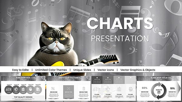
Organizational PowerPoint Charts Template: Visualize Structures with Precision
ID: #PC00716
$20.00
(220)
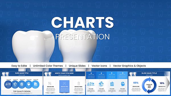
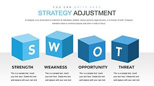
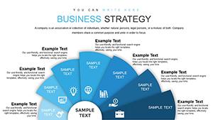
Business Strategy PowerPoint Charts Template: Craft Winning Strategies Visually
ID: #PC00698
$18.00
(154)
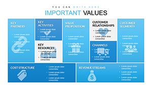
Free Business Model Canvas PowerPoint Template - Instant Download
ID: #PC00612
free
(127)
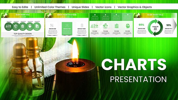
Logic of Operational Analysis PowerPoint Charts: Insightful Clarity
ID: #PC00603
$17.00
(1012)
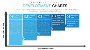
Business Development Strategies PowerPoint Charts Template
ID: #PC00587
$20.00
(881)
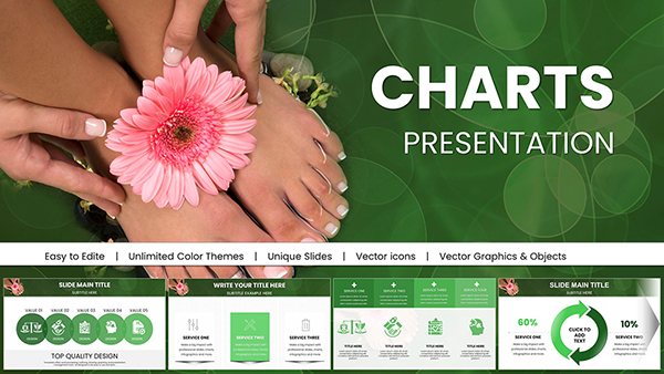
Welfare and Prosperity PowerPoint Charts Template
ID: #PC00579
$22.00
(506)
Business Strategy Development PowerPoint Charts Template: Craft Winning Plans with Precision
ID: #PC00577
$19.00
Elevating Reports Through Strategic Charting
Reports succeed when data speaks volumes without verbosity, and our PowerPoint templates achieve this via meticulously crafted charts that balance detail with digestibility. Whether quarterly earnings or project retrospectives, these visuals distill complexities into actionable intelligence.
Picture a sustainability report where stacked area charts track carbon footprints over time, color-coded by initiative - revealing progress at a glance. Or a market analysis with bubble charts sizing opportunities by revenue potential, guiding strategic pivots.
Core Applications in Reporting
Financial Summaries: Line charts for trend forecasting and variance analysis.
Project Status: Gantt-integrated bars for milestone tracking.
Market Research: Pie variants for share breakdowns.
HR Analytics: Heatmaps for turnover patterns.
These outpace default PowerPoint charts with pre-styled axes, legends, and annotations, reducing formatting drudgery.
Expert Tips for Chart Mastery
Select Apt Types: Match charts to data nature - histograms for distributions, radars for multi-attribute comparisons.
Enhance Readability: Employ consistent scales and tooltips for interactive depth.
Integrate Narratives: Anchor charts with summary bullets tying visuals to objectives.
Automate Updates: Link to Excel for dynamic refreshes in recurring reports.
A consultant leveraged a funnel chart template to optimize a client`s sales process, boosting conversions by 15% through visualized drop-offs.
Innovative Chart Strategies for Impact
Go beyond basics with combo charts merging lines and columns for hybrid insights, or animated sequences unveiling layers progressively. In sales ops, waterfall charts decompose targets into components, clarifying paths to achievement.
For global teams, localize with multi-language labels, ensuring universal accessibility.
Chart your course to superior reports - download a template and visualize victory.
Frequently Asked Questions
What chart types are included? Bars, lines, pies, scatters, and advanced like waterfalls and sunbursts.
Do they support large datasets? Yes, with optimization for 10,000+ rows via PowerPoint`s data tools.
Customization ease level? High - theme colors and fonts adjust globally in one step.
Integration with other MS Office apps? Seamless with Excel and Word for comprehensive suites.
Best for animated reports? Included Morph transitions for smooth data evolutions.
Accessibility features? Alt text prompts and color-blind friendly palettes.