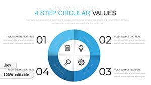
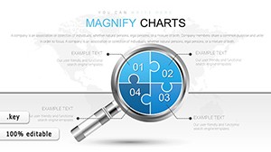
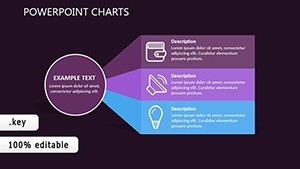
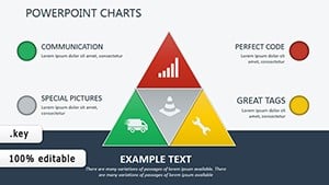
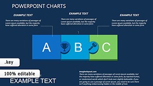
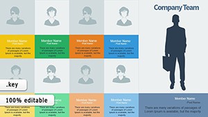
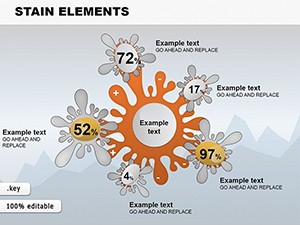
Capture connections beautifully using our Keynote chart templates for relationships. Tailored for the Apple faithful, these charts blend data precision with artistic flair, perfect for unveiling patterns in teams, trends, or timelines. Elevate from mundane metrics to mesmerizing narratives.
For presenters, developers, and visionaries on Mac, the perks include effortless syncing across devices, cinematic transitions, and eco-conscious designs. Harness charts that scale with your ambition, from simple links to multifaceted webs, all within Keynote`s intuitive interface.
Whether for boardrooms or lectures, these templates foster understanding through elegance. Scroll through and select charts that resonate with your story now.
Keynote chart templates for relationships fuel innovation everywhere. Developers chart code module ties for code reviews. Marketers visualize campaign synergies, optimizing ROI.
Tech and Marketing Arenas
Dependency graphs for software architecture.
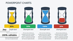
Funnel relationships for conversion analysis.
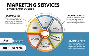
Network charts for influencer ecosystems.
Extended Creative Uses
Musicians map collaboration networks, while environmentalists chart climate factor links for advocacy.
Better Than Stock Keynote Charts
Stock charts in Keynote handle basics well, but falter on relational complexity. Our versions include relational algorithms for organic layouts, like curved connectors that avoid overlaps automatically.
With haptic feedback cues and dark mode variants, they align with macOS aesthetics, offering a cohesive experience defaults lack.
Premium Perks
Real-time collaboration via Keynote Live.
AR preview for stage rehearsals.
Batch export to multiple formats.
Value and Practice Tips
Layer charts iteratively for build-up effects, using Keynote`s build-in tools. Balance data density with whitespace for focus. Embed hyperlinks for interactive explorations.
Propositions feature sustainable palettes and AI-suggested layouts for quick starts. A tech firm might chart user flow relationships, refining UX intuitively.
Compelling Examples
Chefs diagram ingredient synergies for menu development. Activists connect policy impacts, mobilizing change.
Download to harmonize your charts with relational power. Inspire through every data point.