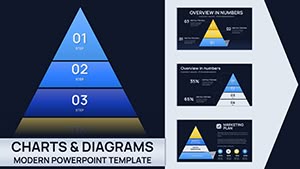
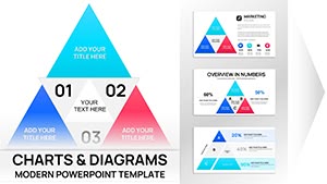
Ascend to clarity with our pyramid chart PowerPoint templates, essential for business analysts, educators, and project leads visualizing layered concepts. These sophisticated designs stack priorities like ancient wonders, from base-level tactics to apex goals, using gradient fills and segmented wedges for intuitive progression.
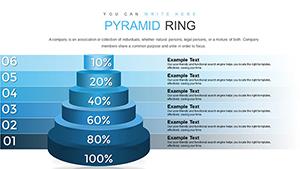
Versatile for Maslow`s needs models, sales funnels, or org structures, they simplify multi-tier data with rotatable 3D views and proportional resizing. PowerPoint`s charting prowess amplifies here, with connector lines tracing influences between levels.
For decision-makers seeking persuasive tools, these templates distill complexity into elegance. From corporate pyramids to nutritional guides, they adapt seamlessly. Scale the heights - browse and build your foundation.
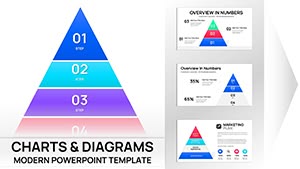
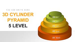
3D Cylinder Pyramid PowerPoint Charts: Elevate Multi-Level Data
ID: #PC00746
$17.00
(614)
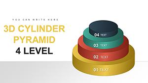
Transform Your Data into Dynamic 3D Stories with Our Cylinder Pyramid PowerPoint Template
ID: #PC00745
$17.00
(298)
6-Level 3D Block Pyramid PowerPoint Charts: Visualize Hierarchies with Depth
ID: #PC00744
$23.00
(692)
Fully Editable 4-Segment Data Comparison PowerPoint Template - Instant Download
ID: #PC00743
$22.00
(253)
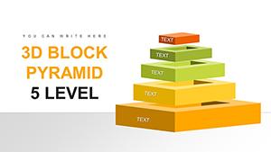
4-Level 3D Block Pyramid: PowerPoint Charts for Clear Hierarchies
ID: #PC00742
$21.00
(1100)
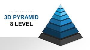
8-Level 3D Pyramids PowerPoint Charts Template: Visualize Hierarchies with Depth
ID: #PC00730
$22.00
(203)
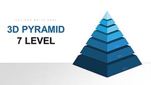
3D Pyramid PowerPoint Charts: 7-Level Template for Immersive Data
ID: #PC00729
$22.00
Elevating Data with Pyramid Chart Mastery
Pyramids symbolize stability, and our templates embody that in charts - eclipsing basic SmartArt with interactive peels and value-based sizing. Flat diagrams confuse; ours reveal interdependencies dynamically.
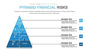
For consultants funneling leads or trainers stacking skills, precision rules. Exemplar: A risk pyramid, base hazards inflating toward mitigation peaks.
Strategic Deployments
Business Models: Revenue layers from inputs to outputs.
Educational Frameworks: Bloom`s taxonomy tiers.
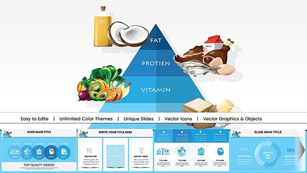
Health Plans: Food group balances.
Analysts see 33% faster insights from visual cues.
Elite Features and Apex Advice
Features: Explode segments for spotlights, link to datasets. Summit tip: Base with broadest metrics, taper to specifics.
Advance: Animate climbs or embed sliders for scenarios. A firm`s SWOT pyramid, with rotating views, clinched a merger.
Chart Crafting
Proportion Play: Scale by importances.
Label Logic: Concise calls per level.
Color Code: Gradients for flows.
Reach the top - claim your template.
Frequently Asked Questions
What pyramid variations are offered?
Inverted, stepped, and 3D, for diverse hierarchies.
How to input custom data?
Excel-linked tables auto-adjust proportions.
Support for non-linear structures?
Hybrid connectors for branched pyramids.
Animation options for reveals?
Layer-by-layer builds from base up.
Print-ready scaling?
Vector cores ensure sharpness at any size.
50+ configurations cover solo to ensemble charts. Innovate with thematic skins or fuse with timelines for evolution pyramids. A planner`s priority stack animated quarterly shifts, optimizing allocations.
From agile sprints to eco-food chains, adaptability abounds. Detail in dropshadows adds dimension without clutter.