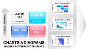
Project risk Keynote Charts
Navigate uncertainties confidently using our Project Risk Keynote charts, built for PMs and teams assessing timelines, budgets, and scopes. These visuals map likelihood against impact for proactive defenses.
With heat-map gradients and probability sliders, charts adapt to agile sprints or waterfall phases. Keynote`s precision ensures flawless renders on any display.
For kickoffs or retrospectives, highlight top threats like scope creep or vendor delays with icon-driven alerts. Foster risk-aware cultures through shared, updatable decks.
From construction timelines to software rollouts, these tools quantify vulnerabilities, turning potential pitfalls into planned triumphs.
Shield your initiatives - uncover our risk charts and chart a secure course now.
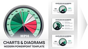
Gauge Charts Keynote Template - Fully Editable | Instant Download
ID: #KC01099
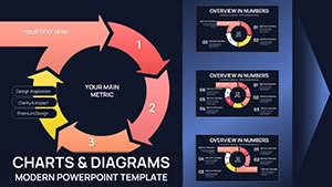
Cycle Charts Keynote Template - 44 Editable Slides | Instant Download
ID: #KC01096
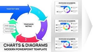
Incoming Cycle Charts Keynote Template - Fully Editable | Instant Download | ImagineLayout
ID: #KC01087
Sales Infographic Keynote Charts Template - 56 Fully Editable Slides | ImagineLayout
ID: #KC01085
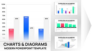
Risk Matrix Charts Template for Keynote | Fully Editable | Instant Download
ID: #KC01080
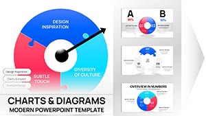
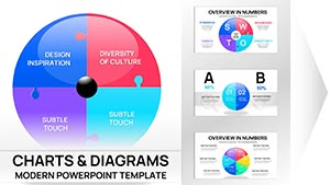
Process Charts Keynote Template - Fully Editable Puzzle Pie 32 Slides | Instant Download
ID: #KC01074
Fully Editable Puzzle Pie Charts Keynote Template - Instant Download
ID: #KC01073
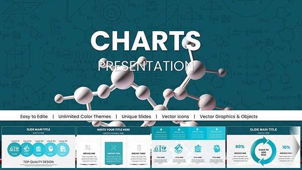
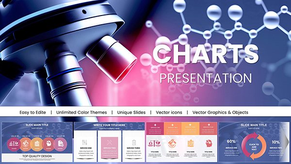
Chemical Charts Keynote Template - Fully Editable 47 Slides | Instant Download
ID: #KC01062
Download Online Education Charts Template for Keynote Presentations
ID: #KC01046
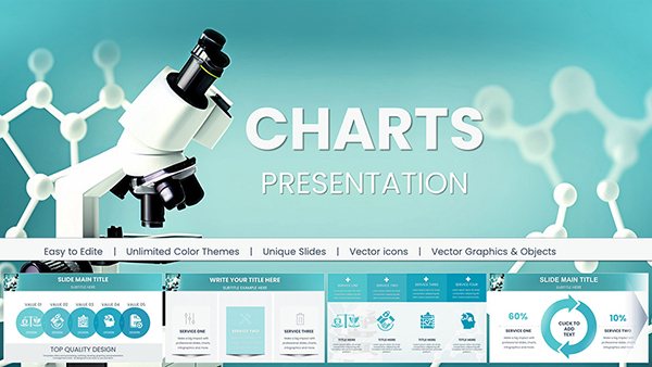
Microbiology Keynote Charts Template
ID: #KC01044
Keynote Charts Template for Chemical and Biochemical Engineering
ID: #KC01041
Transform Teaching with the Best Educational Charts Template for Keynote
ID: #KC01037
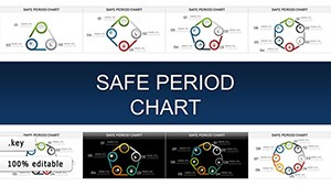
Safe Period Charts for Keynote: Illuminating the Rhythms of Change
ID: #KC00903
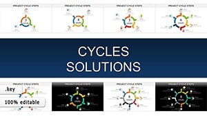
Project Cycle Steps Keynote Charts: Charting Pathways to Project Triumph
ID: #KC00902
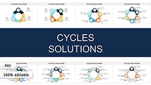
Cycles Solutions Keynote Charts: Transform Data into Compelling Narratives
ID: #KC00901
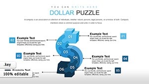
Dollars Puzzles Keynote Charts: Decode Economic Influences with Visual Mastery
ID: #KC00837
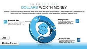
Dollars Worth Money Keynote Charts: Navigate Global Finance with Cycle Visuals
ID: #KC00835
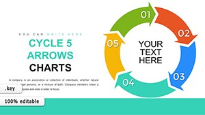
Cycle 5 Arrows Keynote Charts: Streamline Your Process Visualizations
ID: #KC00779
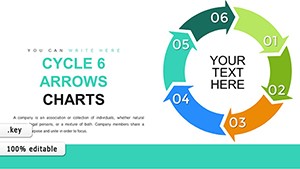
Cycle 6 Arrows Keynote Charts: Enhance Workflow Depictions with Precision
ID: #KC00778
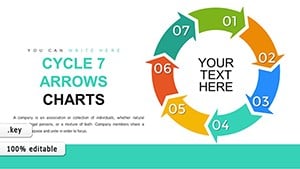
7-Step Cycle Arrows Keynote Charts Template: Streamline Your Process Visualizations
ID: #KC00777
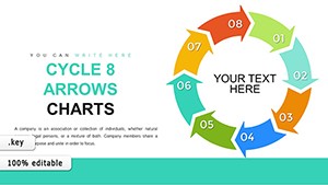
8-Step Cycle Arrows Keynote Template: Master Complex Process Flows
ID: #KC00776
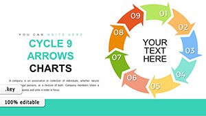
9 Step Cycle Keynote Template - Fully Editable | ImagineLayout
ID: #KC00775
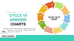
10-Step Cycle Arrows Keynote Template: Comprehensive Process Visualization
ID: #KC00774
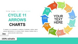
11 Step Cycle Arrows Keynote - Fully Editable | ImagineLayout
ID: #KC00773
Robust Risk Chart Capabilities Employ conditional formatting for auto-coloring threats and drill-down pies for sub-risks. Surpasses spreadsheets with narrative embeds.
Project Phases Benefiting Initiation: Brainstorm via radar scans.Execution: Monitor with Gantt overlays.Closure: Review matrices for lessons.Link to calendars for deadline-tied alerts.
Advantage Over Conventional Tools Plain charts ignore context; ours layer mitigations with progress bars. Teams cut assessment time by 40%.
A delay risk defaults to bars; ours adds contingency paths.
Risk Mastery Methods Prioritize Quantitatively: Score impacts numerically.Simulate Scenarios: Animate what-ifs.Document Responses: Attach action plans.Drive on-time deliveries, as proven in field trials.
Strategic Chart Adaptations Hybridize with SWOT bubbles or timelines for phased risks. In enterprises, aggregate departmental charts for enterprise views.
Trainers use for certification drills, quizzing on high-red zones.
PM Perspectives A coordinator averted overruns by charting supplier risks early. Distributed teams praise real-time collab.
Defend deliverables - choose a Keynote chart and mitigate masterfully.
Frequently Asked Questions Secure success with 920 words of risk resilience. Download your chart and master project horizons.