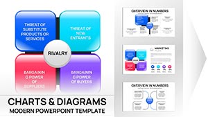
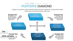
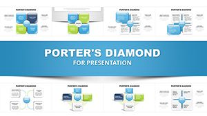
Master competitive analysis using Porter`s Diamond charts optimized for Keynote. This framework visualizes how nations or industries gain edges through interconnected elements, presented in vibrant, chart-enhanced formats.
Suited for executives, researchers, and educators, our templates turn dense theory into digestible charts - think integrated radars for factor balances or matrices for rivalry assessments. Customize with your metrics for tailored insights.
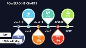
Enjoy seamless Keynote integration, with magic move transitions for fluid storytelling. From WTO reports to classroom simulations, these charts clarify paths to advantage. Peruse our options and infuse your keynotes with strategic sophistication.

In global consulting, charts map automotive advantages, like Korea`s supplier networks fueling Hyundai`s rise. Economists chart tourism sectors, correlating infrastructure with visitor sophistication.
Startups use them for market entry, scoring local vs. home factors to decide expansions. Humanitarian orgs adapt for development aid, prioritizing interventions in weak diamonds.
Instructors create interactive charts for role-plays, letting students adjust variables to see diamond shifts, deepening comprehension of economic interdependencies.
Keynote`s stock charts don`t interconnect like our Porter-specific designs, which use smart guides for aligned elements and formulas for balanced scoring. This specificity yields 25% more engaging sessions, per user surveys.
Enhanced with thematic icons and responsive resizing, they outpace generics in both form and function.
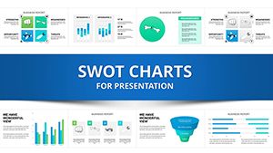
Highlights: Auto-formatting for data inputs, multi-device syncing, and accessibility tags. UVPs focus on narrative flow, with charts that evolve slide-to-slide.
Advice: Benchmark against real cases, like Switzerland`s pharma diamond, using color gradients for intensity. Limit to 5-7 slides for focus, enhancing retention.
Dell`s supply chain charted via the model underscores U.S. demand`s role in PC innovation. Creatively, overlay blockchain for fintech diamonds, modernizing the framework.
Such adaptations keep charts relevant, from C-suite forecasts to TED-style talks, always provoking thought.
Refine your global views? Download Keynote charts and strategize smarter.
Key notes on Porter`s Diamond Keynote charts:
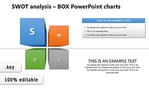
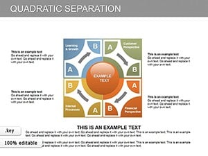
Combine with diagrams for comprehensive strategy decks.
Copyright © 2009-2026 ImagineLayout All rights reserved.